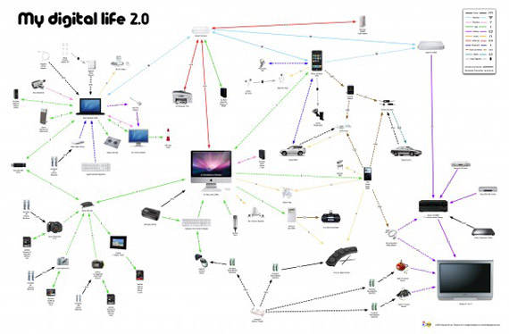
数据之美 40个精美数据报表设计欣赏
对于一个电脑工程师来说,数据无疑是非常美丽的。而如何把这份美丽呈现给你的客户,却是一件很困难的事情。单调的数字,这无疑是很令人反感的。分享给大家40个精美的数据报表设计,如果你拿这样的一份报表给你的老板,那你离加薪就不远了。
1. The colors of the top 100 web brands

2. Yahoo developer network metro map


5. The cmo’s guide to the social landscape


7. The 2010 social networking map

8. A modern history of human communication

9. How much do we really recycle?

10. Money in the food industry


12. Time wasted on loading unnecessary data


15. Facebook: facts you probably didn’t know

16. The most widely spoken languages

17. What BP could have bought with all the money they lost


19. Largest bankruptcies in history

20. What are people buying online?

21. The human tongue

23. Serial killers


25. Animals & Humans: What’s the difference?


28. What makes good information design?


31. A guide to buying your own island


33. What’s cheaper now than it was in 2000?

34. The bumpy rise of a start-up

35. The perfect pour

36. How do I win rock, paper, scissors every time?

37. Rubiks cube


39. The display ad tech landscape

40. Music preference by gender
