28个流行包装设计
一个精美的产品包装,能很大程度提升产品的质感,以及加深消费者的第一印象,收集了若干个不同产品的外包装,流行元素居多。
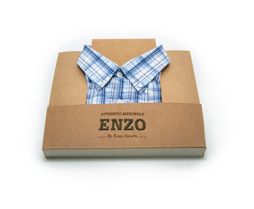
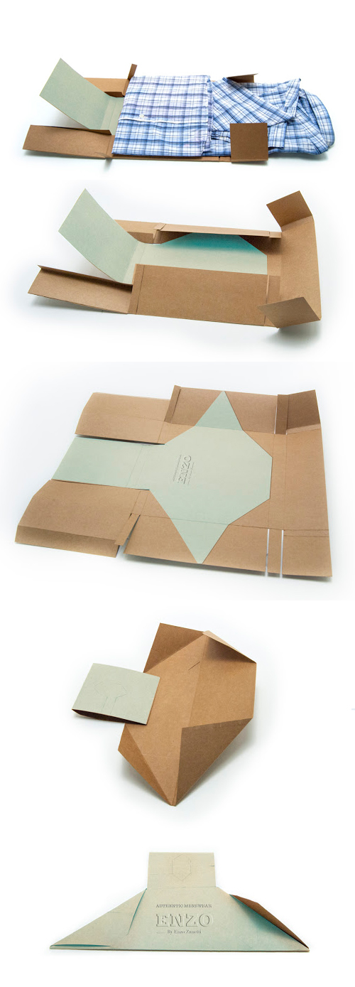
ENZO – Box to Hanger
Enzo is a clothing company that values craftsmanship and genuine design. The brand personality is authentic and artistic. They needed an environmentally friendly packaging for their men’s shirts.
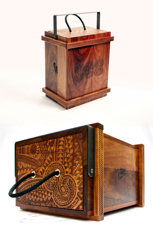
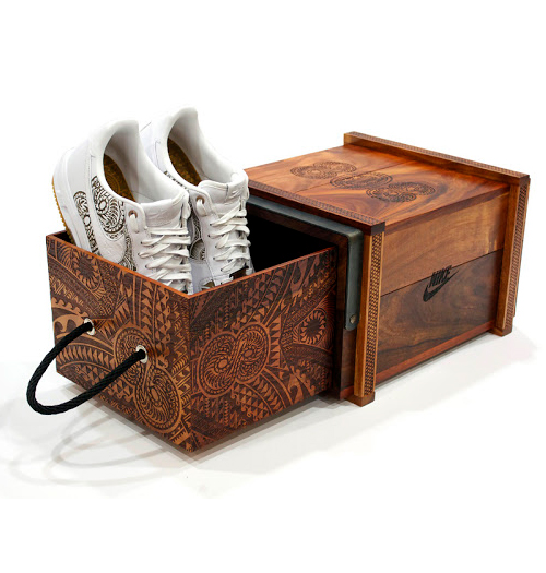
Marcus Mariota Shoes
Custom Laser etched shoes and wood box.
VITA Cosmetic Creams
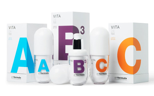
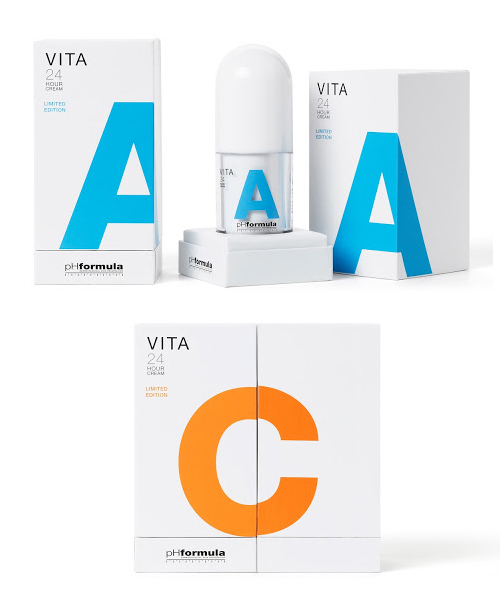
We create a graphic image with a very large and shocking lettering to make clear the difference among every product. We suggest the creation of a high quality wrapped box, with an upper opening which leaves the product displayed as a totem once it has been opened. The final result is a range of 3 products, which surprise people not only in the packaging but also in the capsule flask, helping the client to boost the sales of the product.
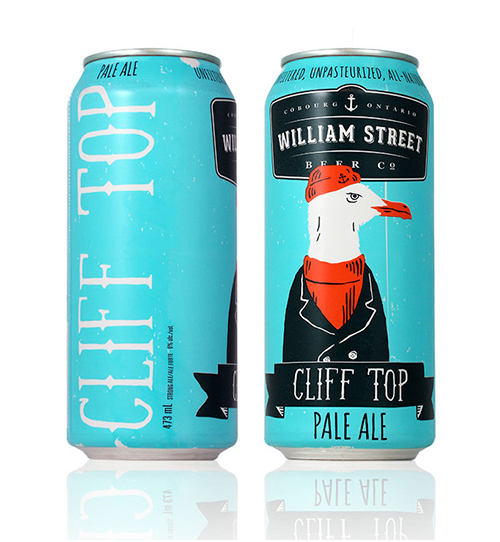
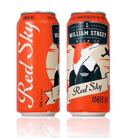
William Street Beer Co.
“William Street Beer Co. is Ontario’s newest craft brewery located in the idyllic port-side town of Cobourg. William Street wanted to acknowledge Cobourg’s marine heritage without appearing too stuffy, so we created a series of whimsical maritime characters that reflect the eccentric spirit of the townsfolk.”
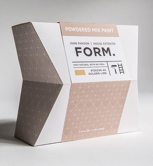
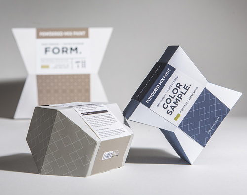
Sustainable Paint Package Design
To create a new paint company in cooperation with John Pawson, who is a British interior designer associated with the minimalistic aesthetic. The company only sells high quality powder mix paints that are sustainable, biodegradable, and contain non-harmful environmental content.
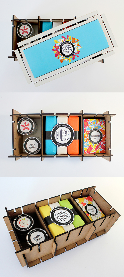
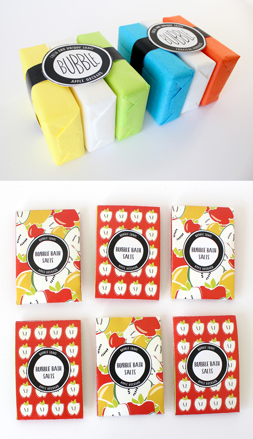
Bubble Soaps Sustainable Packaging
Bubble Soaps is a sustainable package design and branding project. The exterior box is adhesive free, re-usable and made of masonite. I created two scent themed packages, Tropical Paradise and Apple Orchard. Each box contains three bars of soap, six sachets of bubble bath salts and six scented candles. The box can be easily taken apart and re-assembled using the eight flat packable panels, which also allows for convenient storage for the box when not in use.
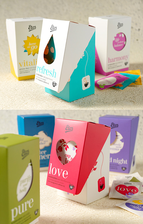
Etos Tea
“Etos is the Netherlands’ best-known drugstore. It comes with a very wide range and lots of store brands. This is how Etos provides a perfect alternative to primary brands, always on the lookout for categories that will take the entire product range to the next level.
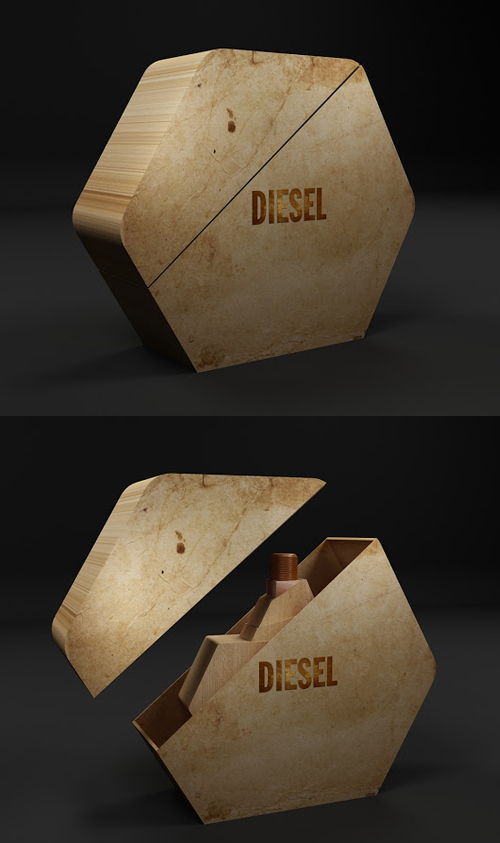
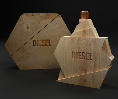
Diesel Perfume ( Packaging Concept )
Getting inspiration from the Diesel official website, Hossam used wood to craft the perfume bottle, it makes the packaging a fresh and different look.
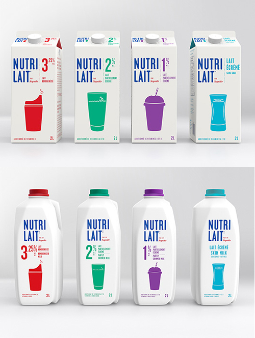
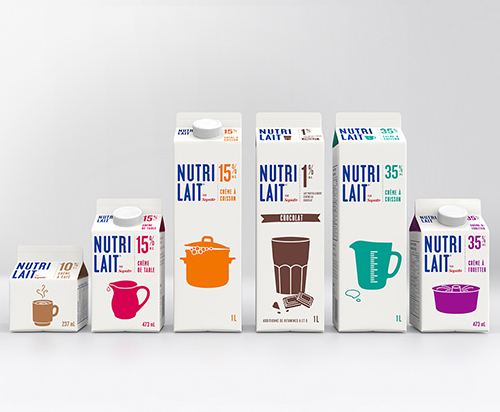
Nutrilait Packaging Design
“For its new brand identity, Nutrilait’s simplicity is featured. Far from the image of an immaculate and perfect lifestyle used in so many ads and magazines, the platform was built around the tag line “Real milk for real life.” Life is full of beautiful messes – chaotic mornings, kids who don’t want to wake up, spilt milk, and dinners in front of the TV. Life isn’t perfect – and Nutrilait wants to celebrate these beautiful imperfections.
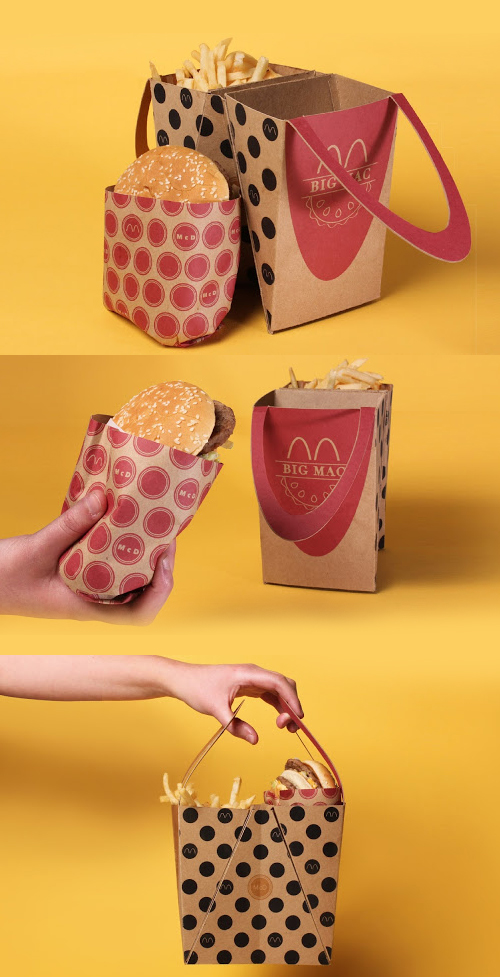
McDonald’s Big Mac Packaging Ideas
This packaging is simple at its core. Its purpose is not to alter the orbit of the globe or solve world hunger (quite the opposite, in fact). Its goal is capture the simple delight of a child opening up a Happy Meal, while understanding that reality is often hectic and complicated. Eating a meal should be a break from the chaos. This packaging aims to make the Big Mac meal a small improvement in a user’s day. The idea of eating food from your thigh gap can make people giggle on their way to work. The joy of swinging your Big Mac from the handles of a cute adult Happy Meal can make people smile when they’re running late for an appointment. Experiencing this package can make anyone say, “I’m lovin’ it.”
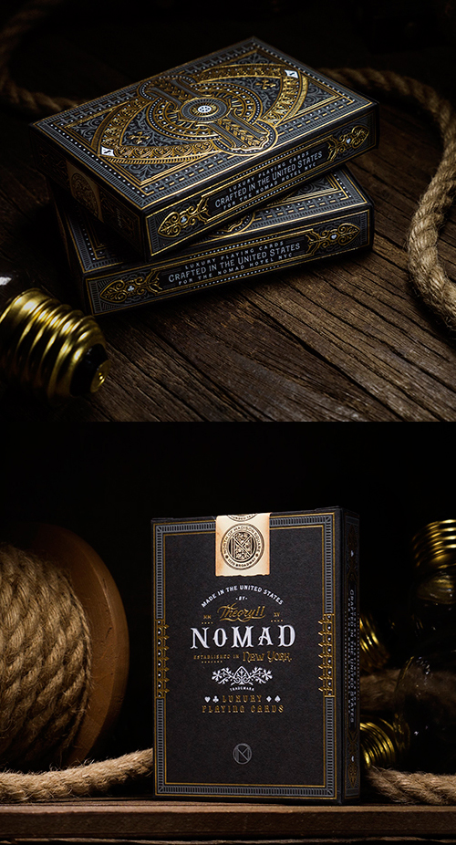
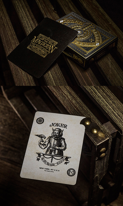
The NoMad Hotel Playing Cards
NoMad Playing Cards from theory11 were produced in collaboration with The NoMad Hotel in New York City. In the 19th century, The NoMad District of New York was the meeting place of the era’s elite – from Oscar Wilde to Charles Dickens, Mark Twain to Nikola Tesla. Our vision was to create a deck of cards that would serve as a monument to The NoMad. The result is a timeless blend of beauty and elegance.
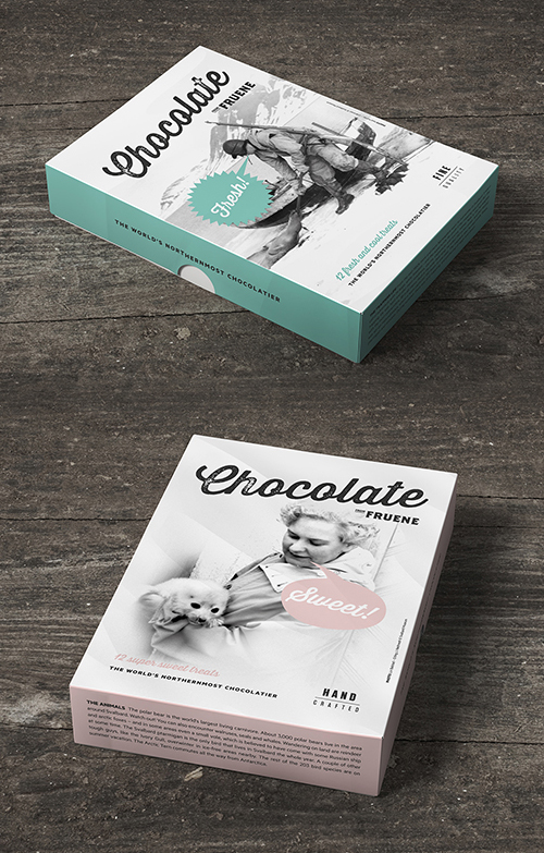
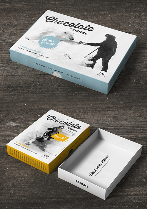
Fruene Chocolate Packaging Design
writers and the Svalbard Museum in order to find the best stories and pictures. Simple color coding and clean typography distinguishes the different boxes from each other and leave the story in focus.
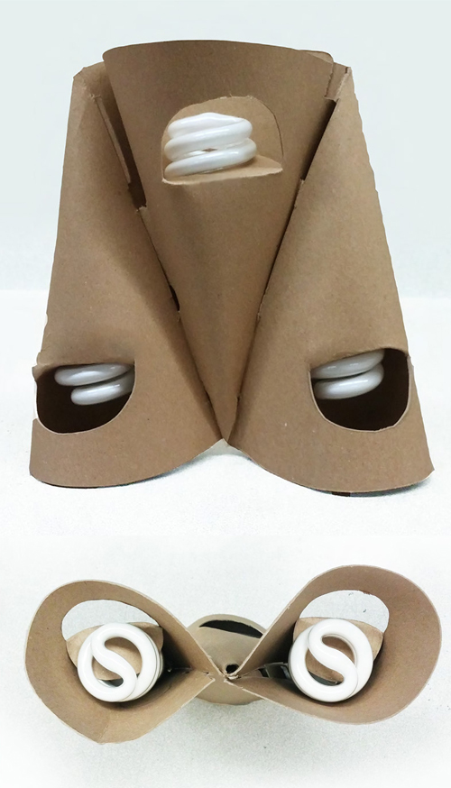
CFL Bulb Package Design
Soft Surge is a fun and approachable redesign of the standard CFL lightbulb package formed from a single sheet of cardboard. I’ve always thought CFL Bulbs were reminiscent of soft serve ice cream. The two couldn’t be more different, but upon closer observation both are products in an encasing of sorts. The bulb is packaged in multiple ways from boxes to plastic clamshell cases, while the soft-serve, simply supported by a cone.
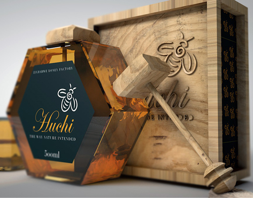
Huchi (Honey) Product Packaging Design
Honey… a sweet and healthy product with a sunny-warm color. The offered concept jars are an intended brand image package for the honey product for Zimbabwe Market. Huchi is a Zimbabwean name for honey. Zimbabwean packaging branding isn’t that great, so i was inspired to create a premium brand of honey.

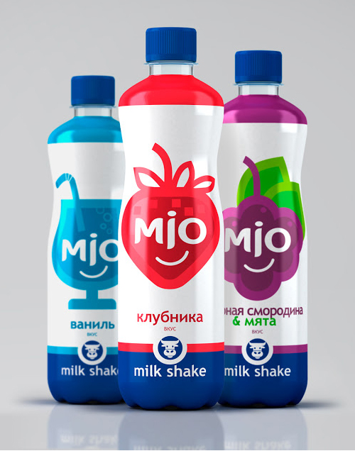
MIO Milk Shakes Packaging Design
ASGARD branding agency has completed a project for The ALKON Group to create a new PET packaging for the increasingly popular MIO milk shakes.

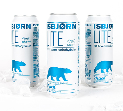
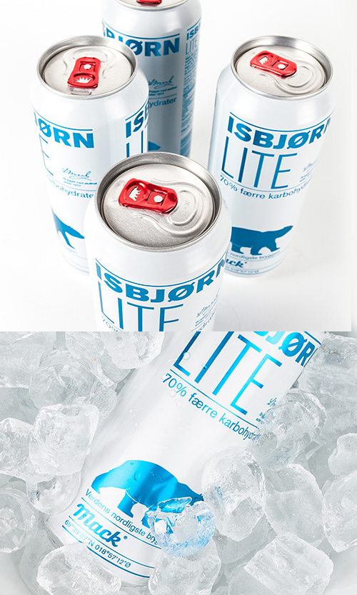
Isbjørn Lite Product Package
After the relaunch of Mack’s Isbjørn in February 2014, Mack’s Isbjørn beer has been a success, stealing market share from the competition, and is currently Mack’s best selling product. It seemed only natural to follow up on the product with a Lite version of the same brew. The design is closely related to the original Isbjørn, and being a calorie-reduced beer it only seemed natural to reverse the colors.
Teahouse Exclusives Packaging Design
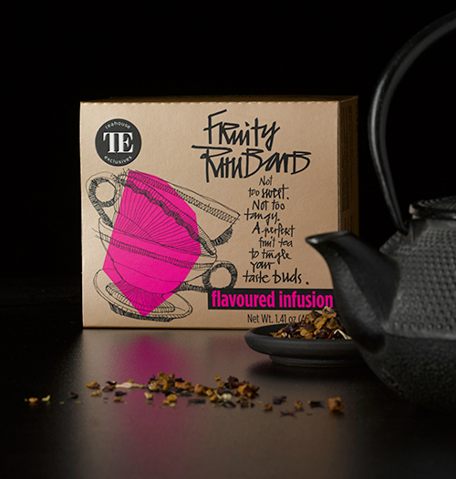
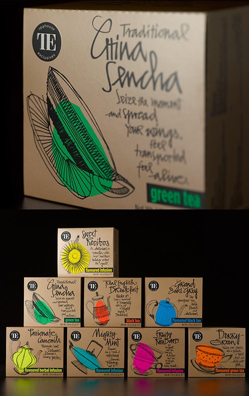
Tea drinkers are individuals of strong character, people who like to indulge in a moment of deceleration in their daily lives, and this is the target group of Teahouse Exclusive’s “Everyday Line”. The packaging is of a bronze, shimmering quality and adorned with loosely drawn images of different cups and teapots, while thanks to a bold, colour coding approach, each tea variety immediately catches the eye. The typography has also been 100% handpicked, just like the teas themselves, with individual writing styles that promote their originality.
Black or White Coffee Packaging Concept
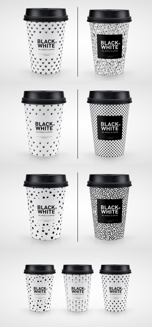
The classic combination of black & white pattern, which is also a word game in the context of two most popular coffee types.
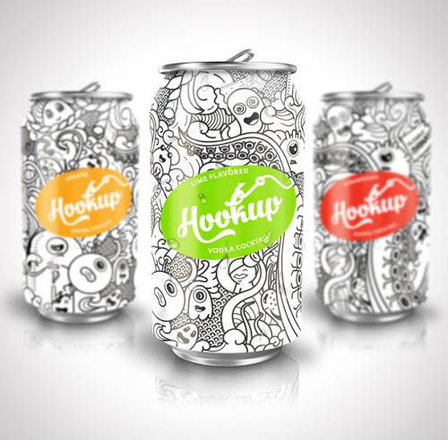
HookUp Cocktails Creative Packaging Design
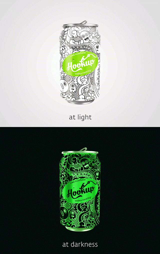
The aim of the project was creating name, logo and packaging for new alcoholic cocktails. As the target audience of the product was going to be youth, mainly clubbers, our team started to explore clubbing culture to hit the ground for designing the metallic cans and bottles. Getting inspired by nightlife and clubbing lifestyle, the cocktails were named HookUp. For the packaging was decided to decorate the cans with doodle art creating awesome characters. Going further, we made the doodling glow in the dark to attract people in the darkness of the clubs or maybe become an attribute of hook up.
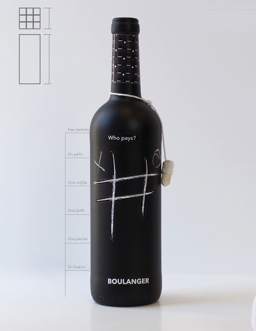
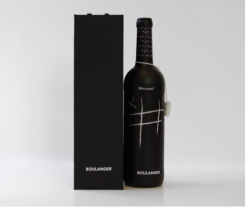
Boulanger Product Packaging Concept
Boulanger is presented as a fun product without losing the elegance of a good wine. On the neck of the bottle we can see a chalk held by a white ribbon.
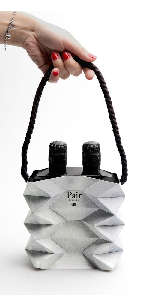
Pair Champagne Product Packaging Concept
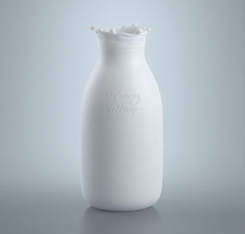
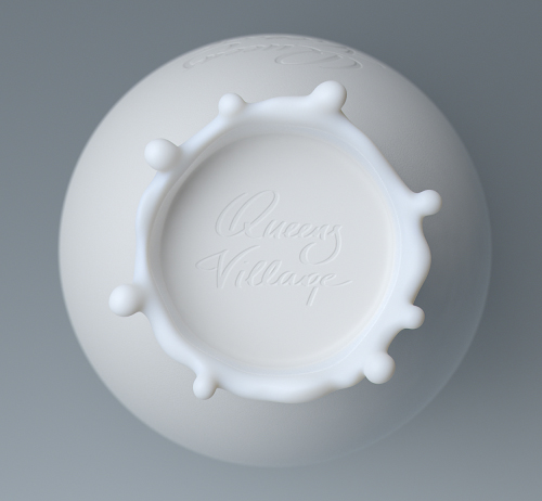
Milk Bottle Packaging Idea / Concept
The main idea was keep the bottle as simple as possible but add some liveliness.
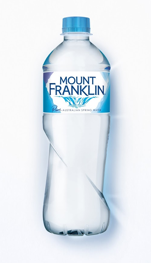
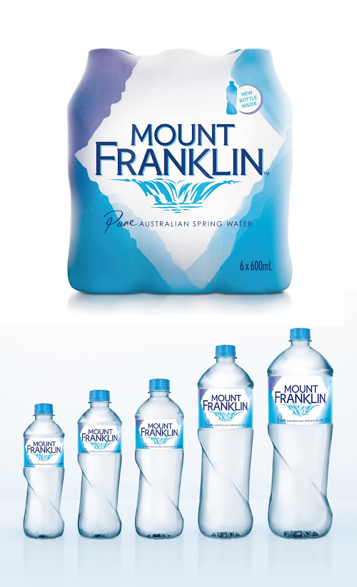
Mount Franklin Rebrand Packaging
Mount Franklin’ Pure Australian Spring Water has refreshed it’s brand identity and redesigned their bottle for the first time in many years. The new bottle was designed by Creative Platform and the Mount Franklin brand team and features modern, pure clean lines and a unique shape, building on ‘Mount Franklin’s’ heritage. It also fits nicely in your hand and feels clean and smooth, to help further enhance the brand’s premium positioning with consumers.
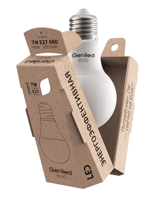
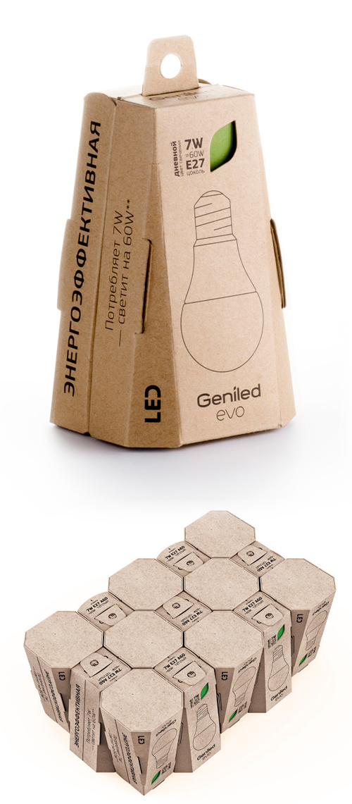
The Economical Packaging EVO
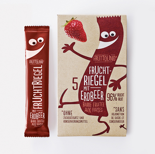
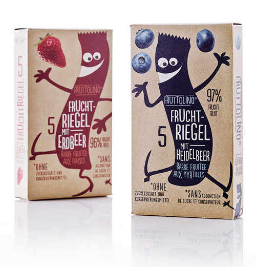
Fruttolino (fruit bars) Packaging Design
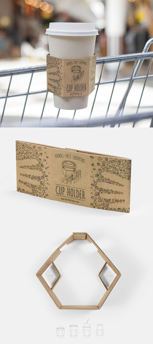
Cup Holder For Shopping Cart Concept
Free your hands while shopping! A drink holder made of a single sheet of corrugated fiberboard, which is folded and with one gluing point. Two clippings allows to hang holder on the edge of a cart. Two additional incisions are designed to be folded inwards to support smaller beverage containers or canned drinks.
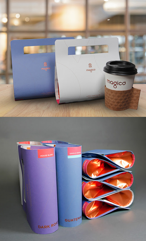
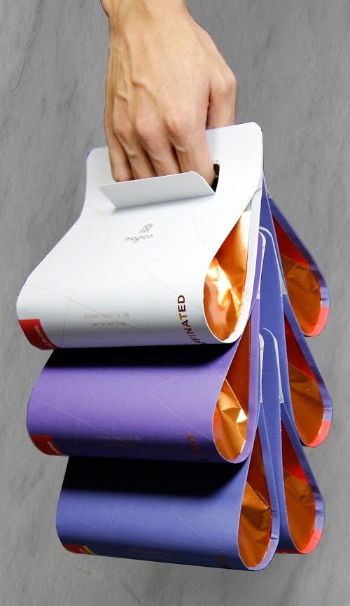
Magico Coffee Packaging Concept
A premium coffee company branding and modular coffee bean packaging system for coffee enthusiast
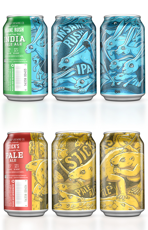
Bootstrap Brewing
