50个非常有创意的LOGO设计欣赏
设计界有一句很经典的话“A good logo is a logo that lives.”即一个好的LOGO是有生命的。设计一个优秀的标识,是一件非常难的事情,需要通过信息的收集来体现形状、颜色乃至于内在涵意的差别等等。
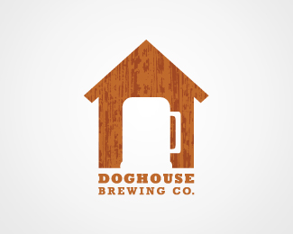
This logo utilizes negative space. As in the name, we see a dog house, and the brewing element is incorporated into logo by having a beer mug shaped entry to the dog house (which is accented with the mug’s handle and stand).
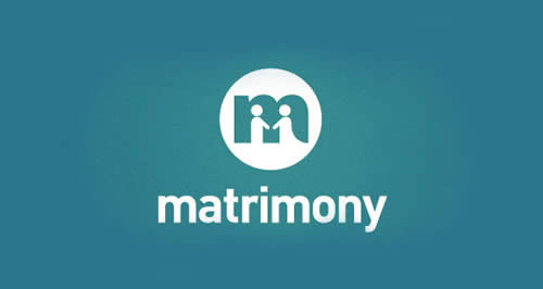
2) Matrimony
Another use of negative space. The holes between M’s legs are actually people holding hands, which expresses what matrimonial bureaus stand for – helping people find each other and fall in love.
3) Pizza Time
The clock’s board is actually a pizza, so it’s kind of like the clock’s hand says: “It’s time for pizza”.
4) Cloud Corner

Clouds are round, but corners are edgy; the corner here is nicely separated from this cloud’s round shape. Also, the colors from the name are nicely reflected on the cloud and its corner.
5) Bee
The B’s shape is formed by bee swarm.
6) Beercation

People associate vacation with traveling, and so this travel bag is actually a beer mug, with handle and wheels – which nicely reflects the logo’s name.
7) Love Clip
The logo’s shape is a heart, which stands for the “love” part of the name, and it’s made from a clip, which of course stands for the “clip” part.
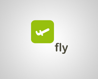
8) Fly
This one is really good. Its shape is an “F” letter, rotated in away so that it reminds an air plane up in the air.
9) Fitmiss
Fitmiss logo combines two shapes: barbells and female sex sign. Of course, barbells shape stands for the “fit(ness)” part, and the female sex sign stands for “miss”.
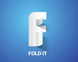
10) Fold It
The logo’s is a folded “F” letter. Couldn’t be more obvious.
11) Families
This one is great: the middle part of the word “families”, the letters “i”, “l”, and “i” are actually very simplified shapes of people. The biggest one is the father, the mid-size is the mother, and the smallest one is a child – a family.
12) The Golf Park
The logo’s shape is a tree, but with a golf stick as a tree’s trunk.
13) Heart Build Foundation
The logo is a shovel (which is associated with building) with a heart at the end. So there you are, heart + building.
14) Invisible Agents
This one is one of my favourites: those lines look almost the same. Almost, because the middle one is slightly different, it’s tie-shaped. First of all, agents wear ties :). Second of all, good agent can blend in so good that it’s really hard to spot him. And that’s what this subtle middle line difference stands for.
The “i” of the “killed” word lies on the ground. Like it’s, well, killed :).
16) Locks
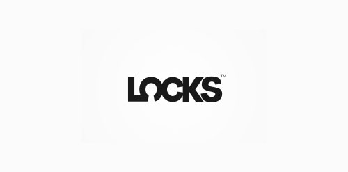
This one is kind hard to explain. You know locks have those little triggers inside them, and when you turn the key, those trigger rotate, causing it to lock. Now, look at letters “o” and “c”. That ring a bell?
17) Mister Cutts Baber Shop
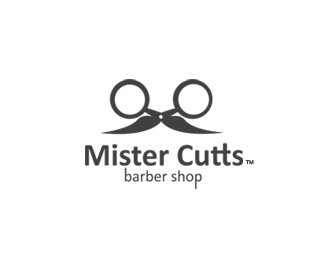
Mister Cutts literally IS the logo. It looks like a mister with eyeglasses and mustache, but that’s actually a scissors upside down.
18) Wine Searcher
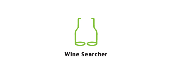
The name here reflects nicely in the shape. The shape consists from two wine bottles, but without the inner lines. This make it look like eyeglasses – and you often put eyeglasses on when you’re searching for something.
19) Newcastle Food & Wine Festival
Another creative use of negative space. The white shape is a fork, which stands for the “food” part, and the fork teeth are the shapes of wine bottles, which of course stands for the “wine” part.
20) CinemaCafe
A coffee cup made of a film reel. Yup, a Cinema Cafe cup.
21) Baloon Chef
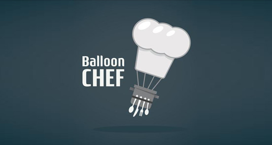
The balloon is actually a chef’s hat, and the balloon’s basket is a chef’s apron with kitchen utilities attached to it.
22) Cowbra Productions
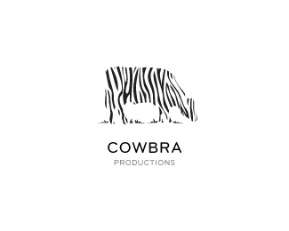
A game of words. The logo is a cow, but with zebra stripes; a Cow-Bra.
23) CityCliq
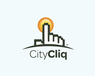
The city here is actually a hand cursor we see on computers, simulating a “click” on the sun above the city.
24) Dig for Saint Michael’s
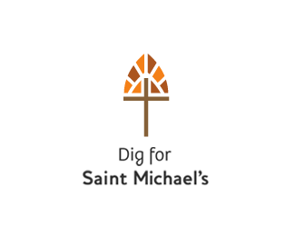
Another shovel here. Shovel itself stands for the “dig” part. It’s made from two elements people usually associate with saints: a cross, and a stained glass windows you usually see in churches.
25) Iron Duck Clothing
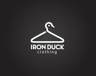
The “clothing” part is reflected by a hanger. Most hangers are made from iron, plus it has a duck-shaped hook. So it’s an iron duck hanger. So it’s Iron Duck Clothing.
###page###
26) MonKey
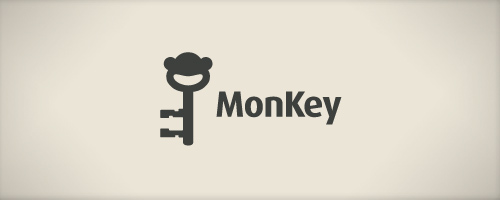
A good one, another game of words. “Monkey” has a word “key” in it already, so there couldn’t be a more obvious logo than a key with a monkey-shaped head.
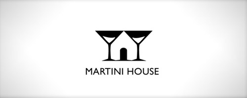
27) Martini House
Yet another creative use of negative space. We see two martini glasses standing right next to each other – forming the space between them into a house. And there you go, Martini House.
28) Filmurbia
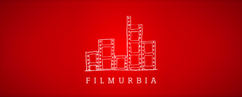
This logo is a nice combinations of concepts from the CinemaCafe and CityCliq logos. The city here, the buildings to be exact, are made from a movie reel too.
29) ChemisTree
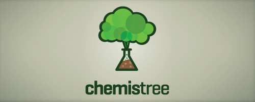
One more game of words. The name is a combinations of words “chemistry” and “tree”. And so the logo reflects it in this weird tree – the trunk is actually a test tube, and a cloud of fumes that is often produced in chemical experiments represents the upper branches.
30) Black Cat
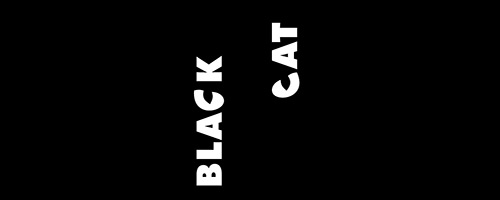
One of my favourites. When you first look at it, you might say “nothing fancy here”. Just two words, taken out of the name, and rotated 90 degrees. There’s nothing to it, right? Wrong! Look at letters “C” in both words. They are actually cat’s eyes :).
31) Brain Finger
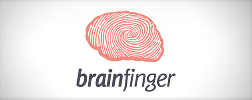
A finger print in a shape of a brain, a brain-finger.
32) uReach Media
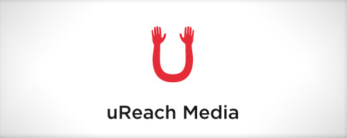
I like the concept here, this one triggers meaning associations in our minds. The logo is U-shaped, which obviously reflects the “uReach” part of the name. Also, letter “u” is commonly used as a replacement for “you”. The “U” has hands on both ends, which triggers in our minds a meaning association: reaching out for something. So it’s like “you reach out for media” -> uReach Media.
33) Econergy
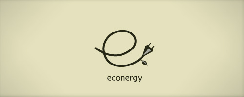
Quite obvious one. The logo is “e” shaped power cable with a leaf at the end. “E” stands for “eco”, and the cable for “energy”. Eco-Energy.
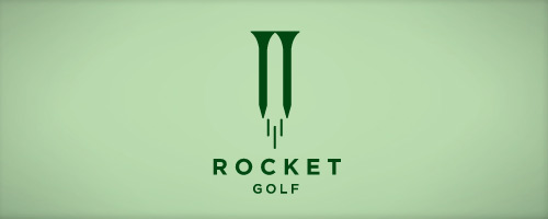
34) Rocket Golf
Awesome use of negative space. The “golf” part is reflected in two tees. The space between those tees looks just like a rocket, which reflects the “rocket” part of the name obviously.
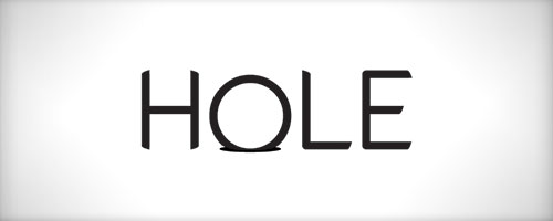
35) Hole
Very simple one. The “O” letter out of the word “hole” is… in the hole :).
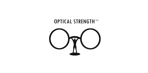
36) Optical Strength
A bodybuilder raising a barbell. Only the barbell is not really a barbell, but eyeglasses, which stand for the “optical”.
37) Evolution X
Great one here, my favourite from this collection. The name is “Evolution X”, and in the logo we can literally see the “X” evolving from a one short line, to a fully shaped “X”.
38) BarCode
The beer mug stands for the “bar” part, and it has a barcode pattern on it. Doesn’t get any more obvious than that, does it.
39) Water Empire
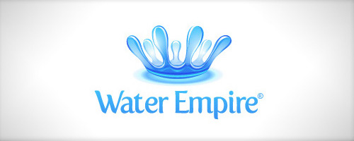
When you hear “empire”, you hear “king”. And when you hear “king”, you think of a crown. The crown here is made of water, and so it stands for the name: Water Empire.
40) Lost
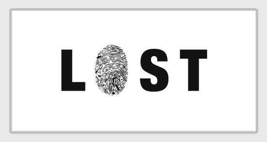
Another one playing with associations. When someone’s lost, you need something to find them, best if it’s something unique that will point to that person, and that person only. What’s more unique than a finger print?
41) Devil’s Music
You hear “music”, and you immediately think of notes and clefs. The logo here is a clef, with horns on the top. You hear “devil”, and think of horns of course. Plus, the clef is red, which is also commonly associated with devil.
42) SoundDog
Very similar. A dog, only with music notes instead of legs; a Sound-Dog.
43) Wiesinger Music Piano Service
This logo utilizes negative space. Letters “W” and “M” are the first letters of words “Wiesinger” and “Music” from the name. Those two letters form piano keyes, which obviously reflects the “piano service” part.
44) VinoPiano Elegant Taste
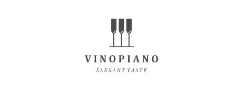
Similar like the one above, only little different. The logo consists from three wine bottles, they reflect the “vino” part. The white space between them with bottles form a piano keys, which stands for the “piano” part.
45) Long Neck Music
Funny one :). What’s music? Notes! And so here the logo is a note, only the note ends with… a giraffe’s head. Plus, both giraffe and the note share the “neck” part. Long Neck Music.
46) Pelican
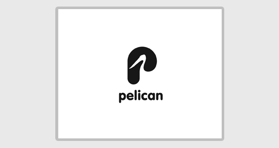
Another negative space usage. Here, both “P” letter and the space inside it, which looks just like pelican, stand for the name – Pelican.
47) Pilot CMS
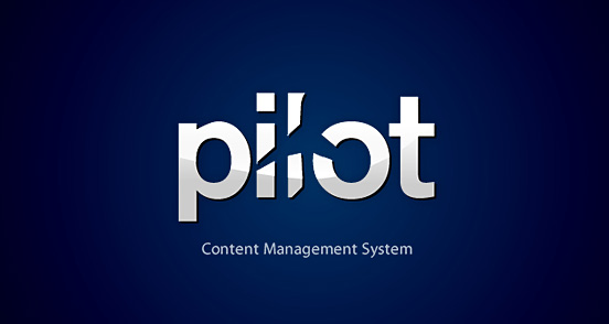
A word “pilot”, with cut out airplane-shaped part. Crystal clear :).
48) Shocked Film Group
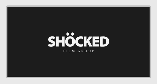
Another funny logo. The “O” out of the “shocked” word looks just like the emoticon we all know – two eyes and widely open mouth. Shocked, jaw-dropped, if you will.
49) Shutterbug
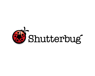
The logo is a ladybug, only she has a shutter-shaped buckler. So there you go, nicely reflected “shutter” and “bug” words.
50) Water Drop
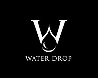
Negative space again. The “W” stands for “water”, and the space between the low part of W’s legs is actually a water drop -> W-drop -> Water Drop.
