57个最新CSS3技术案例与教程说明
M4也开始接触CSS3技术了,必竟这是下代的趋势所在。57个高质量的CSS3技术教程,帮助你学会更好的就用新技术,主要包括文本阴影、圆形边框、动画等相关内容。
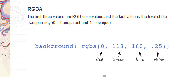
Well, here is a post on the basics of the new properties: text-shadow, box-shadow, and border-radius. These CSS3 properties are commonly used to enhance layout and good to know.
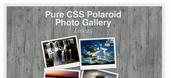
2. How To Create a Pure CSS Polaroid Photo Gallery
Magical things can be done by combining various CSS properties, especially when some of the new CSS3 tricks are thrown into the mix. Let’s take a look at building a cool looking stack of Polaroid photos with pure CSS styling.
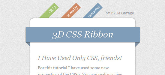
3. How To Create Depth And Nice 3D Ribbons Only Using CSS3
In this tutorial we’ll be learning how to create depth and nice 3D ribbons only using CSS3.
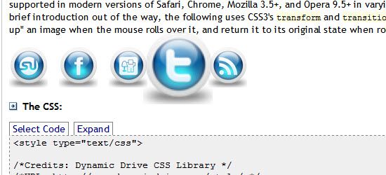
4. Image Bubbles using CSS3 transform and transitions
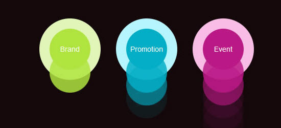
CSS3’s transform and transition properties make it possible to manipulate elements in a variety of ways using just CSS. CSS transform is used to scale, rotate, or even skew an element without disturbing the content around it, while transition is used to animate CSS properties into view. The two properties are supported in modern versions of Safari, Chrome, Mozilla 3.5+, and Opera 9.5+ in varying degrees.
5. The Multi-Column CSS3 Module
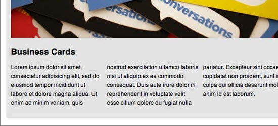
For over six years, CSS3 columns have been available to us; yet, strangely, they’re rarely utilized. Because they currently are only supported in Mozilla and Webkit-based browsers, this means that – again – no support in Internet Explorer. But that’s okay! The world will not end if IE users see one longer paragraph. you’ll see how to use this helpful module in this video quick tip.
6. Using CSS3 Text Shadow for Active Link States
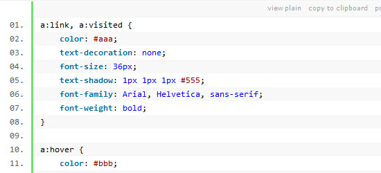
In this tutorial you’ll be walking through the process of using CSS3 text shadow for active link states.
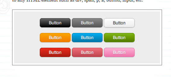
Today I’m going to show you how to put the CSS gradient feature in a good practical use. Check out my demo to see a set of gradient btn btn-primarys that I have created with just CSS (no image or Javascript). The btn btn-primarys are scalable based on the font-size. The btn btn-primary size can be easily adjusted by changing the padding and font-size values. The best part about this method is it can be applied to any HTML element such as div, span, p, a, btn btn-primary, input, etc..
8. How To Create A Polaroid Photo Gallery With CSS And jQuery
Photo Galleries are becoming more and more popular these days. Today we are going to create a simple one using some of the new CSS3 features and jQuery. A prominent feature of the gallery is that You will be able to Drag the photos with single click in the gallery we are going to create. Hope you will enjoy this and understand it easily.
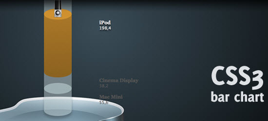
In this tutorial you’ll be learning how to create wicked CSS3 3d bar chart. no images were used to create this wicked effect. The only images that are used in this example, were taken from the Superpack icon pack and only show the Apple icons. Everything else you see in this demo, is created using pure CSS3.
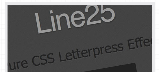
10. Create a Letterpress Effect with CSS Text-Shadow
The letterpress effect is becoming hugely popular in web design, and with a couple of modern browsers now showing support for the text-shadow CSS3 property it’s now simple and easy to create the effect with pure CSS. No Photoshop trickery here!
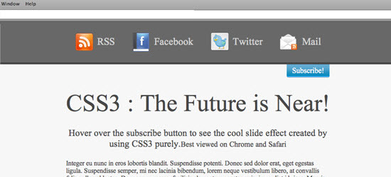
11. Create a pixel perfect subscription box using CSS3
Today I will show how to create the above subscription box using simple HTML markup and a few advanced CSS3 properties. I believe CSS3 is the future and the sooner you can jump on the CSS3 band wagon the better. All the stylish shadows and gradients used are rendered using CSS properties which can be experimented with to produce some fantastic results.
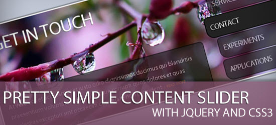
12. Pretty Simple Content Slider with jQuery and CSS3
Today we will create an auto-playing content slider with jQuery and CSS3. The idea is to alter the background image and to slide in the heading and the description. By clicking on one of the menu items, the auto-play function is stopped and the respective content slides out.
This is an attempt to recre ate our solar sys tem using CSS3 fea tures such as border-radius, trans forms and anim a tions. The res ult is sur pris ing and quite interesting.
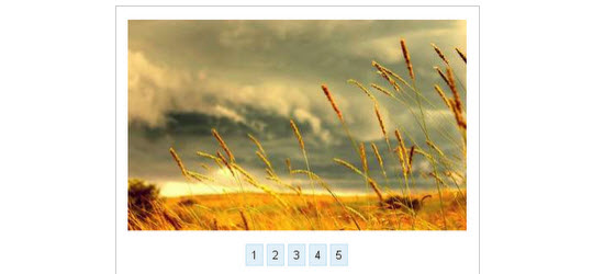
14. Howto Create An Image Slider With Pure CSS3
Image slider is a popular effect and often used in portfolio sites and blogs. Most of these sliders are created by Javascript. But with CSS3’s strength, we can implement an image slider with only pure CSS3. This article will guide you to do that.
15. Build Kick-Ass Practical CSS3 Buttons
What once required background images and icons can now be created with plain-old CSS. Because modern browsers have access to things like box shadow, gradients, rounded corners, text-shadows, and font-face, we can finally take advantage of this and remove any need for images, when creating visual elements, such as btn btn-primarys! I’ll show you how in this video tutorial.
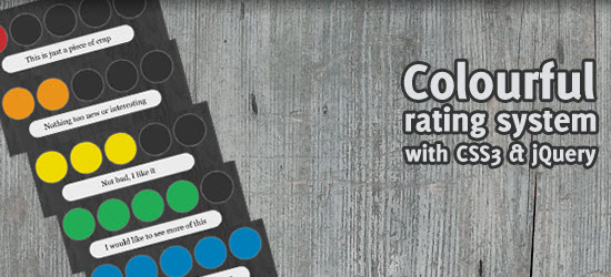
16. jQuery quickie: Colourful rating system with CSS3
Today, we’re going to do a relatively simple jQuery tutorial. Rating systems are used a lot on websites, for example to rate how good a certain product, article or comment is. I slightly wanted to improve this idea, by making it more visually attractive.
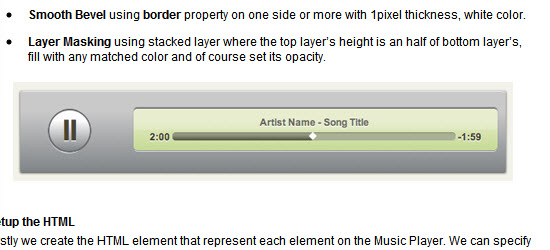
This post is the sequel post from “Photoshop Effect vs CSS3 Properties“, as you know on previous post we have tried to maximize the CSS3 power to create Photoshop-like effect. So, as I promised earlier, this post will explain how to use CSS3 properties only to create CSS Music Player Menu.
18. Beautiful CSS3 Search Form
Did you know you can make a round circle with border-radius and create inner shadow effect with box-shadow inset? Check out this beautiful search form tutorial that I’ve created with CSS gradient, border-radius, and box-shadow. It displays perfect in CSS3 browsers and degrades gracefully in non-CSS3 browsers.
19. Design a Prettier Web Form with CSS 3
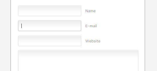
Thanks to advanced CSS properties, such as gradients and shadows, it’s now quite easy to turn a dull web form into something beautiful – with minimal effort. I’ll show you how in this tutorial!
20. Pimp Your Tables with CSS3
Today I am going to show you how to use some neat CSS3 properties to beautify your tables. With so many new selectors we can address specific table cells and rows in order to create a unique style without adding classes to the markup.
21. Create Accordion Menu Using CSS3 Transition – Deluxe Blog Tips
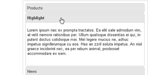
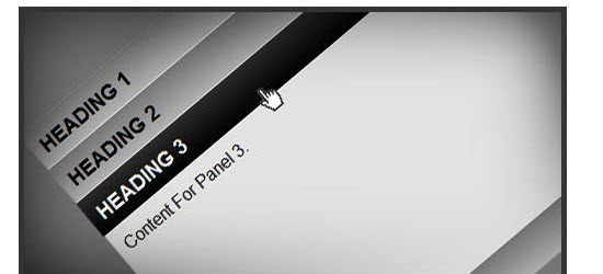
There are many ways to create an accordion menu, most of them use a javascript library like jQuery to make the effect runs cross browsers. In this tutorial, we’ll see how to make an accordion menu using CSS3 transition. It works on most modern browsers that support CSS3.
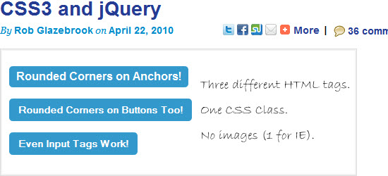
22. Cross-Browser Rounded Buttons with CSS3 and jQuery
This tutorial will show you how to create cross-browser rounded btn btn-primarys with CSS3 and jQuery
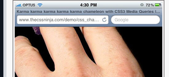
23. How to use CSS3 Orientation Media Queries
For a long time we have been able to specify styles for different media types using CSS, print and screen being the most recognizable. With CSS3 these media types have been extended to allow additional expressions, aka media queries, which gives us greater control on when specific styles should be applied. In this article I will focus on the orientation media query and have a fun demonstration showing how to use it.
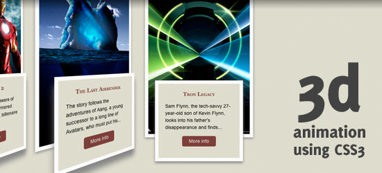
24. 3d animation using pure CSS3
In this tutorial you’ll learn how to create 3d animation using pure CSS3
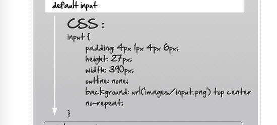
25. Stylize Input Element Using CSS3
Stylizing input element is a common task for us as a web developer, we can make it look nicer by putting stylized input image (color gradient, smooth border, box shadow, etc) as an input background. Nice but the images also take some of our bandwidth, thankfully CSS3 adds some support for element styling, so we can replace them with only CSS.
###page###
26. Contextual Slideout Tips With jQuery & CSS3
Knowing the importance of HTML standards, we are making a set of contextual slideout tips with jQuery & CSS3, which are ideal for product pages and online tours. As a bonus, they are SEO friendly, so all the content is visible to search engines.
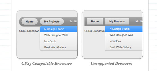
Learn this tutorial to see a Mac-like multi-level dropdown menu that I’ve created using border-radius, box-shadow, and text-shadow. It renders perfect on Firefox, Safari and Chrome. The dropdown also works on non-CSS3 compitable browsers such as IE7+, but the rounded corners and shadow will not be rendered.
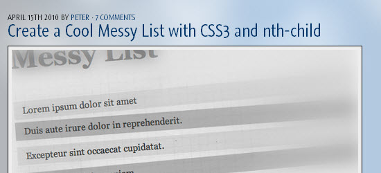
28. Create a Cool Messy List with CSS3 and nth-child
In this short tutorial I’m going to show you how to create a cool messy list.
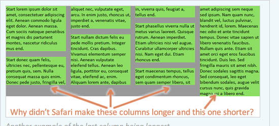
29. Deal-breaker problems with CSS3 multi-columns
Firefox and Webkit support some of the CSS3 multi-column layout properties—but not very well. Unfortunately, the spec isn’t very clear about what’s correct. Until the spec is clearer and the browser problems are ironed out, multi-columns are useless to me.
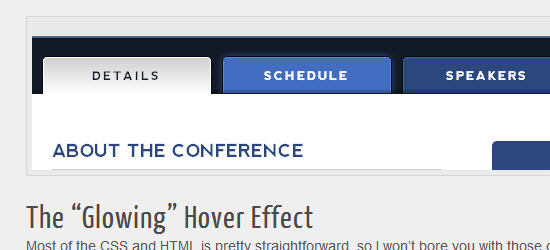
Visit the site in a Webkit-based browser (Chrome or Safari) or Opera 10.5, and you’ll see a nice “glowing” rollover effect along with a subtle inner shadow at the bottom of the inactive tabs. But that’s not all; they’ve also applied some rounded corners and gradients to complete a very nice effect. All with no images — just progressively enhanced with CSS3 so it degrades in non-supportive browsers. I immediately set out to recreate the effect, and I thought I’d write it up so you can see how CSS3 can create intuitive and beautiful interfaces with no images.
31. Create Windows 7 start menu using CSS3 only
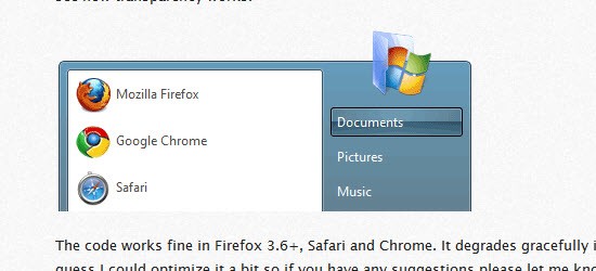
I am fascinated with how much you can do with so little using CSS3. Many user interface elements that require images in order to have appropriate visual appearance now can be styled only with CSS3. In order to prove that I assigned myself a task to create Windows 7 start menu only with CSS3 (and some icons).
32. How to Dynamically Highlight Content Like Wikipedia Using CSS3
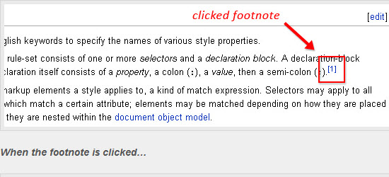
If you’ve ever clicked on a footnote link in a Wikipedia article, you’ve probably noticed that two things happen: (1) the link brings you to the footnote section at the bottom of the page; and (2) the selected footnote is highlighted with a different color. In a list of footnotes, this feature makes it easy for the reader to visually access the appropriate footnote.
33. Cross Browser Pure CSS3 Horizontal Accordion
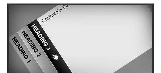
Just few days ago, I shared pure CSS3 vertical accordion that works in all modern browsers, including Internet Explorer. Now it is time to share its twin – a pure CSS3 horizontal accordion. It uses same markup enabling you to switch from vertical to horizontal accordion and vice versa by simply changing the class name.
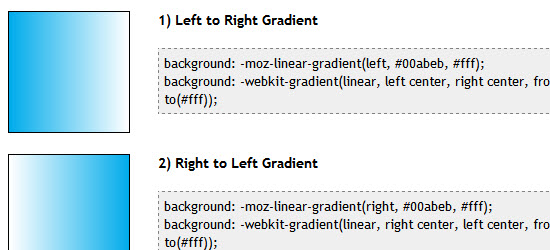
With the advent of CSS3’s comes support for gradients, specifically, linear and radial gradients. CSS Gradients is supported in FF3.6+, Safari 2+ and Google Chrome. In FF3.6, gradients can currently only be applied to an element’s “background-image” or shorthand “background” properties.
35. Cross Browser Pure CSS3 Vertical Accordion
I was studying various CSS accordions and found that better ones are built using CSS3; as expected, they didn’t work in Internet Explorer. More noticeably, they didn’t even degrade properly. This was mainly due to use of CSS3 “:target” pseudo class to open accordion panels.
36. How to build a Cool Animated CSS3 Menu with no Javascript
This CSS3 tutorial was originally written in German by the Webstandard-Team, and they have kindly allowed us to translate it and publish it here. It certainly does deserve to be viewed by a wider audience.
37. Colorful Sliders With jQuery & CSS3
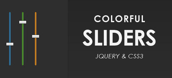
In this tutorial we are using jQuery and the new transformation features brought by CSS3 to create a three dimensional dynamic slider effect. The techniques presented here – for creating sliders, and CSS dynamic resizable bars, can be used together or in part for powering all sorts of jQuery goodness.
38. How to Create a Fancy Image Gallery with CSS3
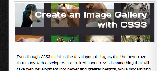
Today, I have prepared a tutorial about how to use CSS3 to make an image gallery with animation. I recommend to use browsers that support CSS3 to see the animations; however, the gallery is going to be usable in browsers without support of the animation.
39. How to Create Inset Text with CSS3
Many exciting new functions and features are being thought up for CSS3. Today we are going to create inset test with CSS3. That property will support Firefox, Opera, Chrome and Safari. Inset text being text that has been pushed into the background, almost like a reverse embossed effect.
40. CSS3 loading spinners without images
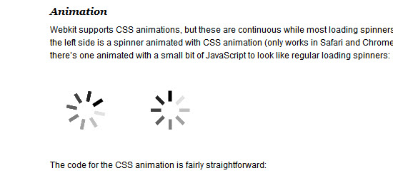
While playing around with css-transform to make various shapes, I saw a way to create animated image-less loading spinners such as used in a lot of webapps and of course on the iPhone.
41. CSS3 Fundametals: CSS 3 Transitions
As CSS3 rolls out around the web, it is bringing some interesting new presentational techniques along with it. Today, we’ll review the basics of using CSS3 transitions and animations to add an extra layer of polish.
42. Pure CSS3 bokeh effect with some jQuery help
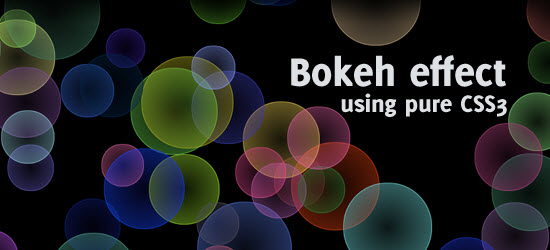
Today, I want to add another addition to the bokeh “hype”, by creating a pure CSS3 bokeh effect. With some help from jQuery, we can add some randomness in colour, size and position for the effect.
43. CSS3 Techniques You Should Know
Many of you have probably heard all the buzz around CSS3, but exactly which techniques can we use today? In this article I’ll show you some different CSS3 techniques that work great in some of the leading browsers (i.e. Firefox, Chrome, Safari, Opera ), and how they will degrade well in the non-supported browsers (i.e. Internet Explorer). Using browser specific extensions, many of the proposed CSS3 styles can be used today!
44. Beautiful Photoshop-like Buttons with CSS3
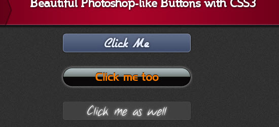
In this Tutorial we’ll show you how to recreate 3 different, slick btn btn-primarys that we created beforehand in Photoshop without the usage of any image in CSS3. We’ll use a multitude of CSS3 properties, such as @font-face, text- and box-shadow, gradients and border-radius.
45. Pretty CSS3 btn btn-primarys
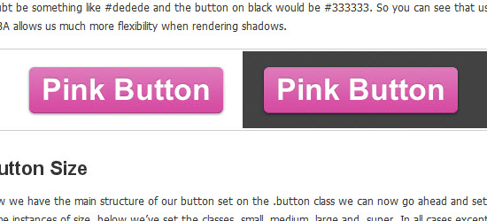
I’ve come across quite a few sites that explain how to create flexible CSS3 btn btn-primarys but i’ve never really spent the time to implement one until i found a great little write up courtesy of the guys over at the Zurb blog who have a fantastic post on creating CSS3 btn btn-primarys. So i’ve taken their example and tweaked it to fit my needs. It’s worth noting that if your using Internet explorer you’re not going to see all these effects as IE still doesn’t support CSS3. Compatible CSS3 browsers are, Safari, Chrome and FireFox 3+.
46. Using Rounded Corners with CSS3
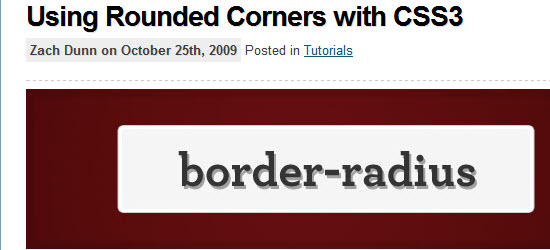
Through the use of proprietary CSS properties, certain browsers can already display rounded corners. For example, Firefox uses the -moz-border-radius property to control the corner radius of a page’s border. Safari can accomplish the same result with the -webkit-border-radius or -khtml-border-radius properties.
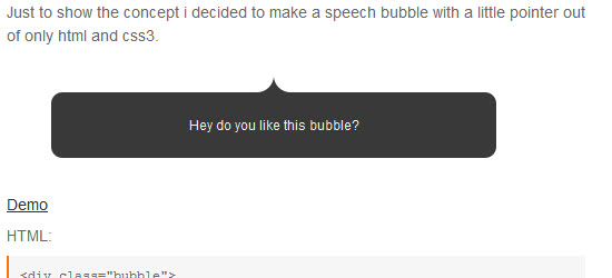
In this tutorial, you’ll learn how to create CSS3 speech bubble.
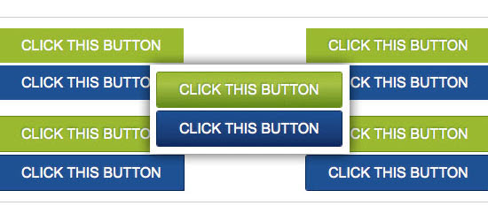
48. Create a CSS3 Call to Action Button
I’m now going to share with you a method for making a slick call to action btn btn-primary using only CSS.
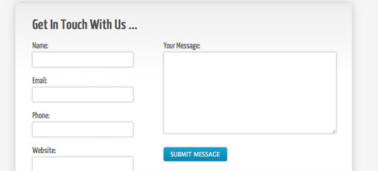
49. Create A Clean and Stylish CSS3 Contact Form
In this tutorial we’re going to look at a range of different CSS3 effects – in particular, we’ll be creating background gradients, adding shadows to elements, applying some rounded corners, and adding a couple of simple animation effects.
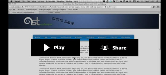
50. How to Create a “Stay-On-Top” Menu with CSS3 and jQuery
This video will show you what you’ll be making and how to do that. Unfortunately, since I had only 5 minutes for this, I focused only on the jQuery part. Everything else you need for this you will find in the tutorial. You can also hit the “Live Demo” btn btn-primary to see the final effect yourself.
51. Apple Navigation with CSS3
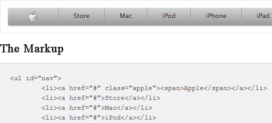
Apple is known for very clean design and if you have been to their website in the last few years you’ve seen their primary navigation. It’s a staple of the apple website and today I wanted to take a crack at recreating the Apple navigation using CSS3 techniques.
52. Grooveshark Search with CSS3
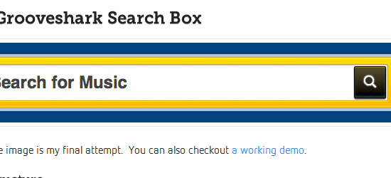
I am a huge fan of the Grooveshark interface. Every time I look at the site I start to dissect the UI and turn it into code in my head. I wanted to see if I could create the search box only using HTML and CSS. Sadly there is one image and it’s the search icon in the btn btn-primary. I recently read a tutorial that shows you how to create a custom font and use the font-face property for icons, but they didn’t have the search icon I needed.
53. Fancy Image Hover Using CSS3
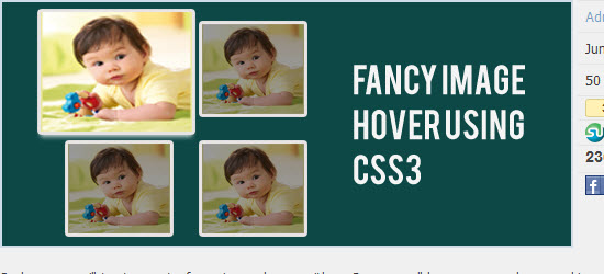
So here we will try to create fancy image hover with css3 as you all know we can have cool image hover effect using jquery but now using transform and transition properties of css3 we can have the same cooler effect with css3 only.
54. CSS3 Rounded Image With jQuery
The other day I was trying to style CSS3 border-radius to image element and I realized that Firefox doesn’t display border-radius on images. Then I figured a way to work around it — wrap a span tag around with the original image as a background-image. Thanks to Darcy Clarke for the jQuery code which does the magic tag wrapping automatically.
55. How to Create a Cool Slide Out Panel with CSS3 only
Many sites have a really cool hidden panel which contains some relevant information and this panel is revealed to us, with a cool animation, when we click on a particular btn btn-primary or hover over it. This has usually been achieved using jQuery. But now as we advent towards the future and CSS3 is becoming a reality, here is a tutorial on how to build an animated slide out panel using only CSS3.
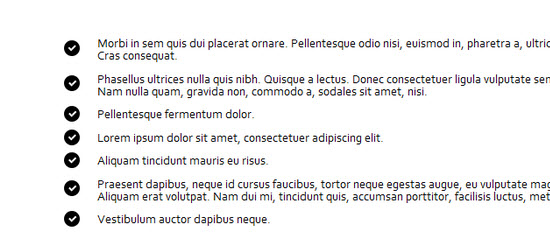
56. Creating Fancy Checkmark Icons with Pure CSS3
I had just seen Nicolas Gallagher’s awesome pure css social media icons, though, and I thought, “If he can do that, than I could certainly create a simple check icon with just css3?. I did figure it out with some experimenting and testing, and today I’m going to show you how to achieve the same effect.
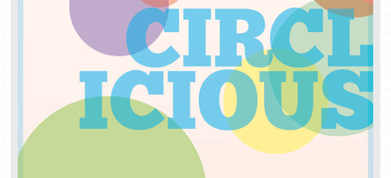
57. Create a Vibrant Digital Poster Design with CSS3
CSS has come a long way in recent years, and with new browser support for a hand full of CSS3 properties we can begin to replicate design styles directly in the browser that beforehand were recently only possible in our design applications. Follow this walkthrough of the making of Circlicious, a vibrant and abstract digital poster design made purely of HTML and CSS.
