30+精美大背景图片网页作品
大背景全屏图片风格的网页设计,已经被越来越多的设计师使用,收集一些精美作品,分享给您。
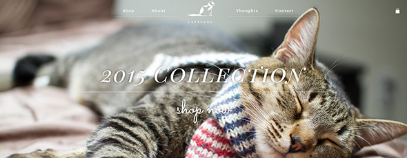
CatScarf
Catscarf was born from a desire for high-quality hand-knit for all the beloved felines in our lives. The website has an elegant design that perfectly presents these products.
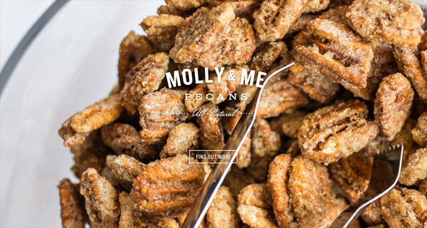
Molly & Me Pecans
Molly and Me is a restaurant from Charleston’s website. It uses a full-screen image as the first thing people see and overlays white typography and a btn btn-primary in case you want to find out more.
Joe’s Garage
At Joe’s Garage, you can come at any time of day, have fun and enjoy fantastic food and drinks. You’ll definitely have a great time. This restaurant’s website greets you with an impressive full-screen picture and bold, custom fonts.
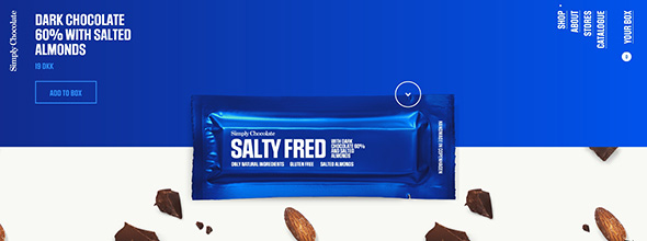
Simply Chocolate
Simply Chocolate is a company based in Copenhagen, where it is too cold to grow cocoa beans. This led them to find another solution and created a new kind of chocolate. Their website is interactive and has a unique design that presents their products in a creative way.
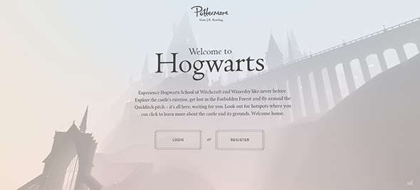
Pottermore
Pottermore greets you with a full-screen animation that introduces you to the world of Harry Potter. With this website, you can experience the Hogwarts School of Witchcraft and Wizardry like never before.
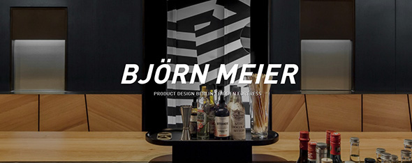
BJÖRN MEIER
Björn Meier studied graphic and product design. If you want to get your daily dose of inspiration, check out his impressive portfolio website that greets with a large full-screen image. It masterfully combines large,bold typography with high-quality, professional images.
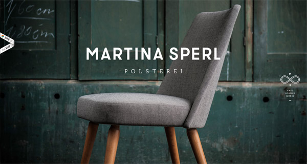
Martina Sperl
Martina Sperl’s portfolio website also greets you with an impressive photo of her works. If you’ll keep scrolling you will find an amazing user interface design and layout which will definitely inspire you in your future projects.
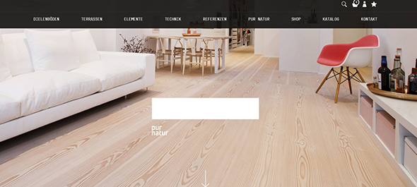
Purnatur
Purnaturr is yet another cool website that uses a large full-screen photo to introduce visitors into what this company loves doing. The layout is very simple, clean and minimalist and the showcased photos are all very high quality.
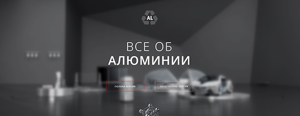
Aluminium Leader
Are you a fan of materials such as aluminum? If so, on this website you’ll find everything related to it. This website is very well designed as it can be a great source of inspiration for web designers who love fullscreen websites and large images and graphics.
Pure Fix Cycles
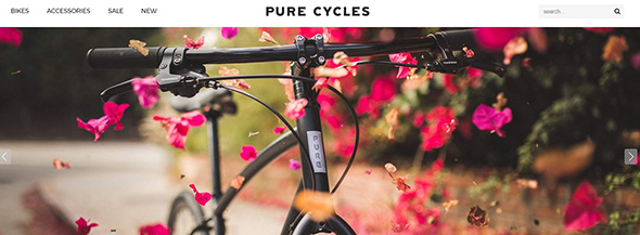
Pure Cycles started as a desire to see more people using bikes. This company has been designing, developing and delivering cool bikes for 6 years now and if you’ll click and enter their website you will see a beautiful full-screen picture of one of their works.
Ecodom
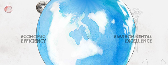
Ecodom uses a large full-screen animated and illustrated image. This website focuses on raising awareness on the economy and environment and beautifully combines custom fonts with watercolor drawings in a modern and clean layout design.
Articulate Studio
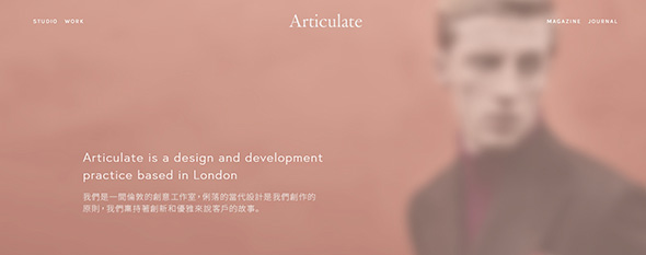
Articulate is a really nice design and development studio and practice based in London and this is their portfolio website. The website uses a blurry full-screen image as the first thing people see.
The Design Files Open House
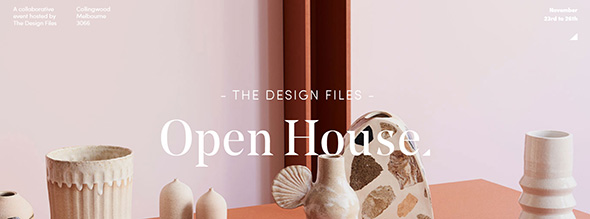
The Design Files are happy to announce their 5th Open House event which will take place on November 23rd and last until November 26th. This company’s website looks elegant and uses a full-screen image in its design layout.
Michael Schmid
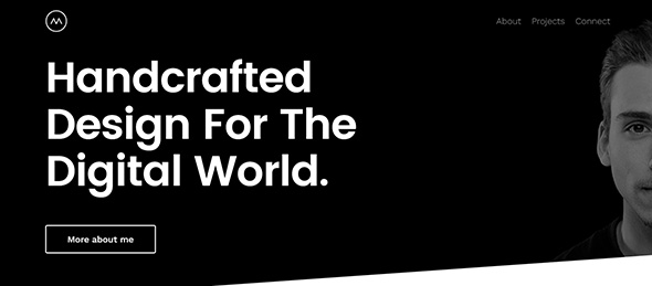
On this personal website, you will find more about Michael Schmid, a German digital designer, and developer. In his work, this designer focuses on brand and responsive web design. His website surely proves his vast experience in this line of work.
Fire Pit Bar
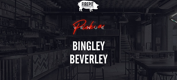
The Fire Pit Bar has a really cool and modern website which will definitely grab your attention, especially through that full-screen image with a dark overlay, on the homepage. The logos pop out and the heading is very visible.
Serve Seattle
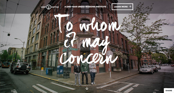
This is an urgent response to a generation’s search for a life purpose and this website, Serve Seattle, presents this team’s urban missions. It has a simple, yet personalized design, due to the clever choice of script fonts for the homepage heading. The navigation is scroll-based and the whole design is very inviting to the users.
Matt Morris Wines
Matt Morris Wines is an elegant website that presents what has now become a brand and changed an entire city. They use a full-screen image of wines as the first thing visitors see.
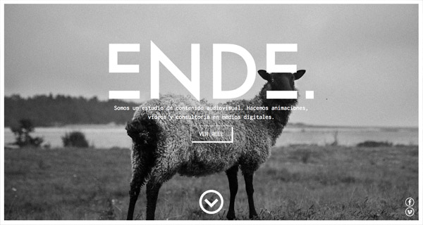
Ende
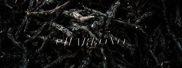
This website presents an audiovisual studio. Their work focuses on animations, videos, and media consulting. The website, Ende looks great and uses a full-screen black and white image.
Creative People

This agency engages in creating websites, interfaces, branding and other developing projects. They have a cool website with an animated full-screen background.
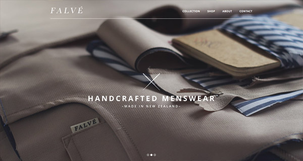
F A L V É
Are you a fan of Falvé, a menswear label from Wellington, New Zeeland. It started as a family business and it has grown since. This is the label’s website which beautifully presents their products.
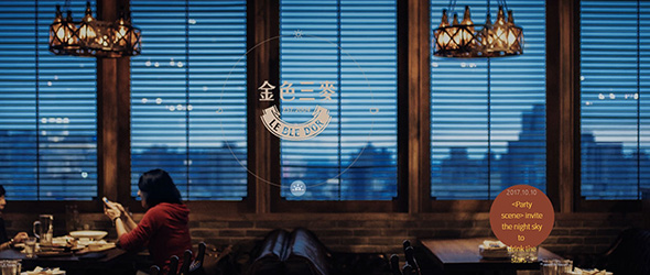
Lebledor
Lebledor is an Asian restaurant that serves really good food and has a beautiful website which will definitely inspire you in future projects.
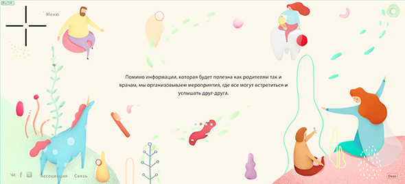
Appd
Appd is a Russian website that uses full-screen illustrations to present content in a really creative way. The result is impressive and worth following.
What You Are
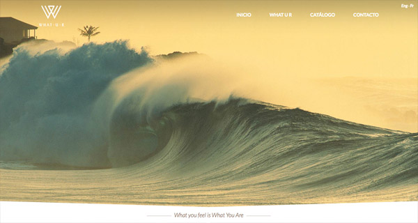
This website’s motto is “What you feel is what you are” and that’s exactly what they manage to suggest through their beautiful website. They say that when you feel that a part of your life belongs in the mountains or in the wind, that element is exactly what you are.
Knuckles Industries
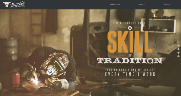
Knuckles Industries focuses on furniture and industrial design and their website has quite a creative design layout at which you might want to have a closer look at!
Brave People
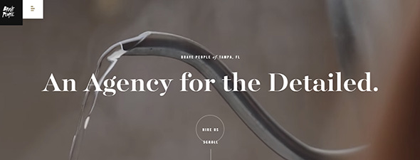
Brave People is an agency for the detailed, as they like to call themselves, and their website greets you with full-screen animations and beautiful imagery. It also offers an impeccable user experience.
Dickson Fong
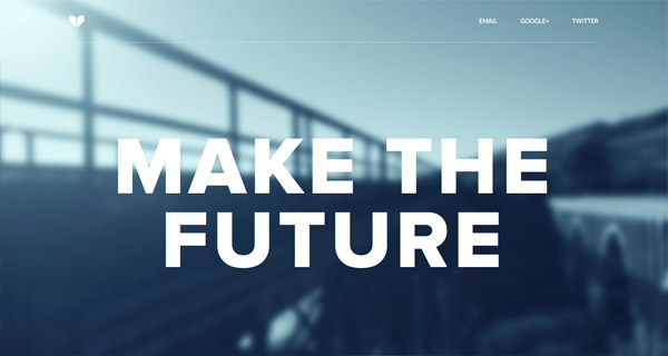
Dickson Fong is a designer at Google, where he works with a talented team to connect people and cultures all over the globe. This is his website, which shares with us a few of his beliefs through the huge motto overlayed on a blurred photo.
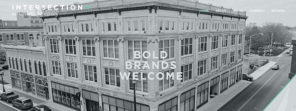
Intersection
Intersection aims to create exchanges between brands and people and this is this company’s website which uses a full-screen black and white image.
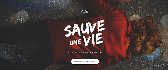
Sauve Une Vie
Sauve Une Vie is a really nice website that proposes an experience which you can choose to take part in. The website uses an impressive full-screen picture as the first thing visitors see.
Livso
This company creates products that actually work and fill a void and this is their website. The website looks amazing, it has an impressive design layout and some really cool representative images.
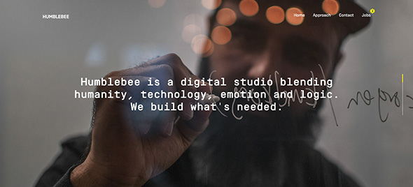
Humblebee
Humblebee is a digital studio that uses design and technology to solve problems. This agency’s website uses full-screen images on its homepage, combined with simple white typography. This design helps them deliver information in a very eye-catching way.
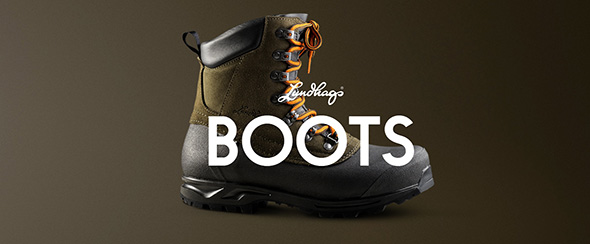
Explore Lundhags
This website invites you to explore the Lundhags good quality products. The first thing you will see will be a full-screen image of one of their products.
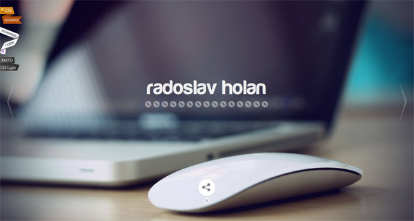
Radoslav Holan
This is a really nice portfolio website which uses a full-screen slideshow to present this artist’s work. The overall layout is minimalist and the transitions and navigation systems are very well coded.
