40个web2.0表格在网页设计中的应用案例
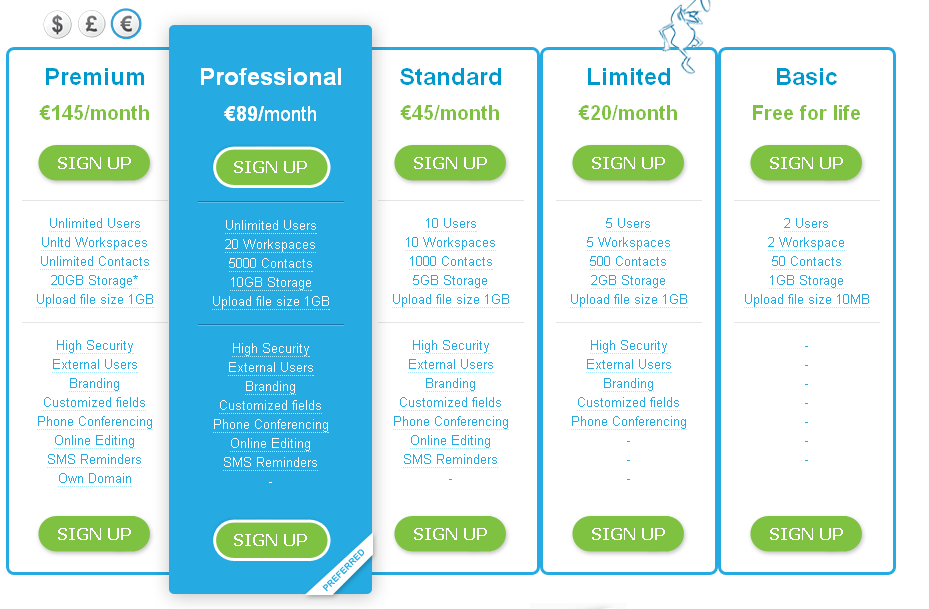
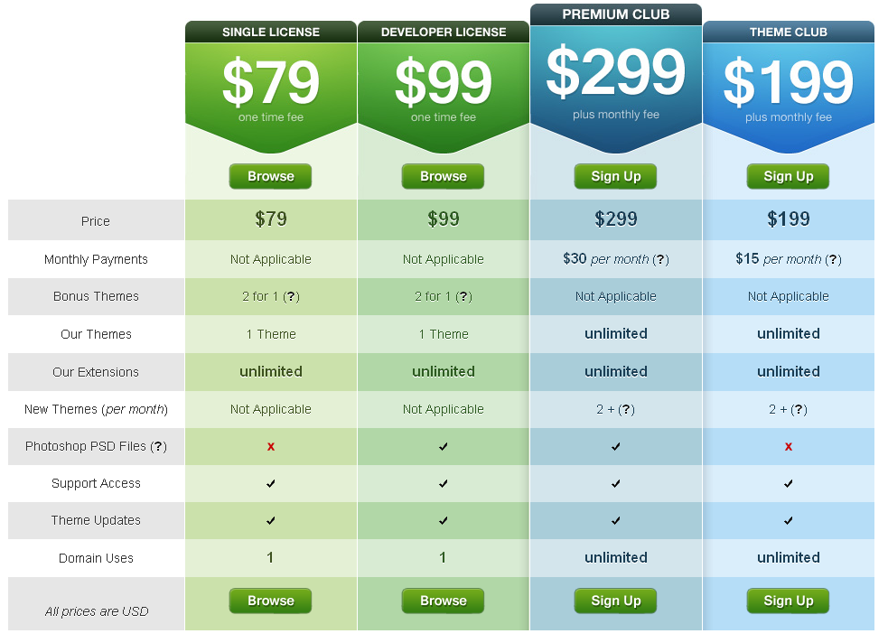
进入web2.0时代,标准的1px边框表格,已经被越来越多的网站抛弃了。而替代他们的是以xhtml为标准的新表格风格设计,收集了一些网站,都使用此类设计模式。希望朋友们能够喜欢。
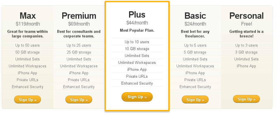
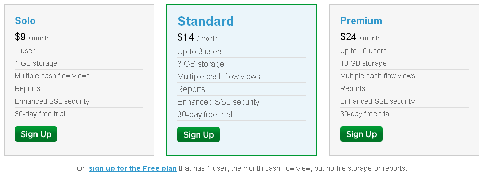
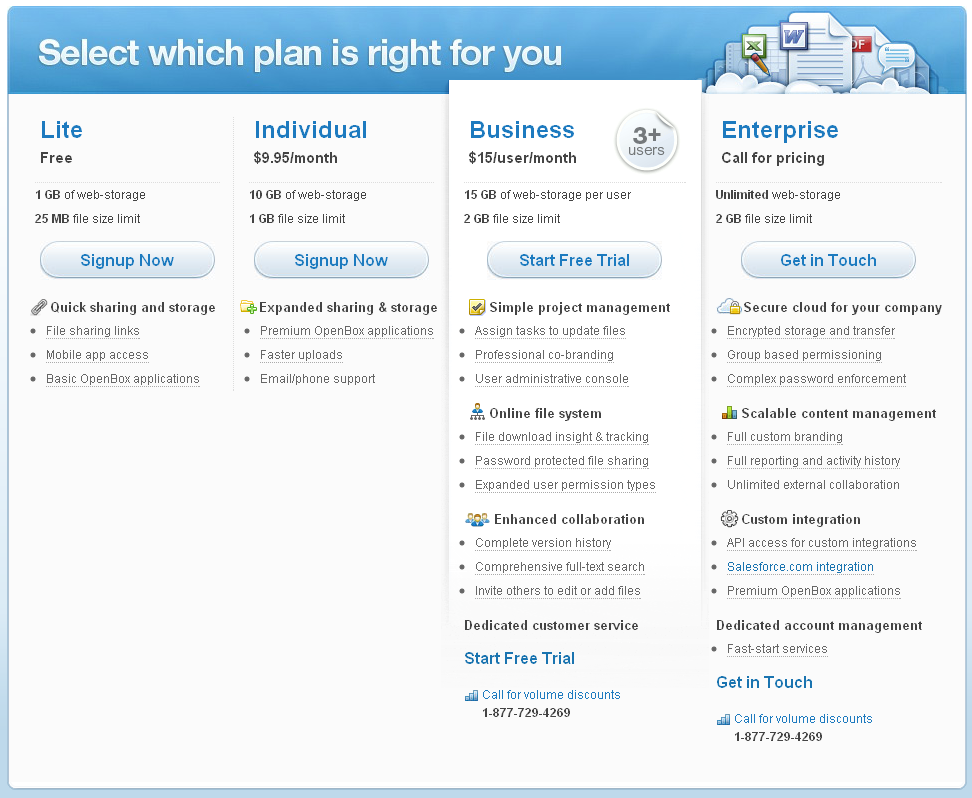
One Hub
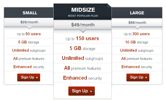
Onehub goes with a common column layout with a highlighted column displaying their most popular plan.
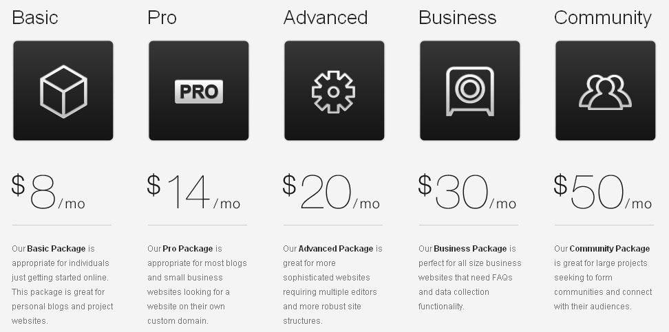
Squarespace
Squarespace makes use of simple, yet bold icons, alongside beautiful typography to create a beautiful column style pricing table.
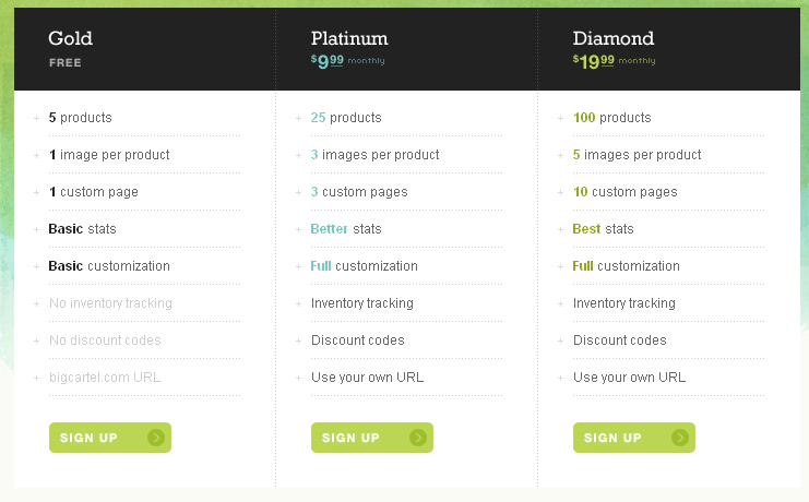
Bigcartel
Big cartel uses simplicity and elegance to get its pricing plans across, as well as subtly highlighting what the free plan misses out.
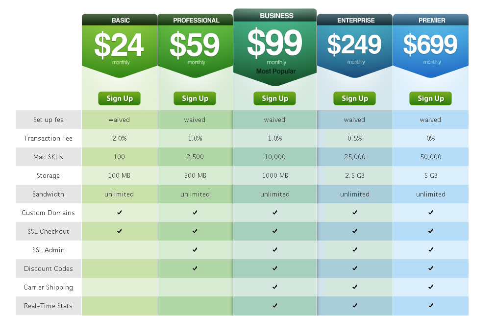
Shopify
Shopify uses a bold approach with a staggered gradient of color from green to blue to show the progression of their plans. Simple ticks are used to show the features of each plan.
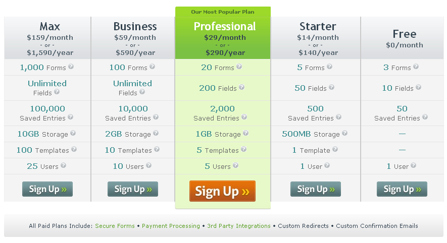
Formstack
Formstack puts emphasis on its popular plan by giving it bright colours compared to its sister grey plans.
Notable
Notable uses a very simple and easy to read table, with a larger btn btn-primary, and wide stroke around their popular plan.
Mailchimp
Due to Mailchimps way of pricing, their tables appear in different formats, split into different sections.
Live Stream
Livestream keep their pricing table relatively clean, with more information available upon hovering over sections.
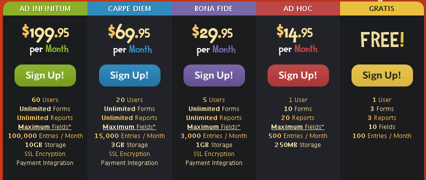
Wuffo
Wuffo uses its playful font and bright colours to attract you into their pricing table.
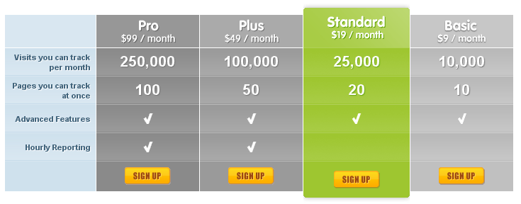
CrazyEgg
Like others, CrazyEgg focuses on their popular plan with the use of colour compared to grey columns.
Highrise
Highrise uses a simple and easy to read table, with a larger btn btn-primary, and wide stroke around their popular plan.
PulseApp
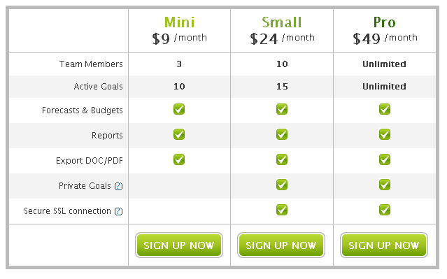
PulseApp uses three simple columns with very little visual graphics to emphasis the sign up btn btn-primarys.
LighCMS
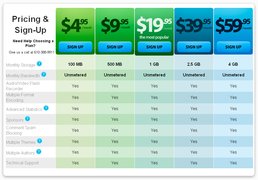
LightCMS has an absolutely stunning pricing table which hits you with its bright gradient of colour, but beautiful simplicity. The table is left uncluttered with common features between the plans all listed below.
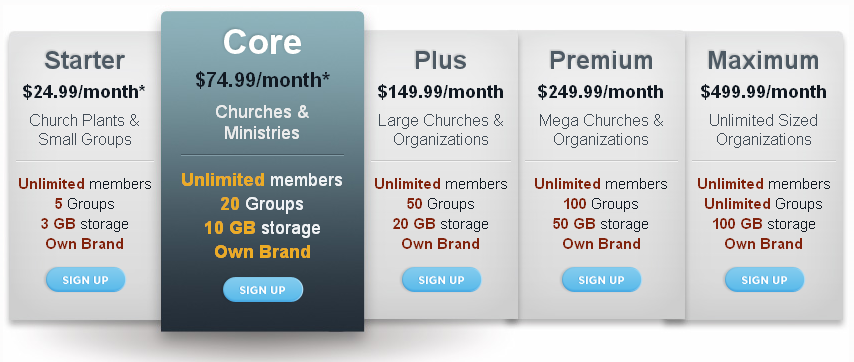
Cobblestone
Cobblestone differs from some other pricing tables in highlighting its popular plan with a dark blue again grey, compared to bright colours against the light grey.
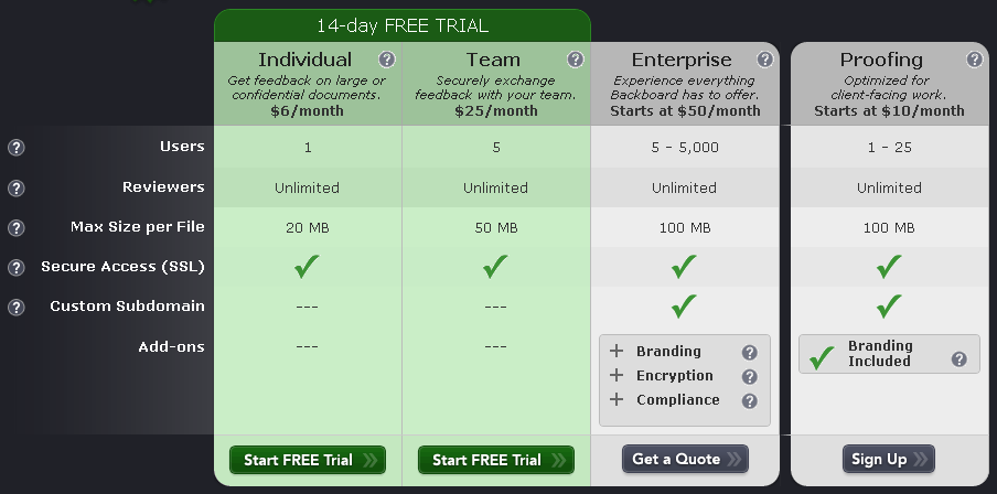
Backboard
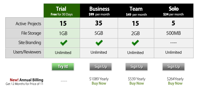
Backboard draws its users in by highlighting plans with a 14day free trial, and driving home pricing after this.
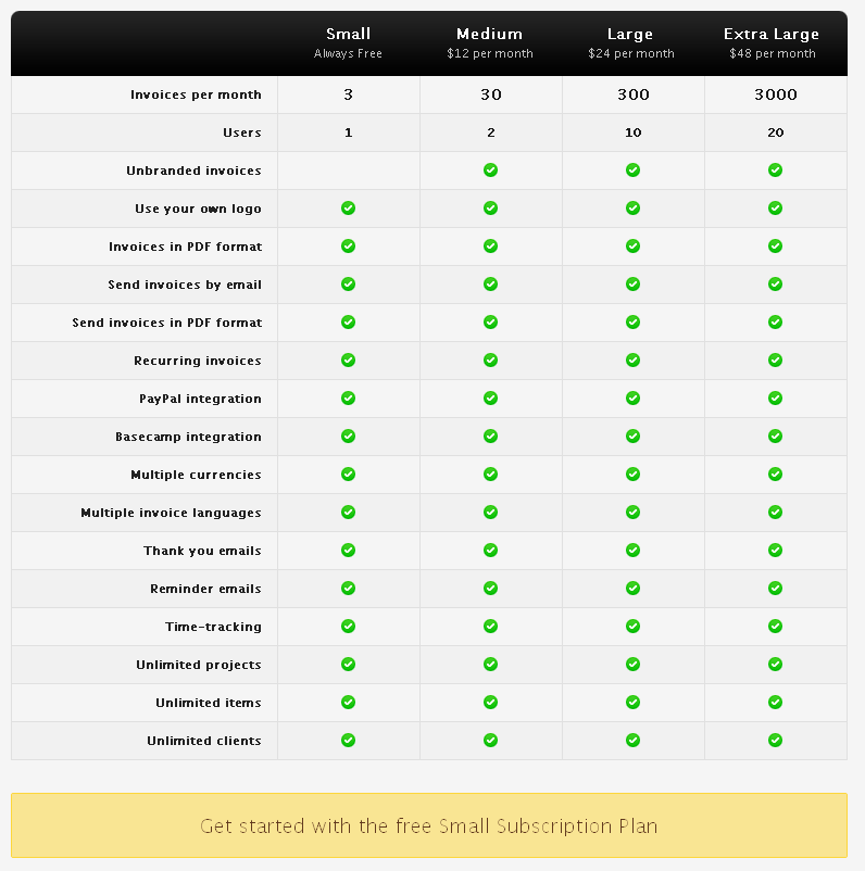
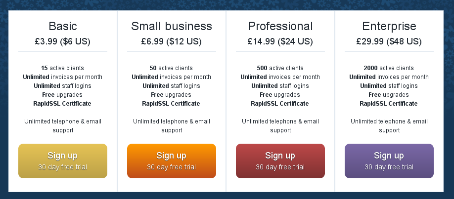
Invoice Machine
Invoice Machine keeps to simplicity by using a simple table, and ticks to show exactly what features each plan comes with.
PlanHQ
PlanHQ’s simple table gets across simple information on the products information, and puts emphasis on the sign up btn btn-primarys.
Concept Share
Like others, Concept Share puts it’s emphasis in colour on the free trial plan, to attract users into the features of the program by using it rather than tabling all the features.
Mediatemple
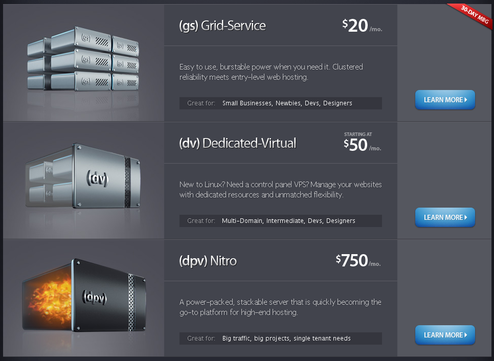
Mediatemple opts for less of a table approach, and more of a box approach showing three of their plans, with learn more btn btn-primarys.
Mailer Mailer
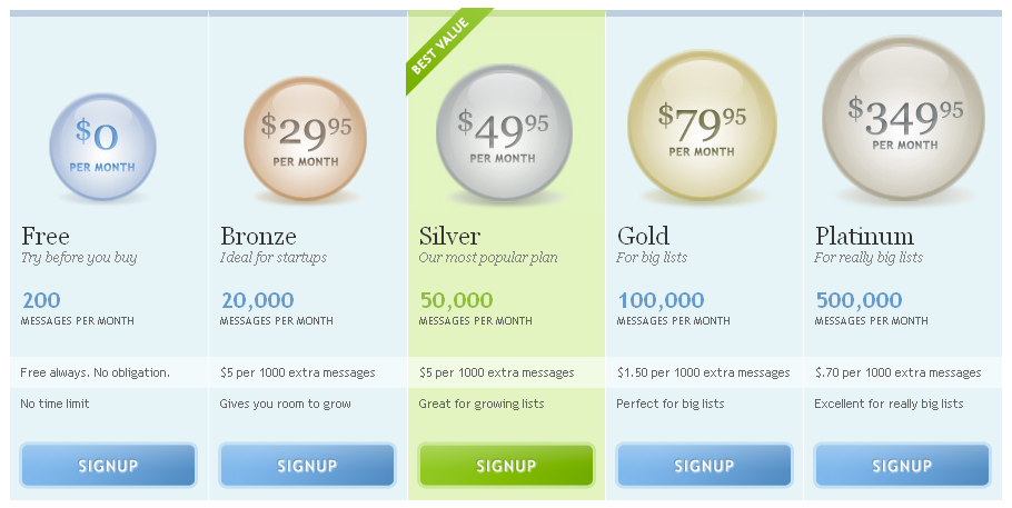
Mailer Mailer emphasises its preferred plan with a “Best plan” ribbon, and a contrasting coloured btn btn-primary.
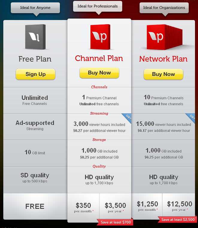
Litmus
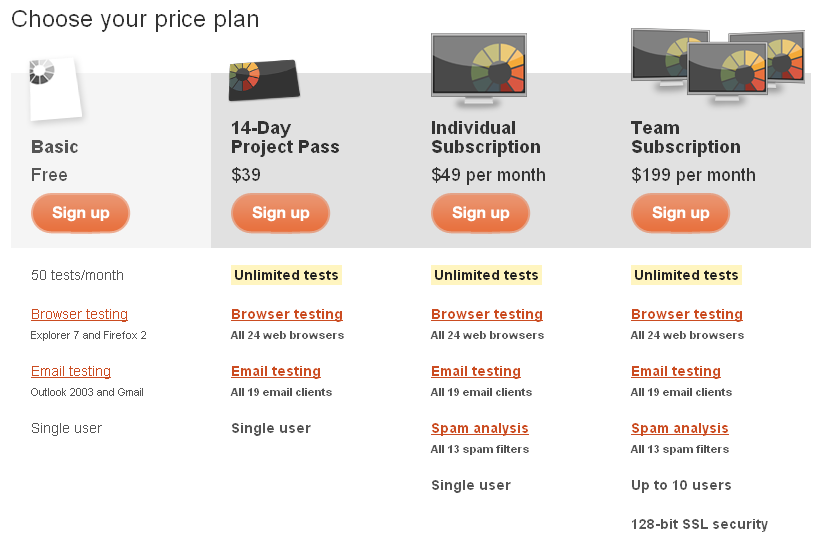
Litmus uses a progression of images to emphasis where the quality is in their pricing plan with a gradual increase in screens in the heading images from left to right.
Sipgate
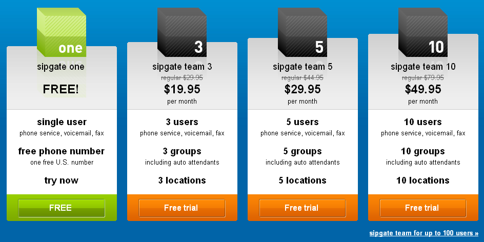
Sipgate emphasises its free plan with a different colour to the premium add-ons.
Yootheme
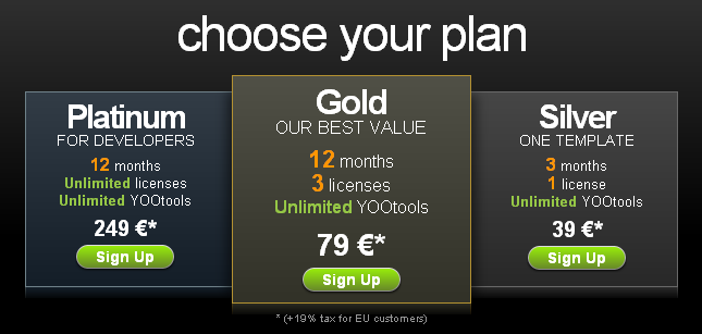
Yootheme emphasises the gold plan by using gold colours as well as brown in its larger centred popular plan box.
The Resumator
The Resumator puts emphasis on its sign-up btn btn-primarys, with its featured plan receiving a border, and different coloured btn btn-primary for emphasis.
Poll Everywhere
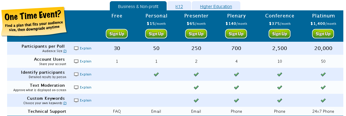
Poll Everywhere uses a feature table with prominent sign up btn btn-primarys to showcase it’s different poll plans.
Box
Box.net uses takes use of white and blue beautifully in its pricing table, subtly highlighting their popular plan by raising it above the rest ever so slightly.
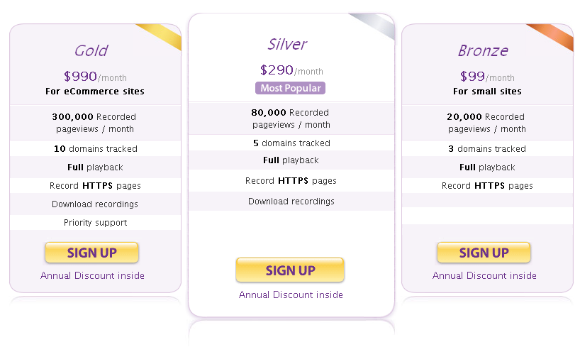
Clicktale
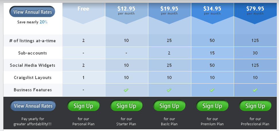
Clicktale takes a different approach than other sits by ordering its most expensive plan far left, and the cheapest far right; a complete contrast to the normal.
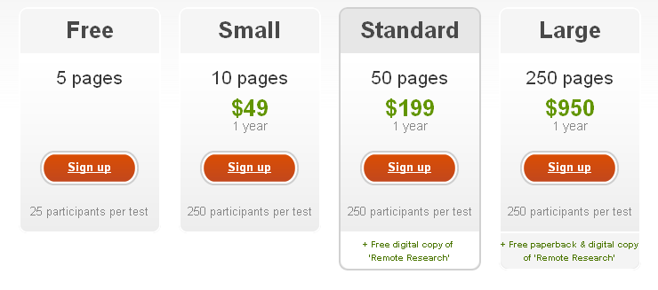
Usabilla
Usabilla goes with a simple table with two bright colours, green and orange highlighting the price, and the sign up btn btn-primary.
Cannybill
CannyBill has opted to make user interaction more noticeable, with table columns zooming on mouse over.
NewsGroupDirect
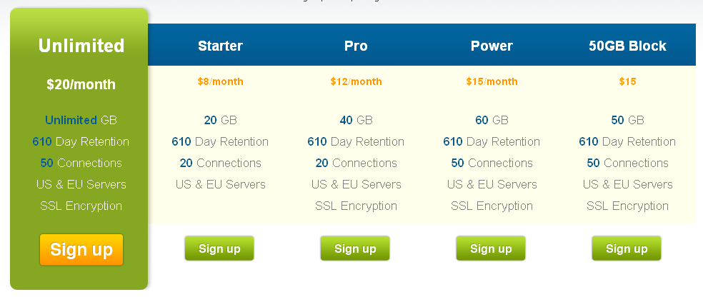
This site opts to feature its most expensive plan on the left, highlighted with a bright green to instantly attract the eye.
Typekit
Typekit opts to make its popular plan stand out by subtly increasing the size of everything in the column.
Podcast people
Podcast people follows in shopify’s footsteps by using the gradient of columns from green to blue.
Vflyer
The downward arrows used by vFlyer help to draw the user’s eye down the page to the features, and beyond to the sign up btn btn-primarys. Simple but effective.
PandaStream
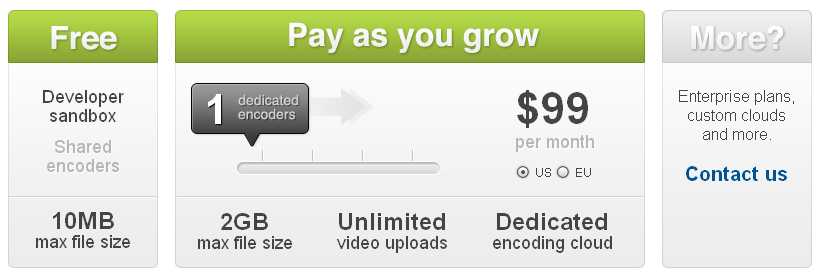
Due to panda’s business model, they have to opt for custom pricing decided by the user. Their easy to use drag bar is beautifully implemented.
Groupsite
Groupsite uses the bright contrast of red and dark blue to attract your eyes through their pro pricing plan.
Browser Mob
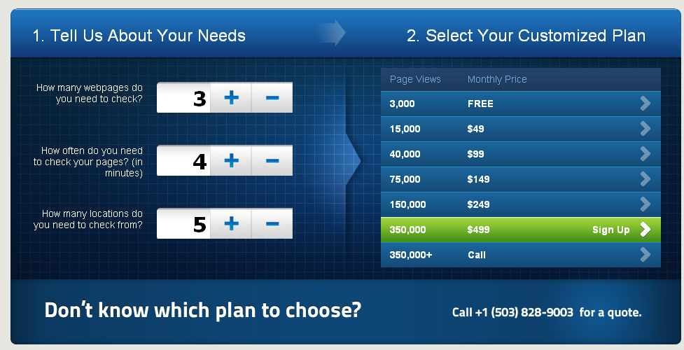
Similarly to Panda, Browser Mob is more of a custom pricing plan, so with so many to offer, they’ve made it easier to choose, by allowing the user to input what they need, and the result showing their most suited plan.
Glasscubes
Glasscubes makes sure emphasis is strong on signing up, offering you the opportunity to do so at the bottom, and top of each pricing column. Their btn btn-primarys aren’t too bright, so you don’t feel pushed into it.
Hellothemes
Hellothemes subtly draws focus to its featured plan with a heightened column, and beautifully done left and right shadow that add’s a bit of depth.
Varto
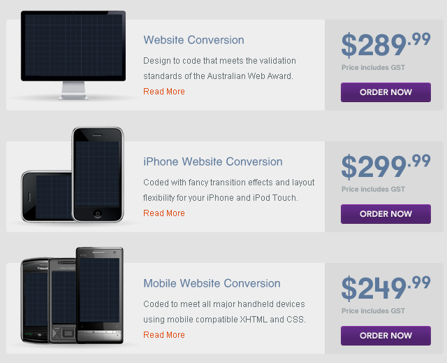
Varto opts for a vertical pricing table for its 3 pricing plans that render beautifully with some great imagery.

