60佳精美网站导航菜单设计欣赏
导航菜单设计,在网站中占具非常重要的部分。一个清晰简洁的菜单,可以让你的访客更快的找到,他想得到的东西。60佳精美导航菜单设计,主要包括简洁型、清晰型、华丽型、图标型、图片型等。源码也包括纯CSS,FLASH以及JS这三个方面。
1. Loodo.com
Casino-like game or snakes and ladders with the touch of colorful menu.
2. Change.org
The calmness of the choice of color with the emboss feeling of the menu to reveal the submenus is a great choice for its advocacy change.
3. Acko.net
Steven Wittens gives us another perspective or view of this menu.
4. UXBooth.com
UX Booth uses stylish yet simple menu.
MacRabbit uses a mac os or apple concept to its design.
6. Joyent.com
Joyent uses simple, business looking menu that offers their works.
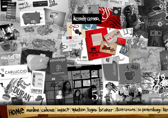
Elegance and simplicity of this portfolio gives you.
Large images-based menu that will attract and will draw users attention. Not the usual menu that you see.
Drop down navigation that uses two colors that presents the active link to the passive one.
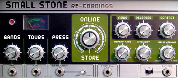
Small Stone recordings, a U.S. record label, uses a radio-like or that so-called a the so-called Space Echo Roland SE-201 menu.
11. TNVacation
Feel of country or map-like that will let you travel to the whole website.
12. Clever Twist
Rounded, apple application-like menu that offers application for your iPhones.
13. Clear Left
Clearleft uses a calendar concept that makes a what-to-do stuff on a particular day feel.
14. Tulumarka
Pressed looking to see the selected menu.
15. Ars Technica
Menu pressed reveals a submenu. Dark yet simple feel.
16. 45royale inc.
Nice hover effects with this simple and clean menu.
17. CSS Beauty
The size of the letters are so cute and not usual but that’s what will caught your attention.
A good way to use a block navigation that shows an effective hover effects.
19. Microformats
Leaf like plus the cool green color that suits into your eyes. From green to black that gives you on what menu you are.
20. ronnypries.de
One of the best concept is to use a floor plan to navigate your users to the entire website is what Ronny Pries did.
21. Jiri Tvrdek
Fruit bearing tree is one of the creative way to use a navigation menu. It is like your harvesting a fruit and lead you to the taste or the content of the website.
22. Matt Dempsey
Brush strokes with the interchange of the colors over choosing a menu is what Matt Dempsey did.
23. Cognigen
Presents a pressed and clear view of the navigation.
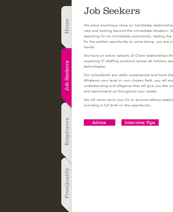
Vertical tab that looks like a folder that really works on this website. Rarely use but really great to work with.
25. Jeff Sarmiento
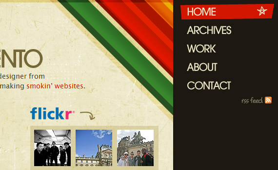
Sloping Navigation that creates a creativity and a punk style looking menu that Jeff Sarmiento used.
26.Racket
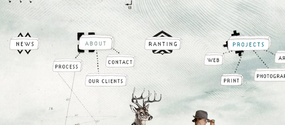
It is like a hierarchy of menu up to its roots. One of a kind navigation that added to the creativity of the website.
27. DFW
Icons gives emphasis on the interaction to the menu.
28. Iipvapi
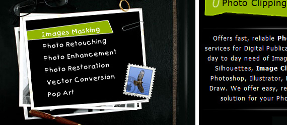
Photo clipping navigation menu with touch of hover color effects used in a Photo Clipping path services.
It is designed to squeeze your creative juicesby tweaking the mood sliders navigation.
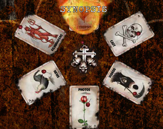
Devilish, freaky and rise to the dead theme of the navigations presented into tarot-like cards. The card will be put in fire if you clicked on it.
###page###
31.Waterlife
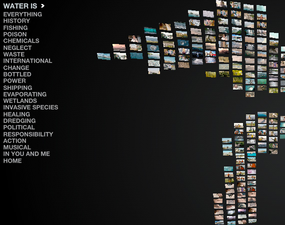
The fluid navigation menu that brings you to the motion of a lake.
32. Nick Jones
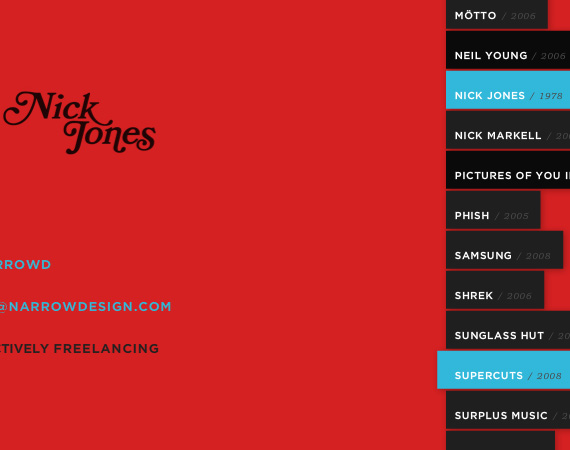
Nick Jones uses a simple yet dynamic navigation for his portfolio. It’s like pulling things up and down.
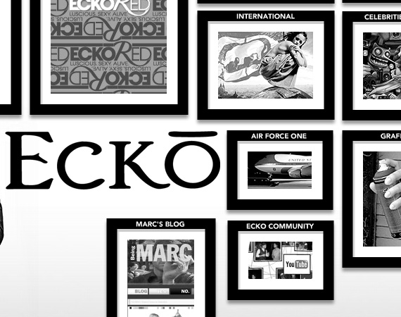
33. Marc Ecko
Marc Ecko presents an art gallery navigation that lets visitors to tour for art and philosophy.
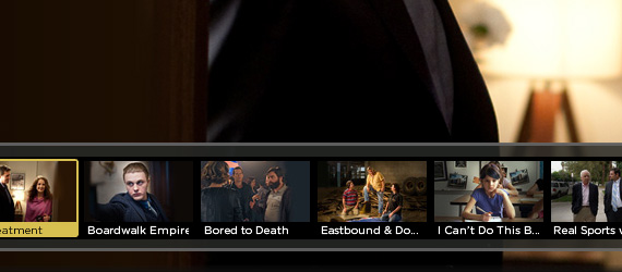
34. HBO
HBO , a tv-movie network, creates an interactive selection of movies for its navigation.
35. Got Milk?
An interesting navigation in a ribbon with a simple hover effect. When an icon hovered, the content menu is presented.
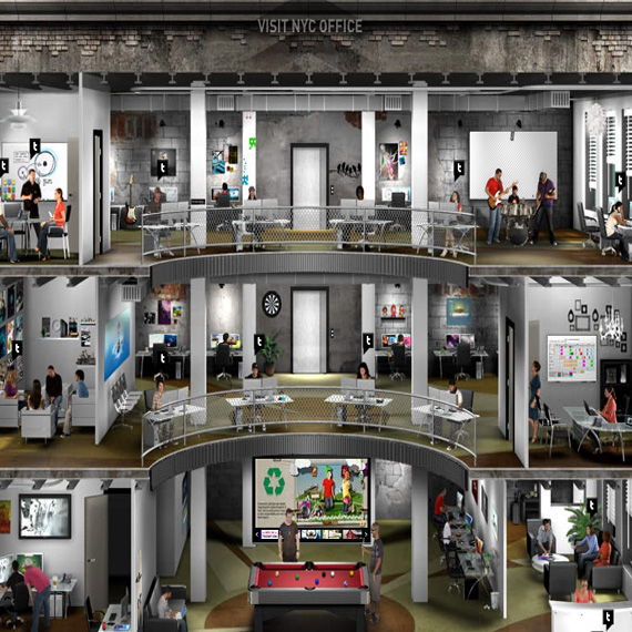
36. AgencyNet
Stunning and amazing navigation design studio based in New York City, NY and Fort Lauderdale, FL.
Stylish neo ancient navigation design with a background mural that leads us to another world.
38. NickAD
Nick Ad uses a flexible but easy to use navigation. The stars that changes to a navigation when it clicks anywhere in the page.
39. Dave Werner
A creative person uses his own works to lead the users on his portfolio.
40. Section Seven Inc.
Section Seven has a colorful pamphlet like navigation with a sub menu written on it.
41. Cathy Beck
A navigation that open and close like a scroll when choosing a menu.
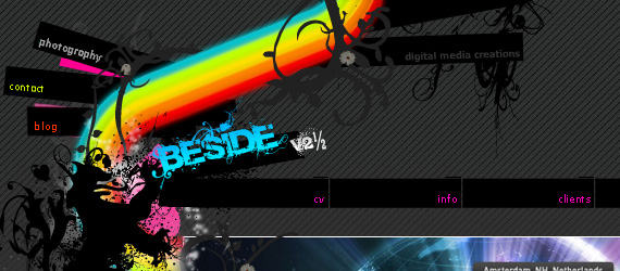
42. Beside
Beside uses a rainbow navigation that puts your colorful fantasies.
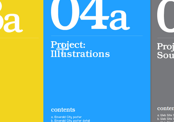
A cardboard concept of its portfolio. The navigation hovers a pencil-like drawing.
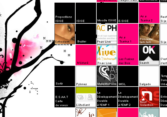
44. Enila.fr
Small squares that put together that acts as the navigation and collaboration of works.
45. Havaianas
A colorful map that has the touch of the slipper texture that Havaianas proud about.
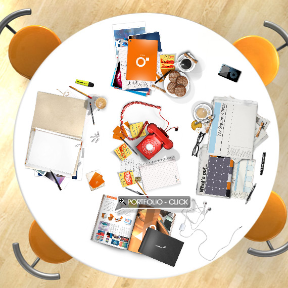
46. Square Circle
A table filled with stuffs that are related to the menu such as telephone for contact us, magazine for portfolio, newspaper for news and others. Real thing that use for navigation is a great thing.
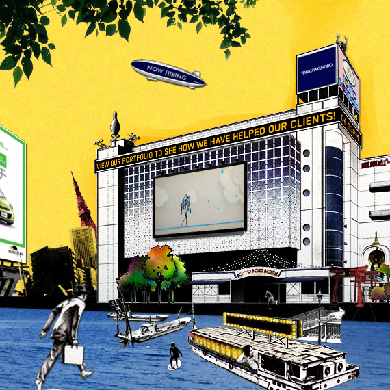
47. TBWA\HAKUHODO
A great, artistic scenario use for navigation. Every element is a wonderful piece that gives life to the website. Rarely used but magnificent.
48. Agami Creative
Simple and eye pleasing of this navigation with the touch of paint colors.
It looks like the navigation is made up of Flash but it’s not. Clean, cool and stylish navigation with a hover effects of colors that made this navigation really pretty.
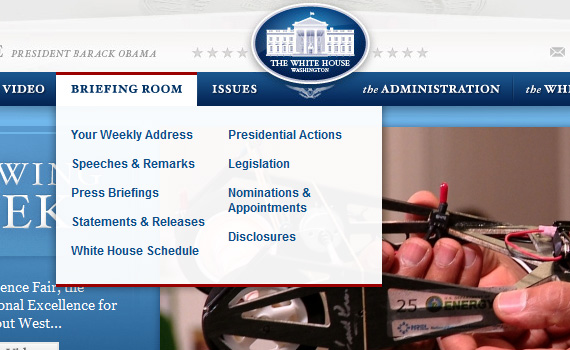
50. The White House
White House really holds up a lot of information for the public. It is easily manage with this drop down menu to contain all the contents.
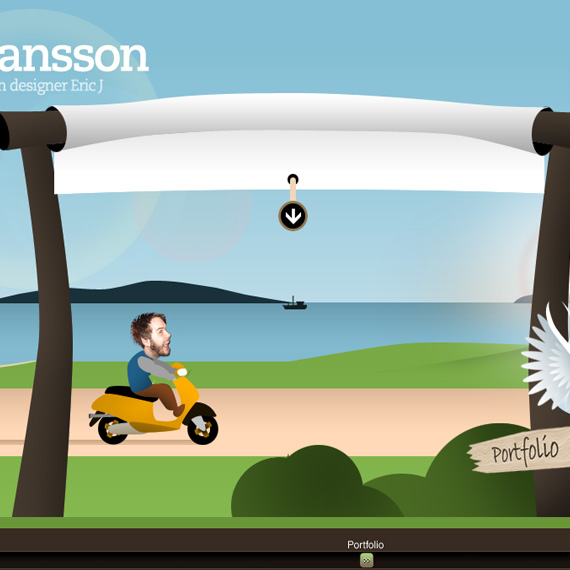
51. Eric Johansson
Eric Johansson uses a JavaScript sliding menu to travel on it’s website.
51. Helmy Bern
The navigation layout is in a grunge theme that also has a jQuery drop down effects.
52. Internet Dreams
The creative hover effect is not usual but it gives a distinguish look over what menu users choose in.
53.Panic -Coda
Familiar and popular icons were used to navigate users easily.
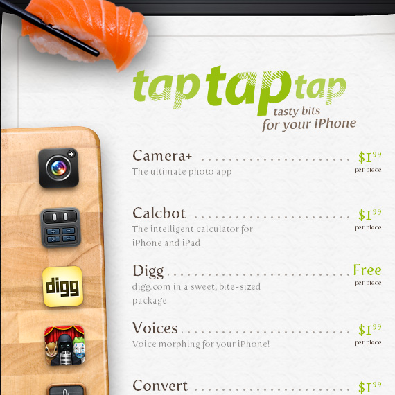
54. TapTapTap
Restaurant menu-like navigation is really great. I really love this navigation because of its simplicity yet creative design.
55. Kobe
This navigation uses a scroll to and scroll in plugin to create an interesting transitions.
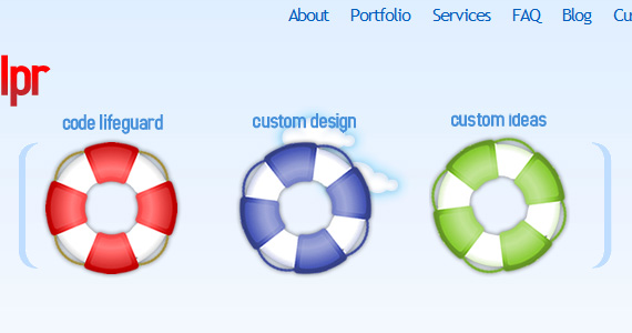
56. BlogHelpr
Floater design to use for navigation. It is the creative way to save the person in swimming into the website.
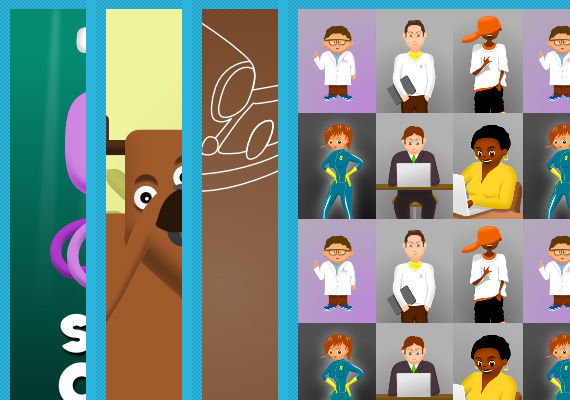
57. EyeDraw
EyeDraw uses an expanding images whenever you hover the mouse over the menu.
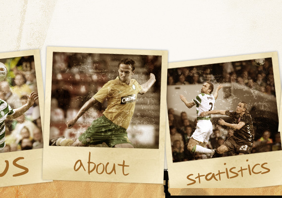
58. Andreas Hinkel
Andreas Hinkel uses Polaroid navigation for the animation effect.
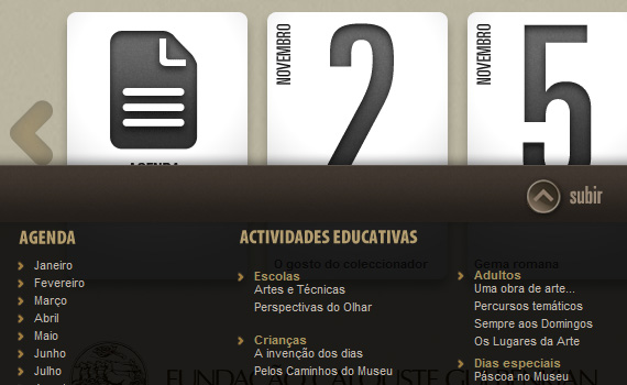
59. Museu Gulbenkian
The drag dock navigation in the bottom is a great way to reveal and hide the menu and submenus.
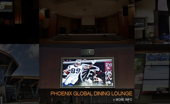
60. Sapphire Sound
The thumbnail used as a menu that has caption effect, custom scroll bar, and you also can see the fading, sliding animation.
61. Design Slicing
Transition effects is what I really like on this navigation. The menu are set of questions that when hover are given answers.


