国外优秀网站搜索框UI设计欣赏
对于一个有很多内容的网站来讲,搜索框部分,是很重要的组成。而一个漂亮的UI,更能体现网站优质、高效的服务,以及更好的用户体验。
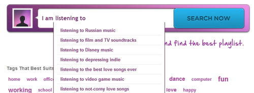
Starting with the prefix of "I am", this search module attempts to intelligently match and list the results matching your query as you type.
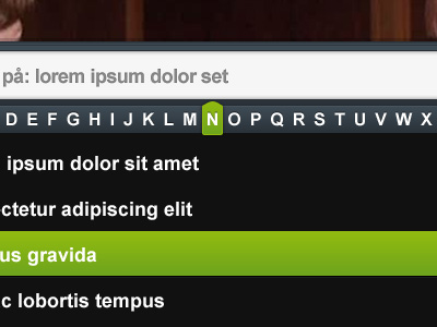
Suggested by designer Nico Nuzzaci, this creative search box allows you to search by typing or by scrolling the alphabetical panel.
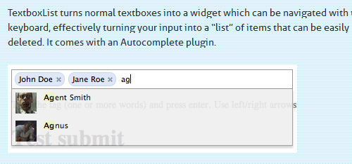
This search module has a combination of few functions: it wraps your search queries in tags format, and allows you to delete a specific search tag. It also comes with auto-complete. Looks familiar? It’s similar to Facebook tagging module!
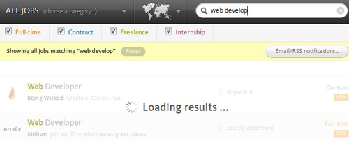
Similar to the YouTube search, the search box here tells you instantly if something matches your result. Yet another intelligent example of auto-suggestion feature.

I think Authentic Jobs already had their search with instant results up and running before Google.
Kontain’s search box allows users to do a general search or filter down the search results to only "updates" or "user".

Similar to Kontain, NY Magazine’s search allows deeper filtering.

Yet another example of filtering in search module to help visitors get what they want within minimal time.
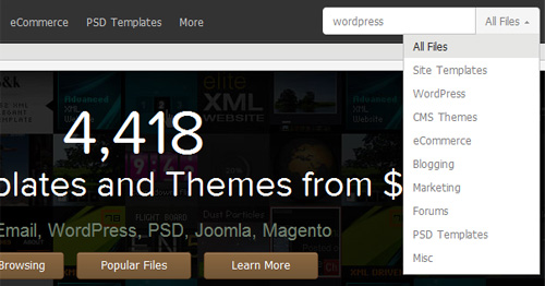
Brian’s search box looks like an advance search module done in a beautiful way; you customize how you want results to look like before hitting the search btn btn-primary.

Subtle and small search module on the sidebar – neat!

If you are looking for a complete search module and yet space is a constraint, this approach may come in handy.

Search module right after the logo, it’s really hard to miss.

A big fat search box that only appears upon hovering the search tab; another good way to make use of space.

Selective searching with filtering done beautifully.

Looking at its business nature, smacking the search box upper fold and right in the center is probably the best idea.

Similar to other sites, iStockPhoto offers massive amount of resources for its readers, so filtering in search is definitely essential.
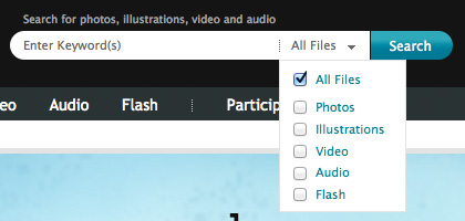
Simple looking yet awesome search box.

Grooveshark allows you to listen and share music online; the first page consists of nothing but just a search box for you to search the music you want. It totally makes sense.

Nice example of how Google Custom Search is customized.

Nice dark search box that blends well with the site design.
