20+精美个人网页设计作品
2017夏季已过去近半了,收集了一些近段时间的精品个人网页,隶属单页类型,主要介绍个人信息、爱好,或者展示自己等。
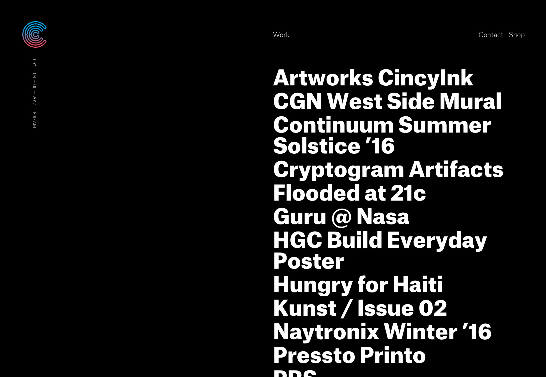
Cryptogram
To start, we have a stylish one-pager that relies on type, and a very minimal amount of imagery to get the point across. I mostly like the animation used. However, I think the visual static effect that appears when you hover on project names is a bit jarring. On the whole, though, it looks good.
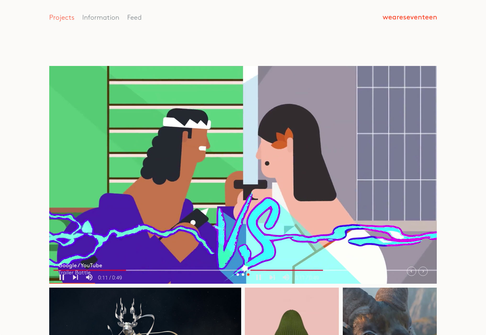
Seventeen
weareseventeen bills itself as a “design-led motion studio”. As you might expect, bits of that motion design are seen in their animated state all over the site, showcased with a simple and decidedly modern design.
One thing I found especially interesting is their image feed. It’s just that: a context-free feed of images that showcase various screenshots of their work, test renders, experiments, and stuff like that.
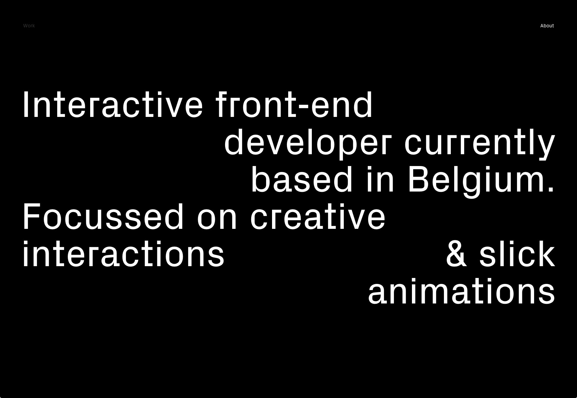
Rafael Derolez
Clean, modern, dark. That’s what Rafael Derolez went for in his design, and he did it. Add in a dash of animation and asymmetry, and you’ve got a lovely portfolio.
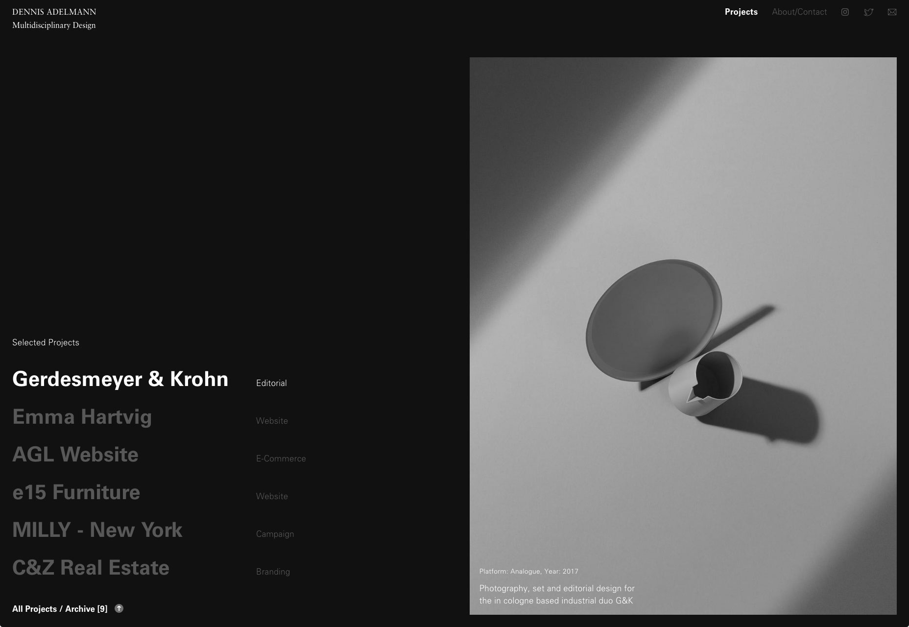
Dennis Adelmann
Dennis Adelmann embraces classic web-minimalism, with tons of white space, large text. I particularly like the presentation of featured project on the home page. It just feels elegant. it feels magazine-like. Hey, just because we’re not designing for print doesn’t mean we can’t borrow a few ideas.
Alexander Coggin
Alexander Coggin’s portfolio is part collage, and part presentation site. The thing that sets it apart for me, is—believe it or not—the custom cursor. The cursor changes based on what you’re doing on the site.
For example, if you’re hovering over a photo in slideshow mode, moving the mouse to the right will turn it into an arrow that points right. And the word “next” will trail your cursor. The instructions make the context a lot clearer. It has some problems with contrast when you move the mouse over dark photos, but if you’re going to use custom cursors, this would be a good example to follow.
Darren Oorloff
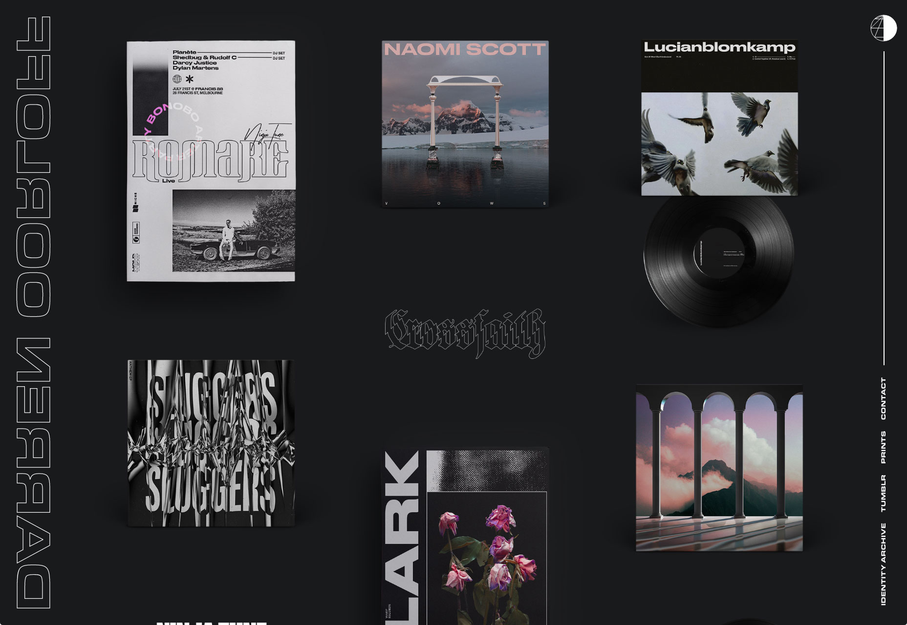
Darren Oorloff designs album covers and band logos. These are displayed prominently in a masonry layout, with an industry-appropriate dark color scheme. Let’s just say you get the idea pretty quickly.
Bobby Giangeruso
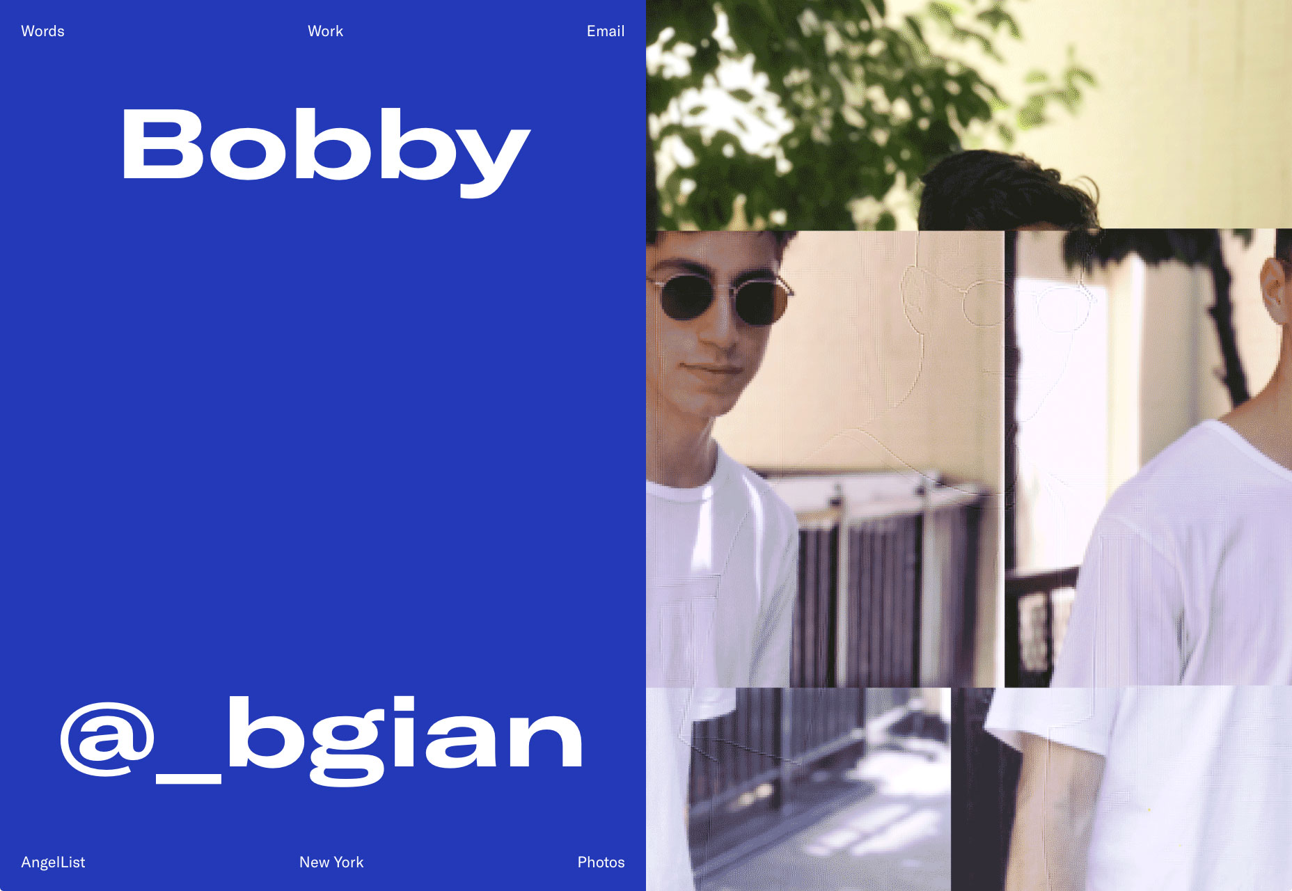
Bobby Giangeruso’s site feels odd, at first. You see the solid, almost default shade of blue, and the vertically-squished text and perhaps you’re not sure what to think about his skills. Then you see the “glitching” photo, and begin to understand that this is a stylistic choice. Scroll on down, and you’ll get that clean sort of design you would normally expect.
I’m still not entirely sure how to feel about it, but it certainly caught my eye.
Karolis Kosas
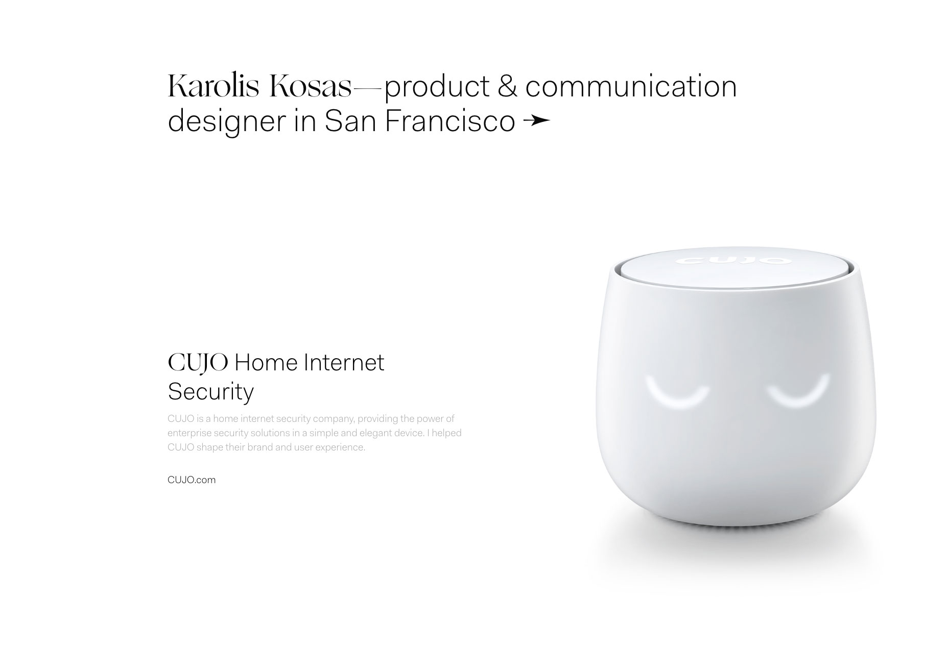
Karolis Kosas brings back some of that classic Apple-style minimalism. It’s clean. It’s smooth. It has lots of literal white space. Some of it will look almost blank to people with badly calibrated monitors.
Other than that, it’s a delight to scroll through. It is reminding me to go on a rant about contrast, though.
Tomek Niewiadomski
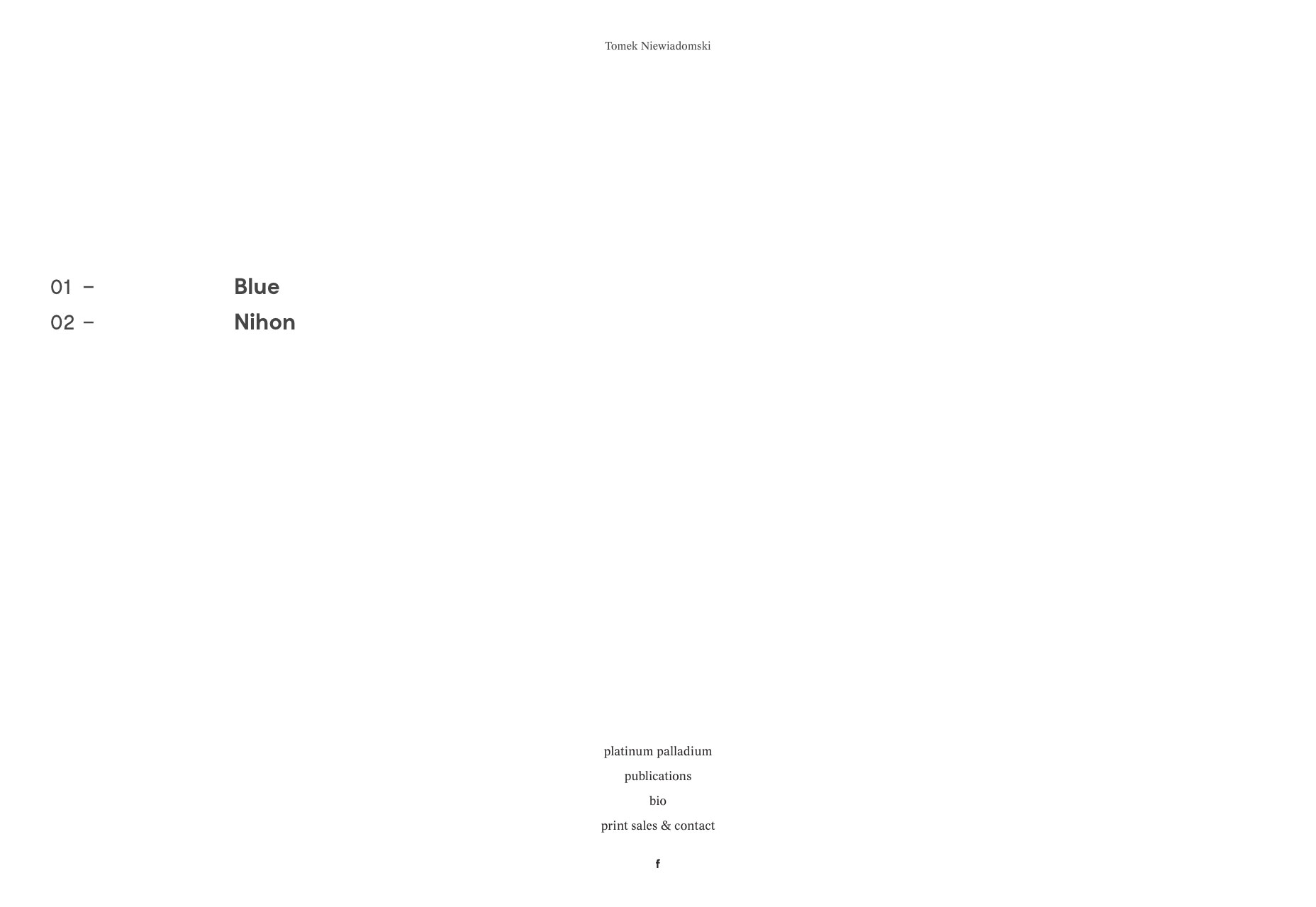
Tomek Niewiadomski is a kind and wonderful person. I know this because he made it easy to copy and paste his name into this article. Aside from that, his website follows a distinctly magazine-style layout to showcase his work. For a photographer whose work is probably regularly featured in print, this works thematically.
Ponto
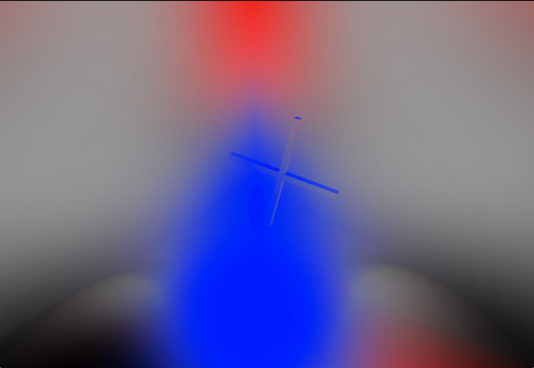
Ponto’s unique approach to design is in evidence from the moment you load their site. They…just go look at it. I am not about to try and describe the way they’re using 3D on the web. The rest of the site continues the theme of being elegant, professional, and more than a little avant garde.
Eric Hu
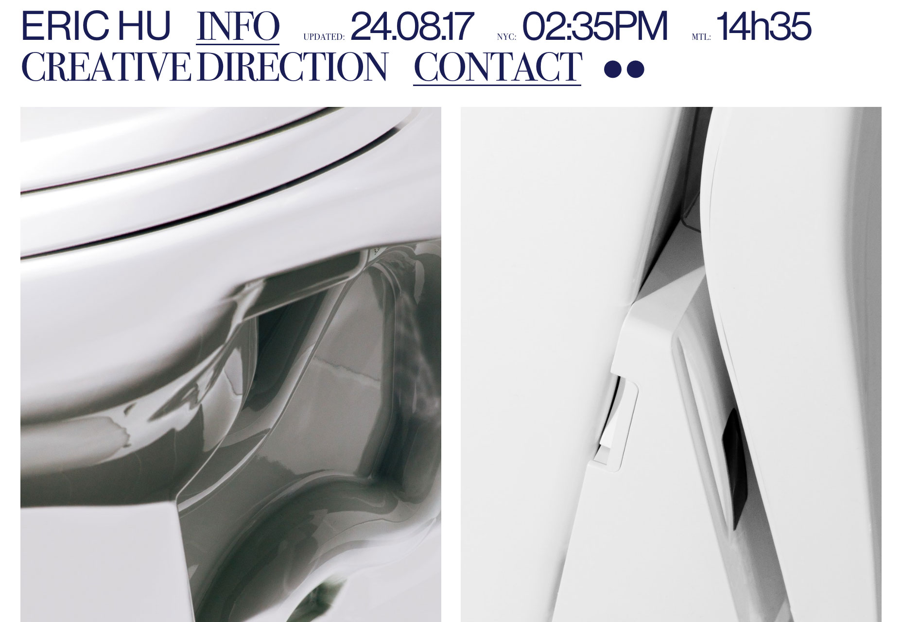
Eric Hu has embraced that post-modern feel, and combined it with a penchant for elegant type. And his site tells you when it was last updated. I find that a brave thing to do, because I wouldn’t dare date my personal portfolio quite so overtly.
Jack De Caluwé
Jack De Caluwé’s portfolio doesn’t do a lot to stand out from the rest, aside from the work it showcases (which I would argue is probably the most important). It is, however, clean, elegant, and overall incredibly well done. Go give it a look-see!
Mesh Mesh Mesh
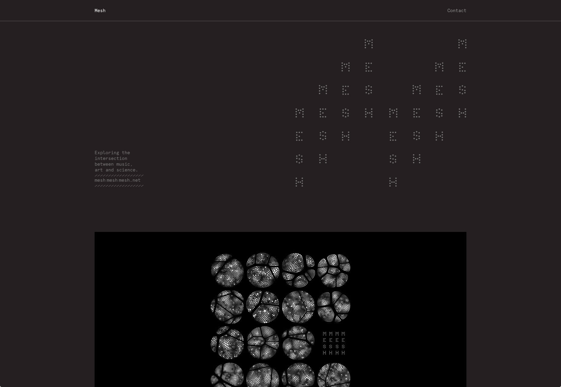
Mesh Mesh Mesh is our monthly reminder that just because it uses monospaced type does not mean it’s brutalist. It’s also yet one more fabulous example of telling the user a lot without inundating them with information.
Alessandro Rigobello
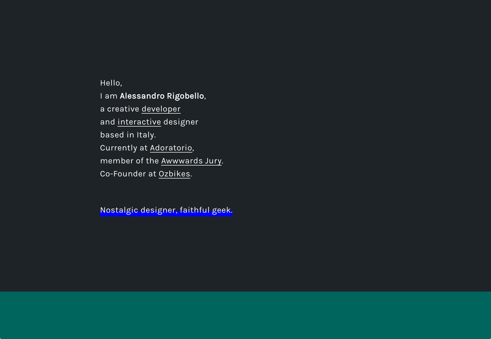
Alessandro Rigobello seems to rely first and foremost on typography, until you start to interact with stuff. I’m actually kind of partial to the background-animation made to look like old video. It fits the theme of the rest of the site, and provides a unifying theme.
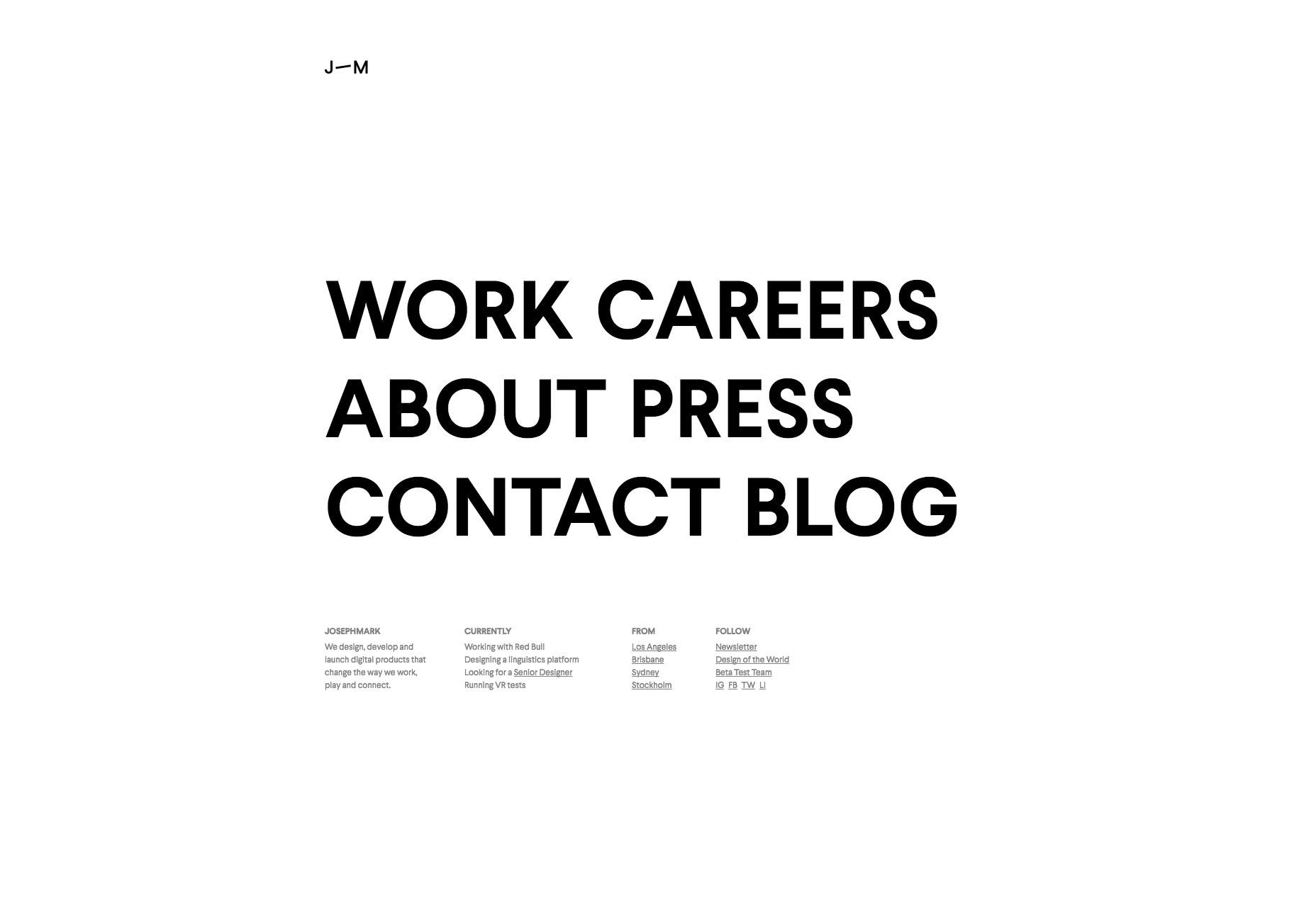
Josephmark
Josephmark (yes, the spelling seems to be intentional) is a digital agency that has embraced classic minimalism in a big way. Animation and motion design is their technique for spicing things up, mostly.
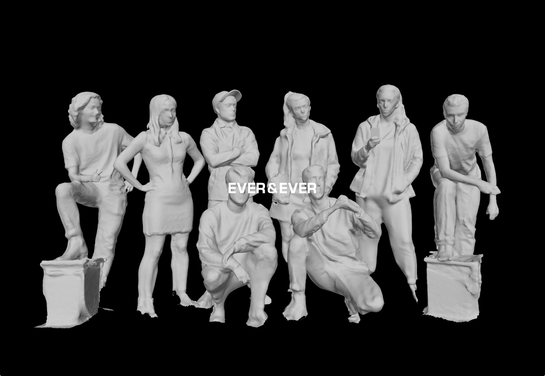
Ever & Ever
Ever & Ever breathes new life into a fairly standard dark theme by rendering the entire team of creatives as statues. It’s a theme that reoccurs in the site, and definitely gives it a “timeless” feel.
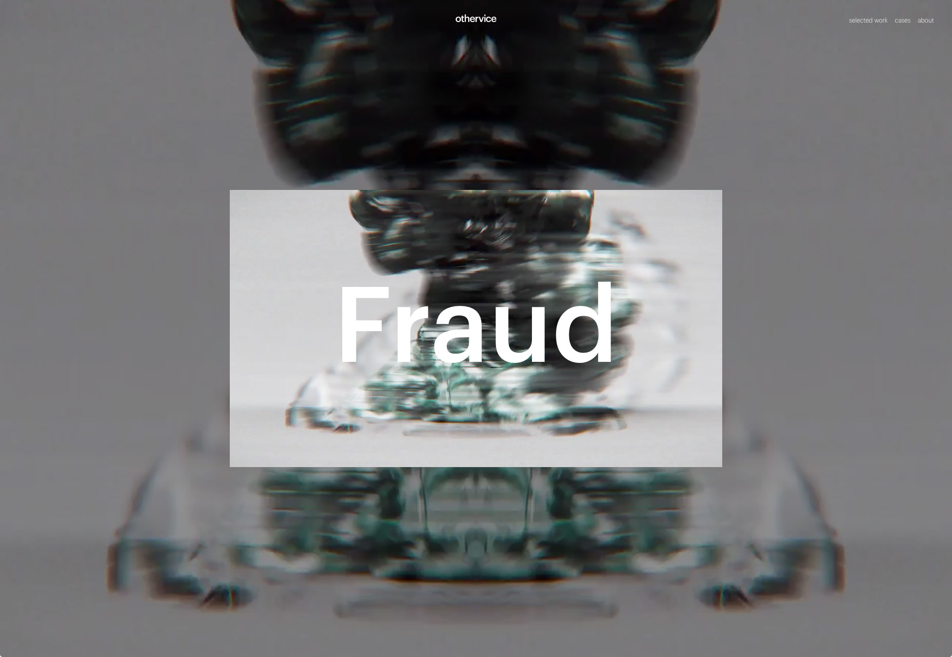
othervice
While many designers these days will temper a site’s modern aesthetic by mixing it with other trends, othervice goes all out. It’s everywhere, in the typography, the motion design, and the layout (of course).
While I’m certainly a fan of what can be achieved by designing trends, there’s something to be said for picking a theme, and going all out with it.
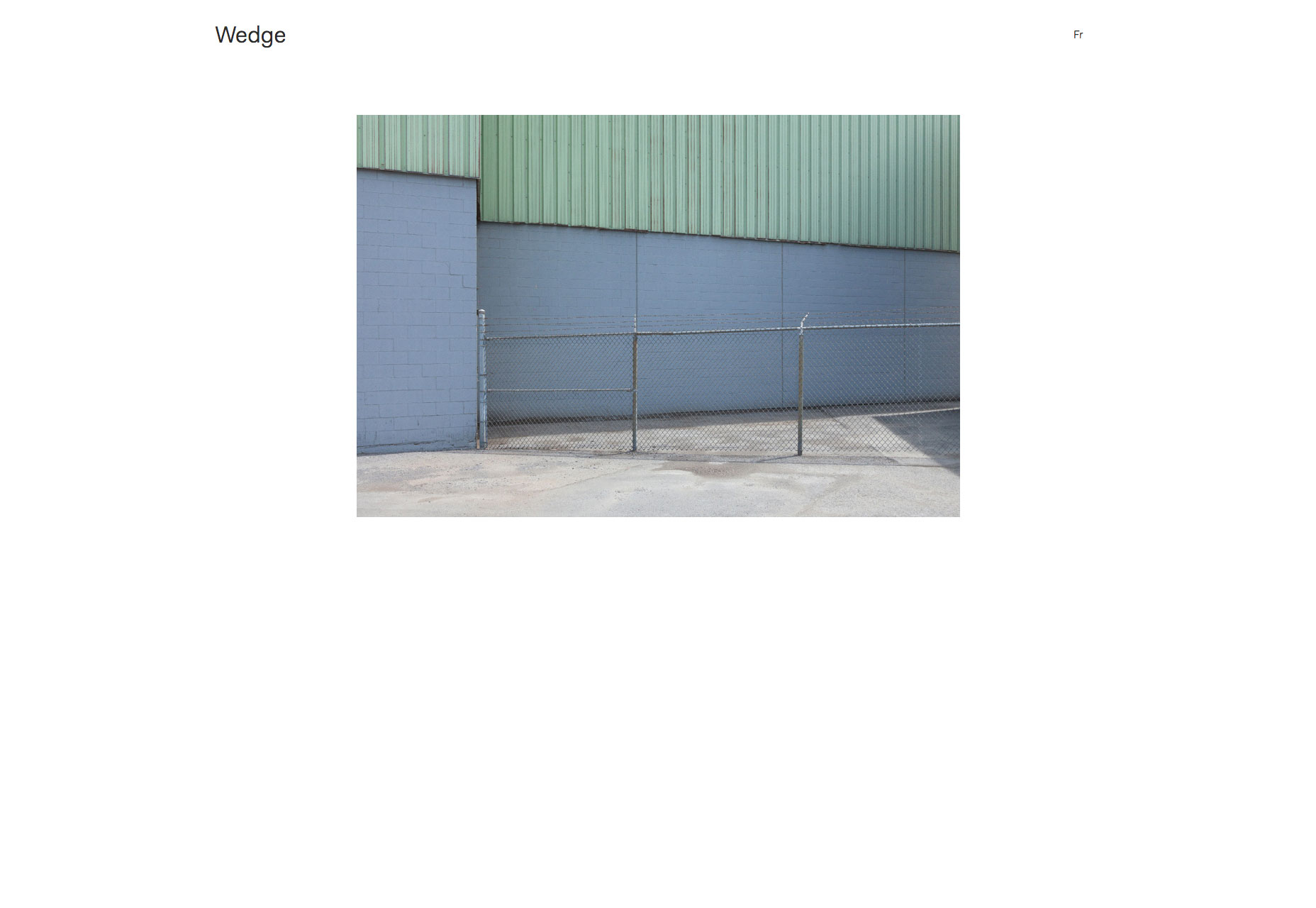
Wedge
I have slightly mixed feelings about Wedge. Let’s start with the good stuff: the design is clean, modern, and beautifully laid out. It uses a very familiar style of minimalism, but still has its own personality.
The downside is the cursor. In this case, changing the user’s cursor to a simple circle really doesn’t add any context or help for the user, and so is just a distracting change. For less computer-literate people, it might even be off-putting.
Otherwise, it’s a pretty site. Go look.
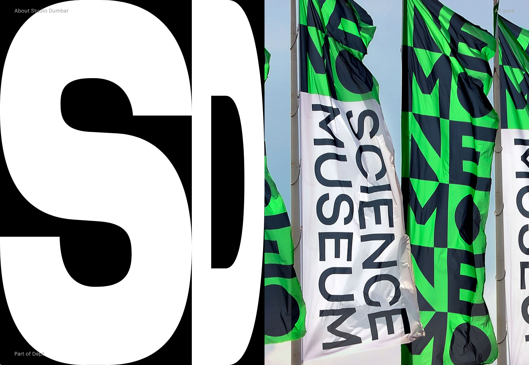
Studio Dumbar
Studio Dumbar shows off their print and other design work in a site that mostly just stays out of your way, but spices things up a bit with animation. The style of design closely matches the style of their work for a cohesive experience.
Some might say it’s a bit self-indulgent to have an entire page dedicated to your awards, but if I had dozens of them going back to the ’80s… I’d make a page like that, too.
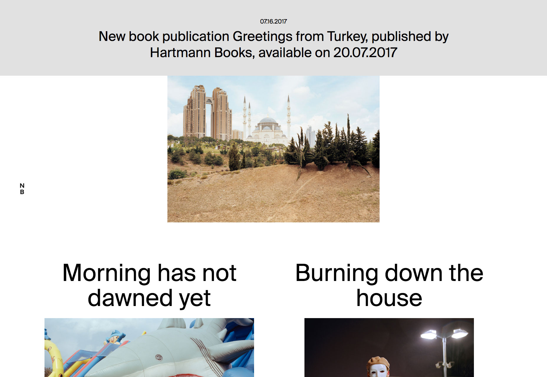
Norman Behrendt
Norman Behrendt’s portfolio embraces that post-modern, nearly-brutalist aesthetic that has all but disappeared from new sites. Not a fan of the circle-cursor thing as I mentioned above, but here, it only appears when hovering over portfolio links, so that’s better.
