21个优秀Responsive自适应设计工具网站
做为一个网页设计师,现在需要越来越多的自适应相关的设计,电脑、手机、ipad等不同宽度各种不需屏幕的需求设计,让人烦不胜烦。分享20余个工具型网站,可以自主检查、测试相应问题。可惜,都是老外的,国人这方面差的好远。
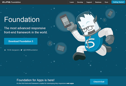
01. ZURB Foundation
ZURB Foundation is one of the world most accepted and advanced framework for a responsive site. A lot of resources had been spent by ZURB on the framework, in addition to the several effort that had gone to open source project on the framework.
ZURB Foundation has huge enhancement strategy, as you are allowed to increase the layer in complexity based on size of the screen and design capabilities. Not only that, You will also found a comprehensive library consisting of several UI component, making it easier for you to prototype any interface you can imagine.
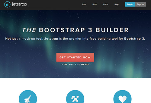
02. Jetstrap
There had been massive turn around in wed design process, as wireframe will not show how a particular design will look in several web environment. And coding knowledge is required to make use of some prototyping tools.
This is where Jetstrap comes. It allows designer to quickly assemble prototype simply by dragging and dropping components from the UI to the canvas. Frontend development skills are not required to start, and you will end up with a breathing web page. You only need to use the drag and drop tools on the interface.
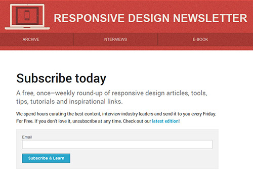
03. Responsive Design Weekly
Web developer Justin Avery spends time sending dedicated newsletter on resources, tools and techniques for responsive web design. As a designer, I spends part of my time on twitter reading feeds on responsive web design. Some of the feeds involve latest resources, and helpful tips on building a responsive web design. Joining responsive web design discussion from LinkedIn will surely improve you skill and get you latest ideas on current trends in responsive web design.
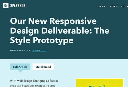
04. Style Prototype
Style prototype is an HTML page showing btn btn-primary style, typography, color, photography style, roll over and other elements for a propose site.
One of the main purpose of style prototype is to create deliverables which are useful and replicable. While there are no rules to building a style prototype, you have to include some basic elements, like btn btn-primary style, typography, color and roll over aside from other elements which can be included.
Style prototype allows you to add animation, color, and other elements in web environment.
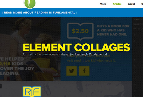
05. Element Collages
When creating full page mock-ups, one of the hardest thing we have to face as designer is the designing of the minute of each page. Professionally, it is advisable to spent more time designing the hero messages on homepage than spending more time on the rest of the pages.
As a designer, creating your site mockups in photoshop is not advisable with current trends in web development industry, as you have a lot of other things to do.
Founder of agency SuperFriendly Dan Mall had gone a step further in simplifying things with Element Collages.
Element Collages has a very good User Interface for visual exploration of interface components. Collages helps you in the visual direction, and you don’t have to create the entire component by yourself, considering the fact that you are not designing for just one device.
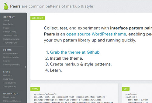
06. Pears
Some important benefits of frontend style guides involves, allowing for easier testing, better workflow, shared vocabulary, and serving as reference to keep coming back to. Pears is an open source wordpress theme created by Dan for creating guide to frontend style.
Pears makes it easy for designers to utilizes common library for a consistent design system.
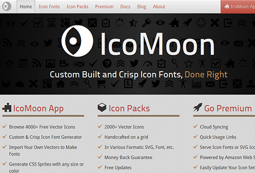
07. Icomoon
Retina and other high resolution displays are fast becoming order of the day, bitmap icons doesn’t scale very well with these high resolution devices. Thankfully, the web development industry is equal to the task.
The effective solution to this is to a create resolution independent icon, which can be achieved by creating custom icon font and embedding it with CSS @font-face.
Iconmoon simply makes the process of creating and displaying icon font easy. You will be able to choose from a library of icons, with options to upload your icon. From there, you can then generate you custom icon font and download a package that includes the font and appropriate CSS. When it comes to creating resolution independent icon, Iconmoon is an important tool.
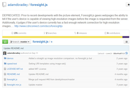
08. Foresight.js
Various devices has different ways of displaying bitmap images, but as a designer, you must have it in mind that that loading high resolution images can bulk up page weight. Foresight.js detects has the ability to detect device display and connectivity to determine whether to load hi-res components or not.
09. Detector
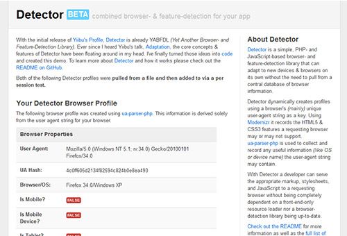
Device detection and profiling can be tricky a times, as device library are difficult to manage. Since, feature detection relies on client side detection, so solely depending on it can bring some limitation in flexibility when delivering functionality to wide range of devices.
This leads to creation of detector by Dave Olsen, using PHP script, and browser based on Javascript, along with a host of feature detection library. The library users modernizr and user-agent detection to determine device classes. Detector has the ability to adapt to new devices and browsers on its own without any need to pull from central database of browser information.
10. Enquire.js
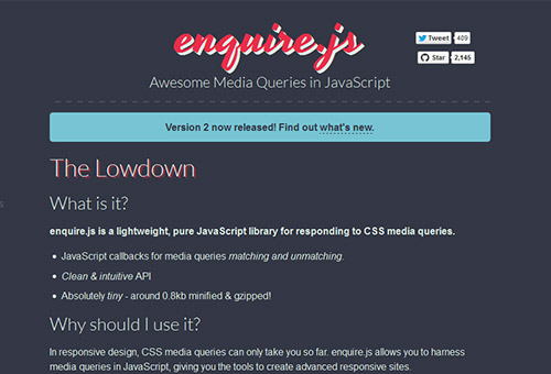
Every designer knows the important of using media queries in CSS. Then what happen when you want to alters some experiences at a certain point? These can be easily accomplished Enquire.js script.
Enquire.js script uses uses matchmedia to conditionally execute some functions, and load some script if certain conditions are met. With this you can expect better user experience and easy from users.
11. SocialCount
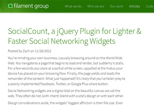
Loading social media share widgets such as Facebook, twitter and Google takes 19 HTTP request widgets and added additional 246.7KB to pages weight, this often increase time for web pages to load, and consumes more bandwidth.
Zach Leatherman addressed it by creating light weight solution, named social count.It is a small script that lazy loads social widgets, so that users are not penalized at all.
12. FitVids
Several media objects including videos are different when compare to images, in the sense that they don’t maintain some of their aspect ratio after resizing. This creates a scaling issue when viewing video from a host of different web enabled devices.< br/> Chris and other designer succeeded in developing a plugin called FitVids.js.the plugin is able to detect and use correct ratio of video or any other media objects when resize. With this, you can get correct resize ratio when your video is resize, and as a result get finely displayed media objects including videos in your applications.
13. IE-friendly mobile-first CSS
Every designer knows how important is media queries, but the fact is that internet explorer does not support media query. At the same time, as a designer, you cannot decide to do away with media query, just because you want to support old IE. This problem can be easily overcome by using Sass. Sass will help us to mobile-first styles, and at the same time provide appropriate desktop styles to old version of IE.
14. ish.
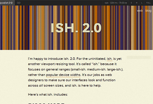
As a designer,if you check online to search for viewport testing tools, you will found many view port testing tools. But the issue there is that most of the viewport testing tools rely on popular devices widths such as 320, 768, 1024 and so on.
Ish classify and bring out general ranges (small-ish, medium-ish, large-ish, etc) just to make sure that your brings out the general resolution spectrum.
15. Proportional Media Queries
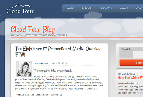
Some designers are still making use of pixel values to set breakpoints, while we’ve been using widths, measurement, and font units relative to various devices viewpoint. A good tutorial was given by Lyza Gardner which explains how we can use relative units for breakpoints to create better user experience.
16. MQTest.io
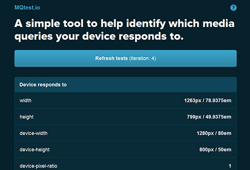
As designer, a times, it might be somehow daunting to track media queries that a particular browser supports. This is easily solve by using MQTest.io developed by Viljami Salminen. The tool will help you to recognize and analyze various media queries that different web browser responds to. With this, you might also be able to utilizes media queries which are not commonly used.
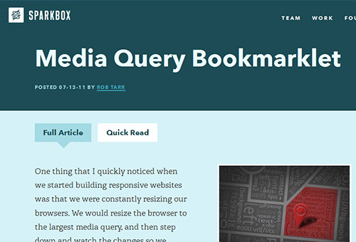
17. Sparkbox media query bookmarklet
Sparkbox is a media query bookmarklet which helps to determine queries for current media or media in use. It is imperative for designers to have access to screen dimensions, as it saves time and also helps in determining proportional media queries.
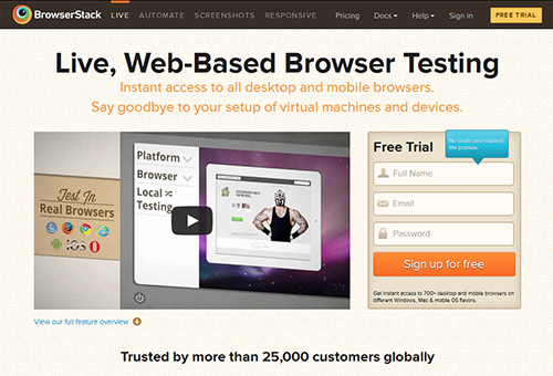
18. BrowserStack
As designer, we knows how expensive, challenging and even daunting it can be when it comes to testing in a representative stack of browsers and devices. This is easily solved when we make use of BrowserStack.
Browser stack provides remote access to several devices and environments, thereby allowing you to do some quality assurance testing. BrowserStack is as impressive as anything as it is also effective when testing on old versions of internet explorer.
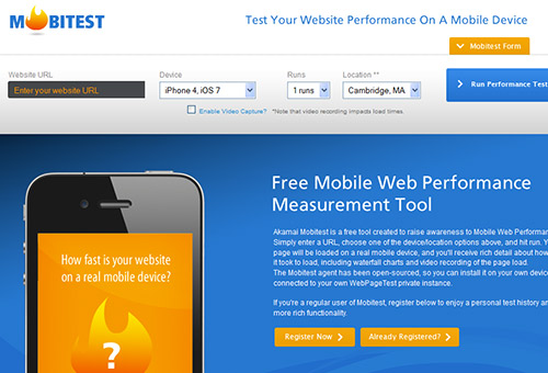
19. Mobitest
Performance is one of the most essential aspect of web design. With Mobitest, you will be able to see how your designs are performing with some analysis.
When testing your design on Mobitest, you only needs to enter a web address, after which the tool displays the site on a real device, and at the same time gives you a lots of performance statistics, as you will also be able to know load time, and average page size along with other statistics.
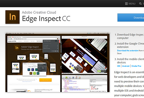
20. Adobe Edge Inspect
The importance of testing on a real device cannot be over emphasize for a web designer, as you need to see and analyze the kind of performance your design will bring to a user prior to publishing. An Adobe Edge Inspect had made testing on real device very easy and straight forward, as you have the tool auto-refreshing all connected devices. You are also able to test code on wide range of devices.
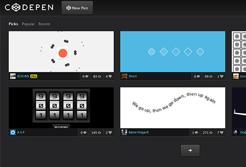
21. Codepen Pro
CodePen is a tool that quickly helps to demonstrate responsive patterns and techniques. It is a tool which also helps performance of our designs on different devices and computers, while still typing.
CodePen is a powerful tool which helps you to see the results of your code on multiple devices and computers as you type.
