20个名星名人网站设计欣赏
国外的一些名人,都有自已的网站,或者是博客或者是论坛等。今天分享给大家20个名人网站,有年度最火明星ladygaga,还有像艾薇儿等。
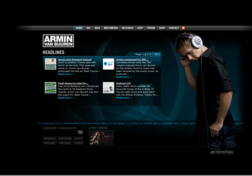
Armin presents himself with a simple design and some interesting background effects. The combination of black and white with some tones of blue is what Armin probably likes, in many spectacles he wears a white or a black shirt. Another interesting point is the complete menu that can direct to everything relating to Armin (from bio to shop).
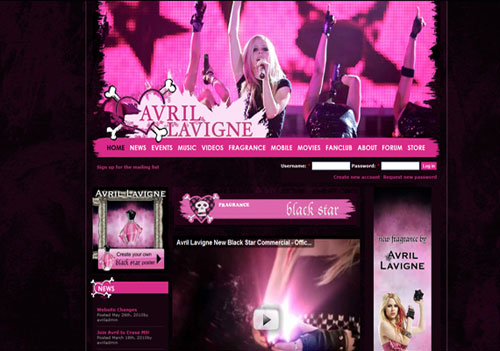
The black and violet background gives me a feeling of mystery which I believe is appropriate to her style. The header is very impressive, being in fact a picture of Avril. In the “News” section I found out that the singer will release a new website which will have more photos, videos and news. Hope to see it sooner!
3. Beyonce
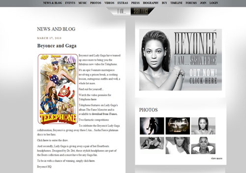
Distinctive for this website are the multilingual versions, and the fact that it has content adapted to a lot of languages which is of course a positive aspect. The background is gray and overall this website looks well.
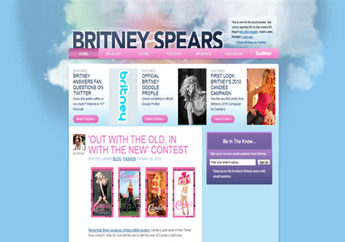
I like this websites (to be honest I really like the music of Britney Spears) but the blue background instantly reminds me of Twitter. The color combination is blue and pink which works well. What I like the most here is the “BS Alert” link; the great majority only has links to Facebook, Twitter or YouTube.
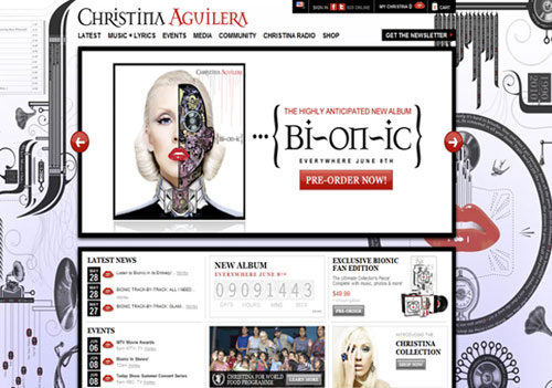
A super cool website. The background presents a futuristic look, probably as an avant-garde for the new album which will be released on 8 June. Another positive fact is that Christina has a radio and promotes it as a section of a website menu. Regarding the new album the promos are convincing so it will probably be a masterpiece.
6.Jay Z
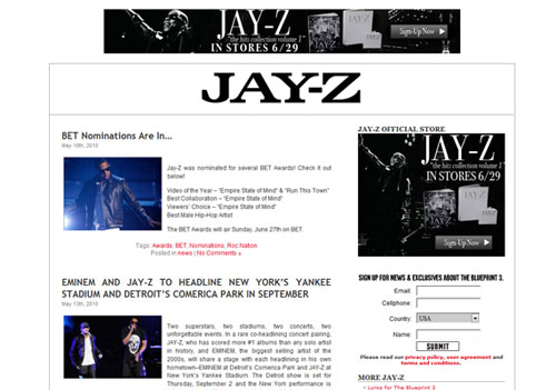
Jay Z has a very simple website, maybe too ordinary for such a well-known star. The menu is almost inexistent, I have nothing to remark, I almost don’t like it.
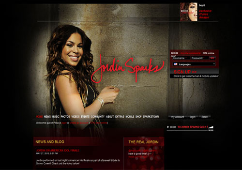
I really like this website; it has all what is needed to keep in touch with fans. It is well worth your while to go to sparkstown where you can find out more interesting stuff about Jordin and meet her most fervent fans and join their community if you share their views.
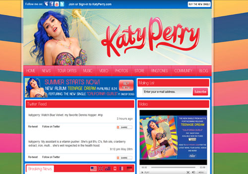
This is the most relevant website to the singer’s style. The background is a multicolor wall and everything seems to be a dedication to life and joy. The key of this website is the color combination of red and blue. The menu is very rich, information about what I want to find out is complete, so I see no negative aspect here. Nicely done Katy! (or Katy’s designer)
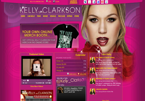
Kelly has a very nice website characterized by a good color combination and a typical menu. There is nothing to make you say “wow”, but overall gave me a good impression (or maybe the calendar with upcoming tour dates located in a central position gives a nice touch).
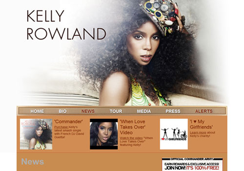
The website is based on a very calm color combination of brown and white, without contrasting (using color contrasts is specific to artists who use it to easier emphasize their message). The header is half a browser page and consists of a beautiful picture of Kelly (this picture will be the cover of a new release of hers, featuring David Guetta).
11.Lady Gaga
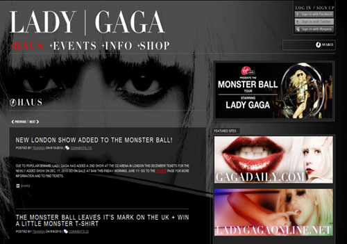
As I expected Lady Gaga’s website is exceptional, really a very good one. Right now she is promoting her new song “Alejandro” (I believe it is a good listen). A very positive fact is the dark background with slight shadows which inspires mystery and that is congruent with Gaga’s style.
12.Madonna
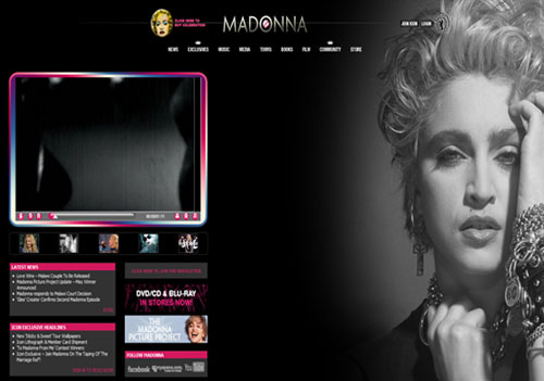
The website is similar with Lady Gaga’s. Black in most cases inspires elegance and this could be the reason it’s so used. Anyway Madonnas’ website is very nice due to the awesome picture situated in the right part of the browser.
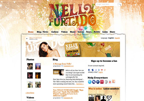
The website of Nelly Furtado is one of those websites that has nothing special, the color combination is very calming; everything seems to induce the idea of simplicity. In spite of that I like this (please let me know in your comments if you agree with me, I am probably very subjective because I love the music of Nelly Furtado). I should remark on the background, a mixture of warm and neutral colors giving a super cool effect.
14.Pink
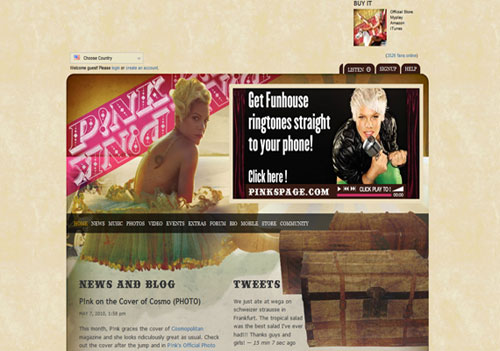
As spectacular as Pink is in her evolution and videos as calm is her official website. The brown background stressed the idea of quietness, small tents of pink giving some contrast. Simple and nice!
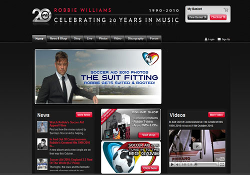
Robbie impressed me and I started appreciating him more than in the past: he is very involved in a project, more exactly he participates in a football game with many other stars to help children, the profits of this project being donated to UNICEF. The entire website is about this… (hats off to Robbie).
16.Timbaland
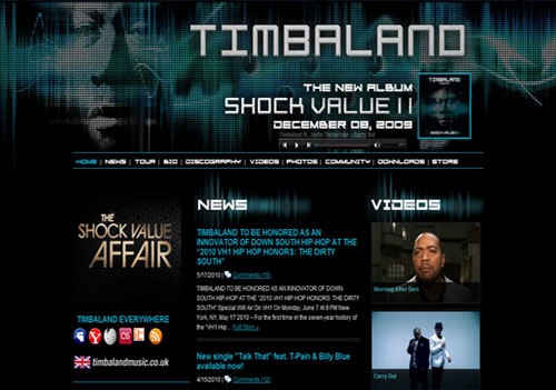
All the websites of music celebrities that I checked out centered on some new release…that is a sign that online has become a more commercial market than we expected. Timbaland presents his latest album as all artists, but he scored a great mark because of the section “Downloads”. Here the fans and visitors can download some wallpapers with Timbaland for free. Good idea!
17. Sean Paul
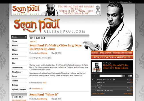
“Imperial Blaze” is the latest album of Sean Paul and the website is as you guess…imperial. Silver is the main color with normal sections, I do not know why but it gives me the feeling of luxury. Am I right?
18.Shakira
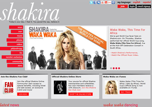
The website is very nice but doesn’t have anything special. What is really impressive here is the section “philanthropy”, please read it very attentively. Far from me the intention to make you buy her albums or become her fan, but she impressed me. Shakira wasn’t very rich in her childhood and she didn’t forget that. Good luck in your campaign!
19.Tiesto
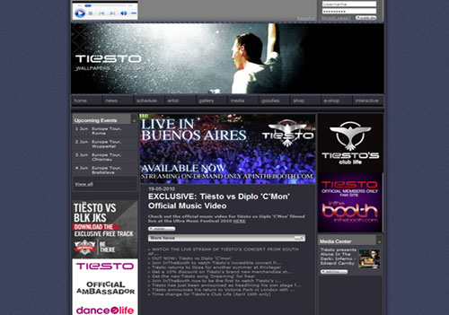
The website of Tiesto is professionally built and has no negative points, remarkable is the logo.
20.Dj Project
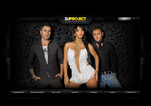
They are not well known over the world as the previous artists but the website is the coolest I saw (and I do not like Flash). Hope that you like it and enjoy my entire list!