25个足球俱乐部精美网站设计欣赏
牛B的足球圈子,牛B的足球俱乐部,牛B的足球明星……当然,这和我没有任何关系,笔者只是收集了25个大牌足球俱乐部的网站,长长见识。看一下,足球这项激情运动的网页设计理念。
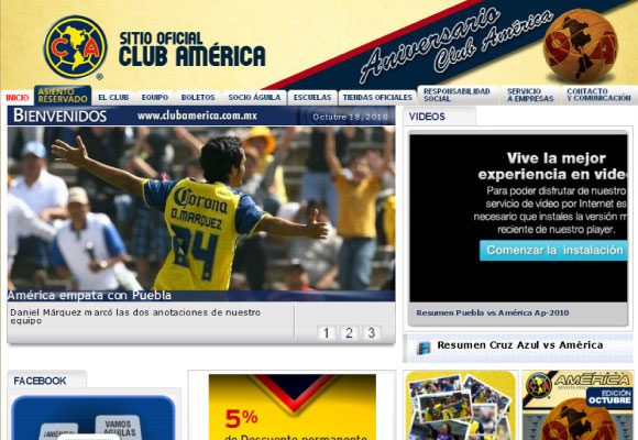
The banner alone is very good at conveying not only the club’s identity but their purpose also.
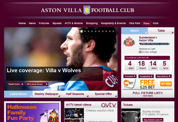
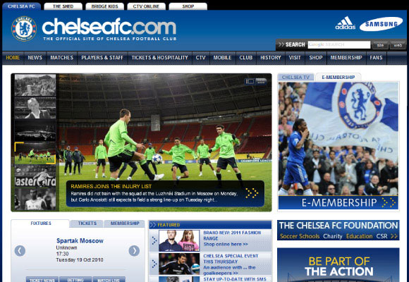
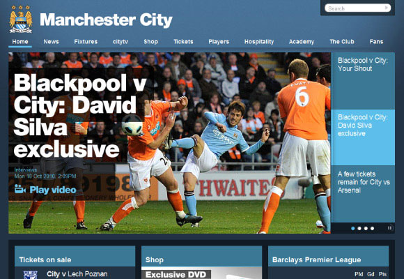
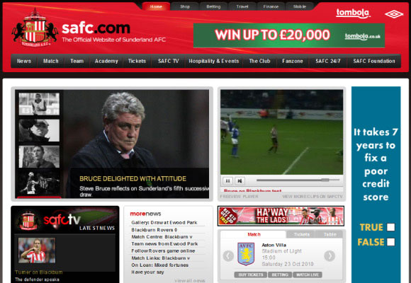
The English club takes a very classic approach to its website, it’s appealing not only because the content is structured clearly. Arrows are used on the interface btn btn-primarys to helps suggest action and movement. The subtle use of gradients and high quality images help to give added value to the design.
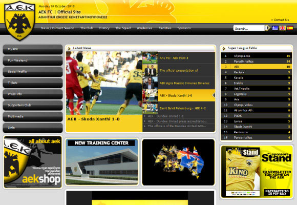
The Greek club manages to create a very striking design. Strong use of the club’s colours (yellow and black) creates a contrast which in turn creates excitement. Unity is maintained in the layout through the rounded corners used on the interface elements.
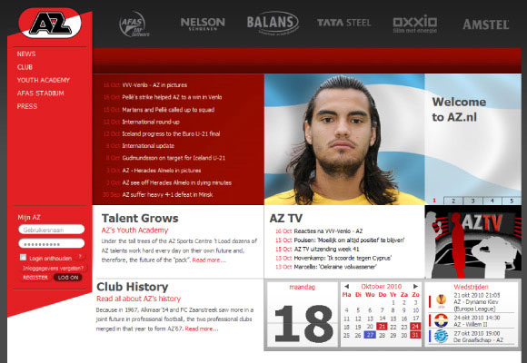
The Dutch club uses a grid structure to organise its site content with a mixture of colour blocks and lines being used to provide more definition. Its also demonstrates how sponsorship elements can be incorporated successfully into the layout.
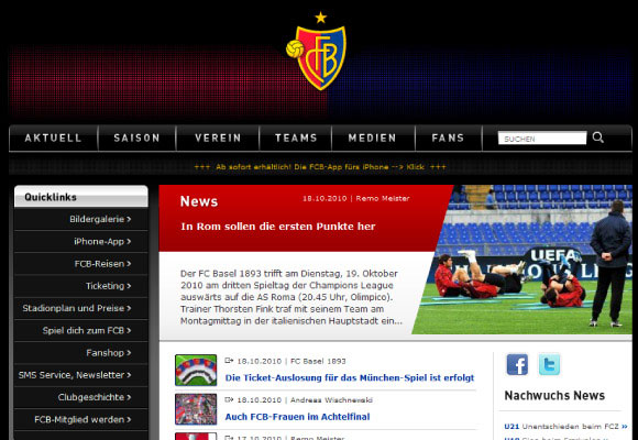
Although the team’s colours are represented in the header, the design uses mainly black to create a dynamic looking site. The Swiss club’s identity is maintained through subtle uses of their team colours but also by making the club’s badge stand out.
This is a very simple, yet still striking design. The layout is carefully arranged and reasonable space is left between elements to give a comfortable feel.
This is a good example of creating a balance between club identity and site content. The content structure allows for reasonable channels of white space to be used. This not only gives a clean layout but creates order and hierarchy through the blue backgrounds used on headings.
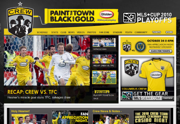
Contrasting shapes and lines used in the banner of this site help to give excitement. This is added to further through the bold use of yellow. The shape of the club’s badge also helps guide users to the most recent content.
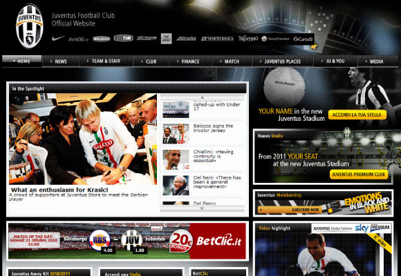
The Italian club creates a very busy interface which in itself creates excitement. This gives great contrast with the club’s badge which is presented simply against a black background. The image rotator is designed to present large amounts of news and information about the club.
Confident use of shape and colour helps to make this a successful design. Recent news is the main focal point of the site and is presented through strong, bold and vivid fonts and images. A strict grid is used to organise site content very effectively, this order helps to create a great sense of unity and is calming to use.
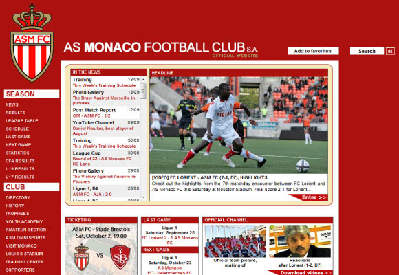
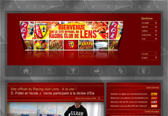
The French club uses a space to frame the main site content. As a horizontal navigation bar is used, users are drawn to the recent news and highlights area as the main focal point of the site.
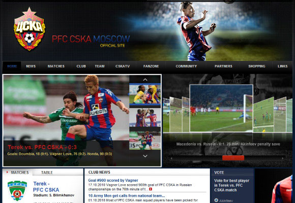
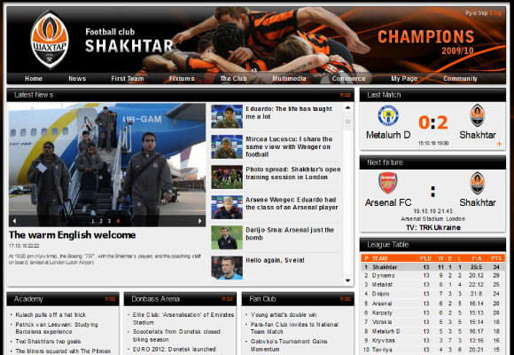
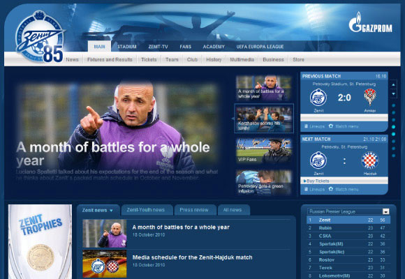
By using the club’s colours sparsely against large amounts of dark elements, the identity of the Russian club is maintained. A gallery of related videos is given high priority alongside recent news in the layout for fans to find quickly.
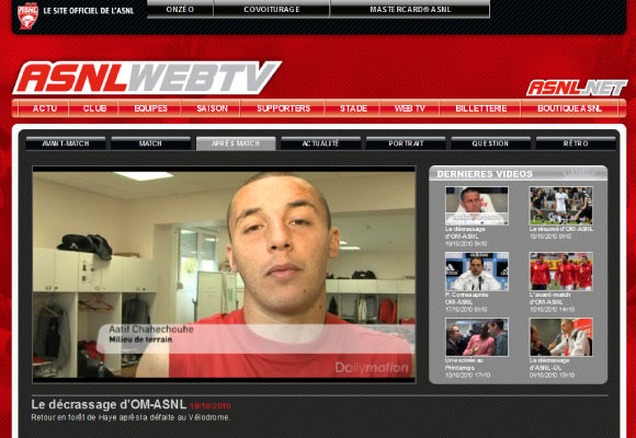
The French club makes its video content the priority of its site. A large video player is used to make this point clear. This is branded as “Web TV” to emphasis the site is an entertainment resource.
This is probably the most unique of the sites included. The banner area is used as a navigation tool and helps users find what they’re looking for. Content is organised using modules which makes the layout very clear to the user. A subtle rhythm is also created through the use of lines and arrows in the site content.
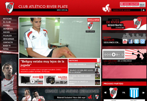
The Argentine club uses proximity very well to make layout elements fit together. The site’s banner helps to contribute to this relaxed mood by presenting the club identity very clearly and having unity with the other elements in the layout. Users are drawn to the site’s image rotator through it using high quality imagery.
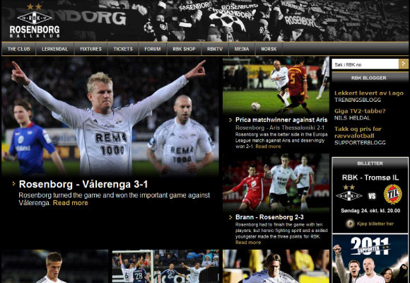
Norwegian club Rosenborg manages to integrate the banner image of their fans into both the layout and colour scheme successfully. This helps to give more weight at the top of the layout where the brand is established. Throughout the layout, photographic images are used frequently to help put the focus on the club in action. And the small touches of gold help to create a really successful accent colour in the design.
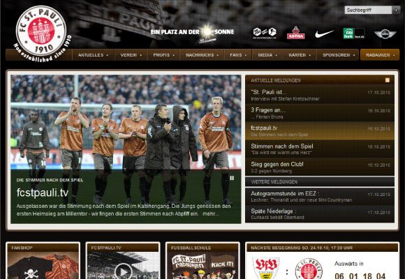
German club St. Pauli uses a very brave colour scheme. Again this is a good example of incorporating sponsorship into a prominent area of the layout. A big image rotator is also used to present recent news immediately.
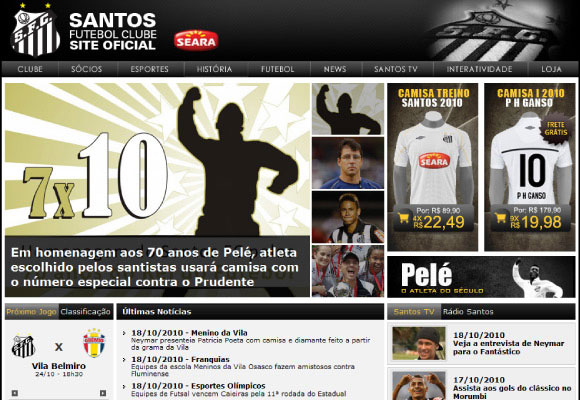
Strong black and white colour scheme gives impact to the site design. By incorporating a photographic image of the club’s badge in the header area emphasis on the club’s identity is also created. Like other club sites the captions used on the image rotator help to create an initial focal point to the site’s content.
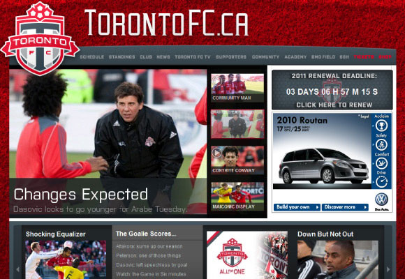
This is another good example of using one of the club’s colours more than another. By using black more frequently in the design, orange elements have far more impact and help to create hierarchy. Presented on the right are the club’s last match, next fixture and league table, making it easy for users to find.
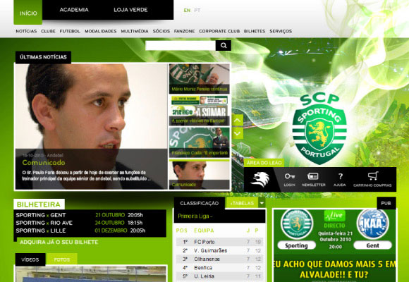
The Portuguese club uses an untypical layout that gives excitement. The strong use of green not only helps to maintain the club’s identity but also helps to present the elements clearly. By arranging the club’s badge along side the image rotator, it helps to draw users further into the layout and immerse them in the site.
Although this is a good club website, the green sponsorship banner in the header does take something away from the design. What is even more frustrating is the successful attempt to incorporate sponsors above this banner. Having said that, the overall aesthetic and layout is very good. The combined banner and navigation bar is very clear and content is very well structured.
The layout of this site fits really well together. Unity is created which allows users to navigate content quickly and easily. The club’s identity is presented strongly through emphasis on the badge which overlaps and contrasts with the navigation area.
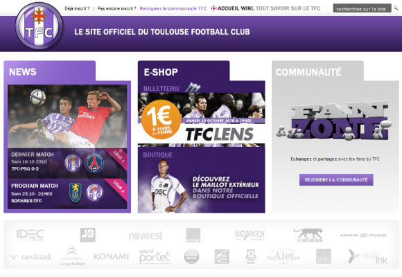
French club Toulouse uses an unconventional, almost minimalist design. Presenting only important information in three buckets. Sponsorship is presented at the bottom in a mute grey colour so it has very little if any effect on the overall design. By using mainly white and purple the design is left clean and uncluttered.
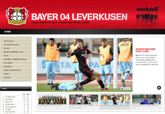
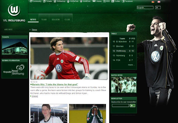
The German club has a very clever way of incorporating advertising on its website. Instead of presenting sponsors logos as separate elements, photographic images of players are used instead. This has the advantage of displaying sponsorship without spoiling the design because they’re part of the club’s strip.
This site uses a mixture of rounded and square corners to create contrast. By using solely club colours, a strong sense of unity is created between the design and the club itself.
