26个超级简洁网页设计欣赏
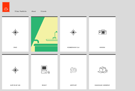
简洁已经成为一种网页设计的趋势,摒除掉华丽的图片、炫烂的色彩元素,还你一个干净而显得专著的网站。包括很多色调,灰色、淡蓝、绿色和橙色。
原文:It’s impossible to ignore that clean websites have become the top trend for web designers from all over the world. To honor this trend you are invited to browse through the most beautiful clean websites we could find online. This time, we’ll focus on minimalist websites with lots of gray, because along with the clean style, gray is very popular with modern web designers and developers. At the same time we’ll show you that a light and a clean website is not necessary a white website. Gray is another color that makes web designs look clean and neat, but also adds some shade and maybe even mystery. As for the colors that work well with gray these are light blue, green and orange.
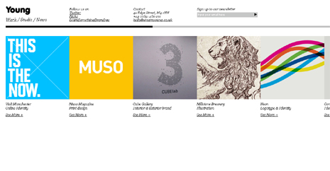
weareyoung.co.uk
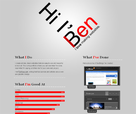
benlind.com
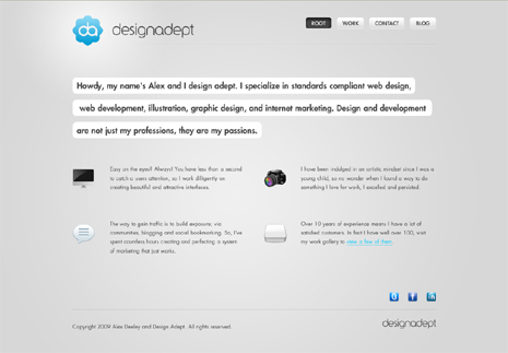
designadept.com
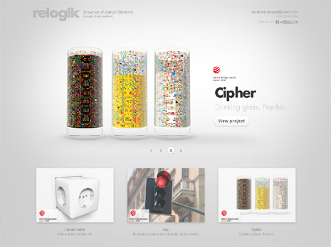
relogik.com
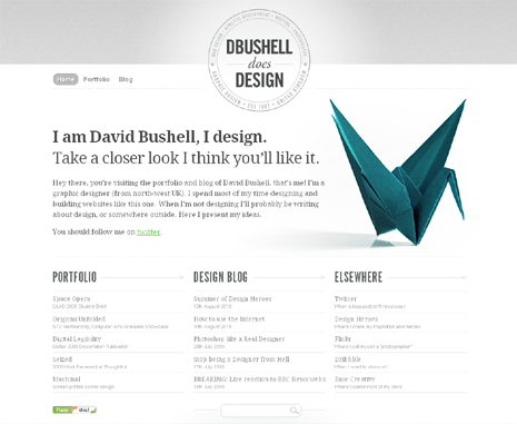
dbushell.com
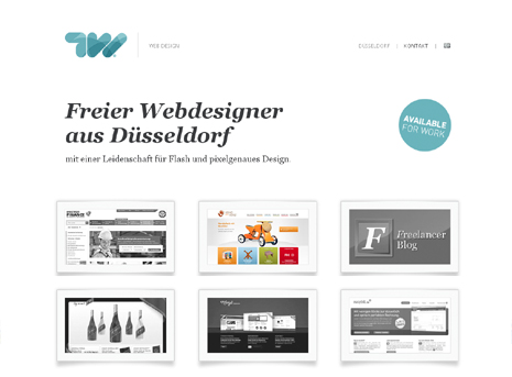
tobiaswenzel.com
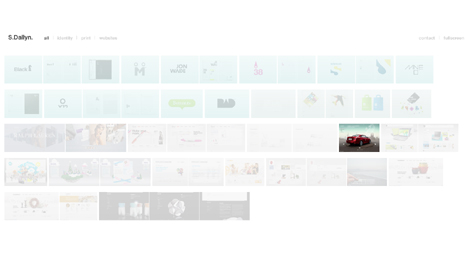
samdallyn.co.uk
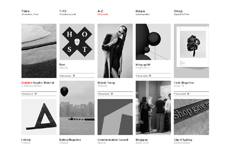
toko.nu
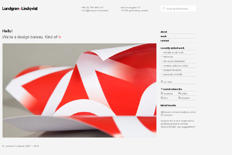
lundgrenlindqvist.se
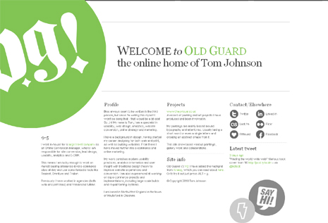
oldguard.co.uk
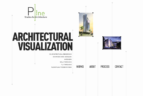
plinestudios.com
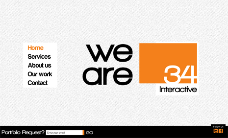
34interactive.com
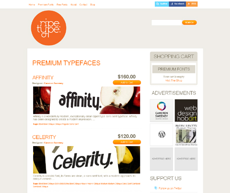
ripetype.com.au
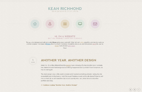
keanrichmond.com
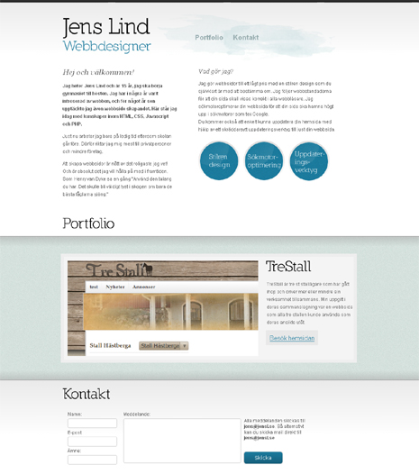
jensl.se
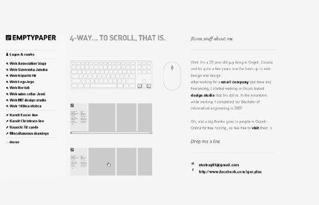
emptypaper.net
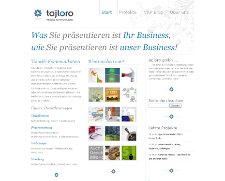
tajloro.com
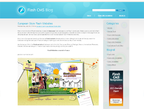
topflashcms.com
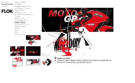
flokdesign.com
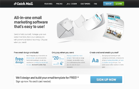
catchmail.co.nz
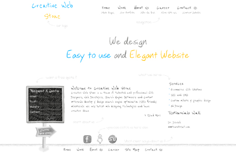
creativewebstone.com
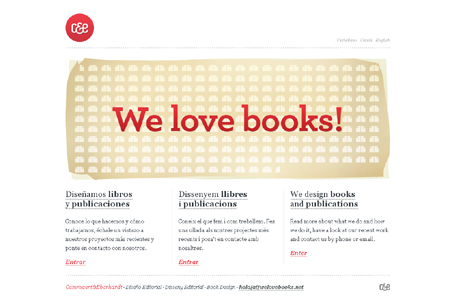
welovebooks.net
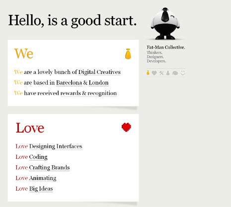
fat-man-collective.com
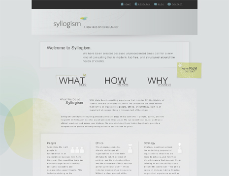
syllogism.co.uk
haikavanian.com
