27个优秀博客网站设计欣赏
In this inspirational showcase article, I collected a little bit different blogs – usually blogs serve for one purpose – design or function. Just a few blog designs fulfil both important tasks, I thought I will find a lot more design suitable for this article before I started.
Here you’ll find a lot of beautiful simplicity and functionality where design really works and matters! Enjoy and hope you will learn good things from those blog designs and implement in your own designs as well!
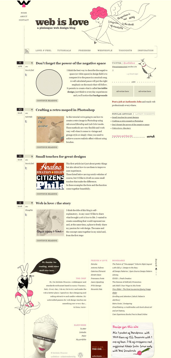
1. Web Is Love
You will find just a few colors used in this layout, effectively used whitespace, cool hand-drawn illustrations and little icons. Unique concept.
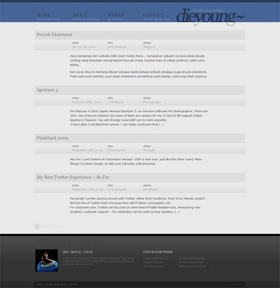
2. 15 June
Very clean landing page without any images, but visit his individual posts as well, you’ll see unique styling and change of navigation color!
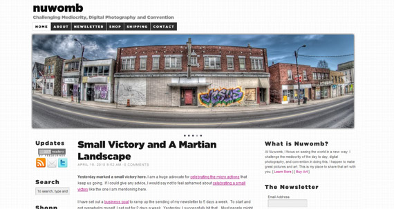
3. NuWomb
What I enjoyed the most was a little touch with textured background and featured slideshow putting all main content above the fold. Only I think since middle section is so long, designer should have 2 column layout not 3 to give more space to actual article. It’s good to have the most important information on “above the fold” section though (RSS subscribe, newsletter, shop).
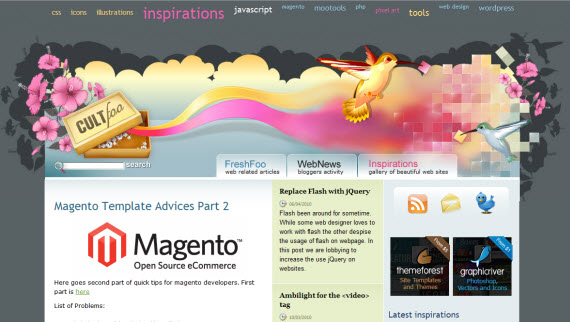
4. Cult-F
This blog has excellent header to show immediate creativity, not sure though if it’s not too big. Navigation is very interesting – when you scroll down, navigation cloud moves with you – idea is great, I felt a little bit disturbed since I am sitting on my laptop with little resolution, but this is a great way how to increase pageviews I think.
Here I enjoy the most little, silent Twitter,Facebook, Delicious and RSS btn btn-primarys – every designer will notice and evaluate this approach!
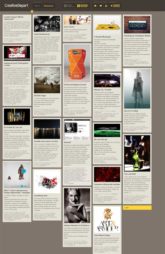
Interesting approach – you can switch between grid/normal modes and choose which layout works better for you. At least for me – I feel appreciated, like I have some kind of modification possibilities and personal touch.
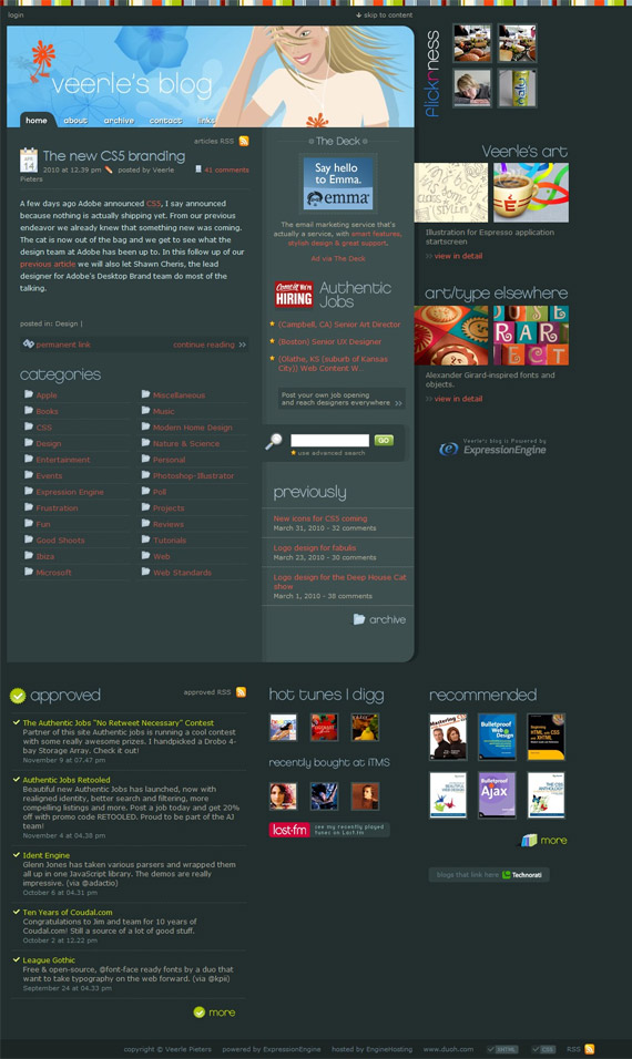
Great example showing how it’s possible to consume a lot of different information in good way. All those little icons, header and light typography just creates right accents and makes layout interesting.
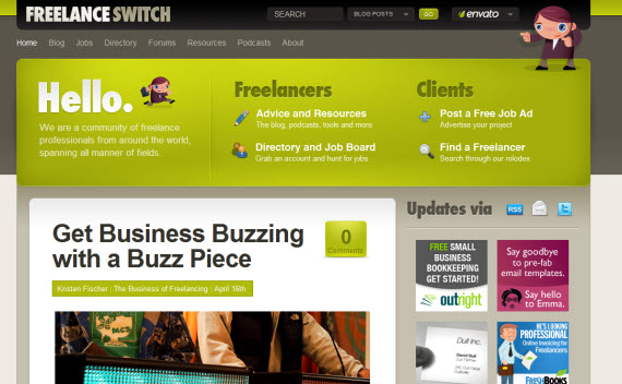
Every site in Envato network is designed in smart and very effective way. Watch out how they put the most important information in above the fold section, but in the meantime they emphasize effect with big typo, self describing icons and cool mascot!
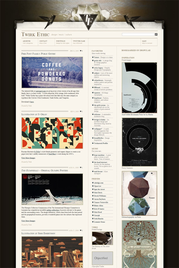
Beautiful simplicity – can retro style be any cooler? Excellent 3 column layout consuming a lot of information in visually appealing way.
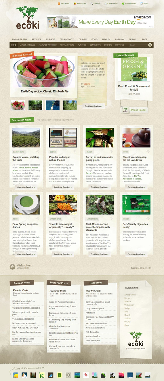
10. Ecoki
Is it possible to be any more cleaner and grid based? Such eye-candy and so effective design!
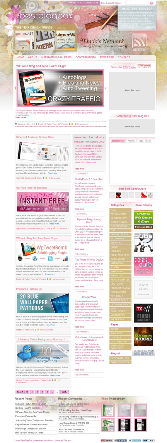
11. Best Blog Box
Visually and content rich magazine type website – on index page you will find a lot of different articles to grab your attention in 3 column layout, but when you are in article, you’ll get even more space for article and just 2 column layout! Handy!
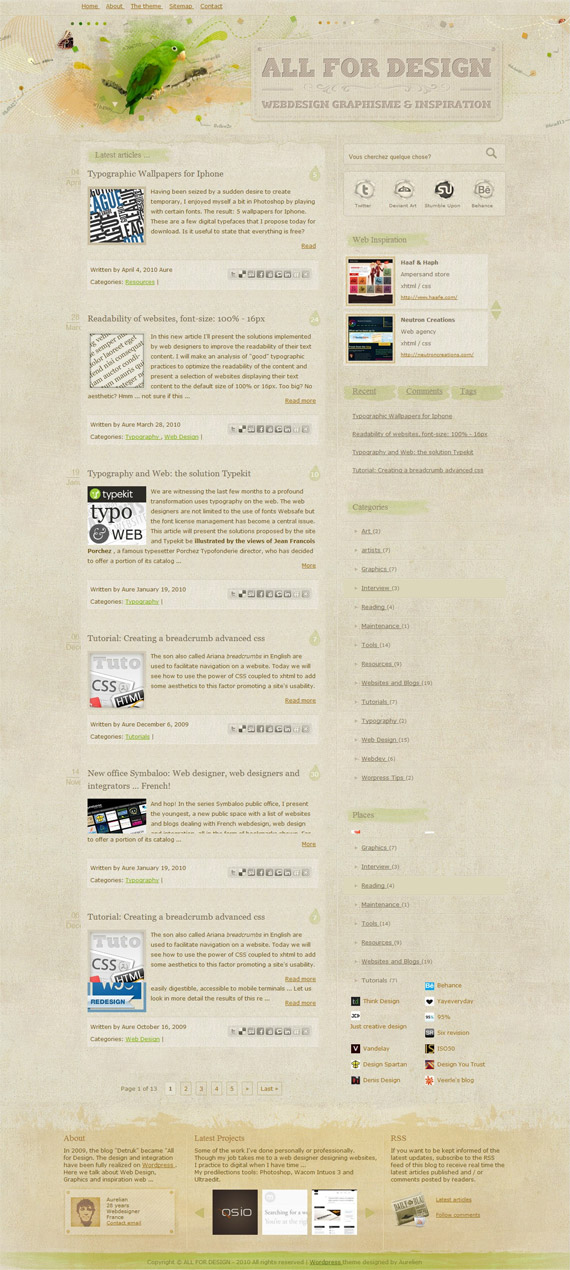
12. All For Design
Very clean and textured French blog design – I enjoy social networking mouseover btn btn-primarys and style throughout whole design keeping it clean, grungy – yet trendy. Visual beauty is emphasized with colourful “above the fold” header.
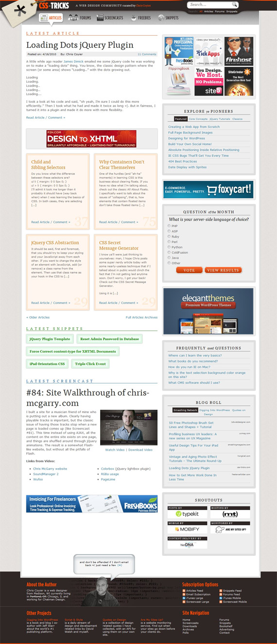
13. CSS Tricks
Close to perfection, Chris has many projects already and he advertised almost all of them in single landing page! Very functional website, only I think it needs more detailed sections, so people could find information more easier besides search and sidebar featured articles.
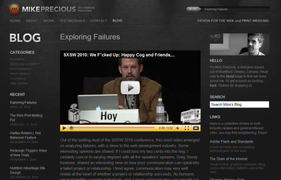
14. Mike Precious
One more great dark design!
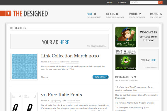
15. The Designed
Very often it’s good idea to just keep layout clean to be effective.
16. SquareSpaceBlog
Little rulers and transparent header creates an effective impression, I am not sure about sidebar but other than that – unique approach!
Besides colors, I enjoyed original footer and even more notice Search, which is only there! Good way of thinking – people scroll through site, don’t find what they want, but then notice footer and fat search btn btn-primary inviting to search for desired topic!
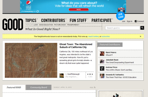
18. Good.Is
You can learn from this website, how to consume huge amounts of information and sections in good way.
19. Mashable
Mashable’s great design is huge case of study more from functional point of view (I would give a little bit more artistic look to it, but it’s social news site, not design blog).
I include whole index screenshot, because I wanted to show how many ads and information is consumed here, how mashable promotes their all social networks and really dominate there!
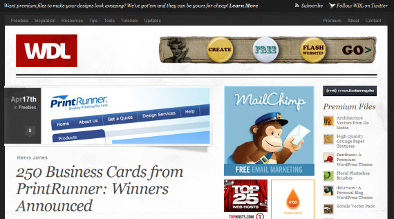
Henry Jones has given this 3 column site some great functional and visual features – beautiful featured images and a lot of small thumbnails in sidebar to grab reader (designer) attention and it works!
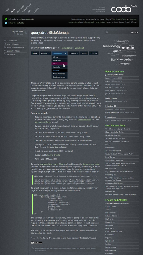
21. Coda
One of rare exceptions where I really like dark design! Design could be more functional, but it always depends from specific project – for them, I think, suits perfectly!
22. Think Vitamin
Beautiful light and functional design which works using just monochrome, orange and green colors in the right sections!
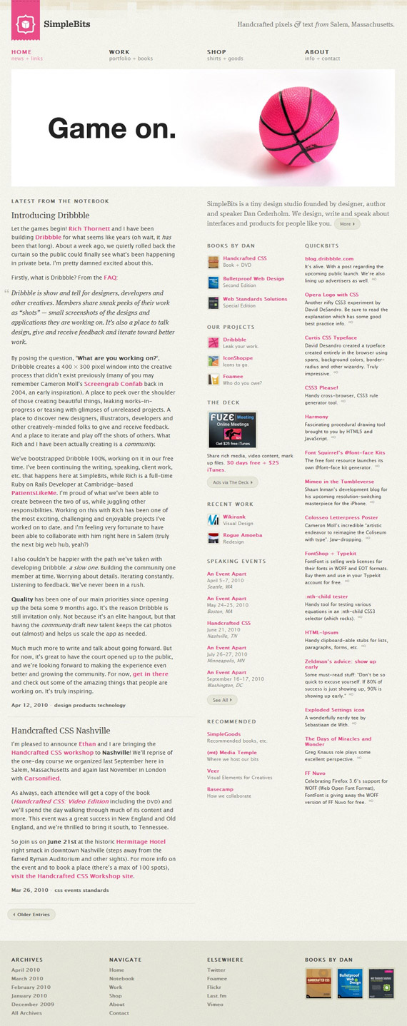
23. Simple Bits
Handcrafted pixels done effectively!
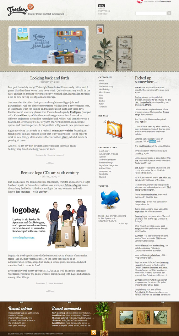
24. Freelenz
Little things matters and a lot of little things used in good way, create amazing website like this!
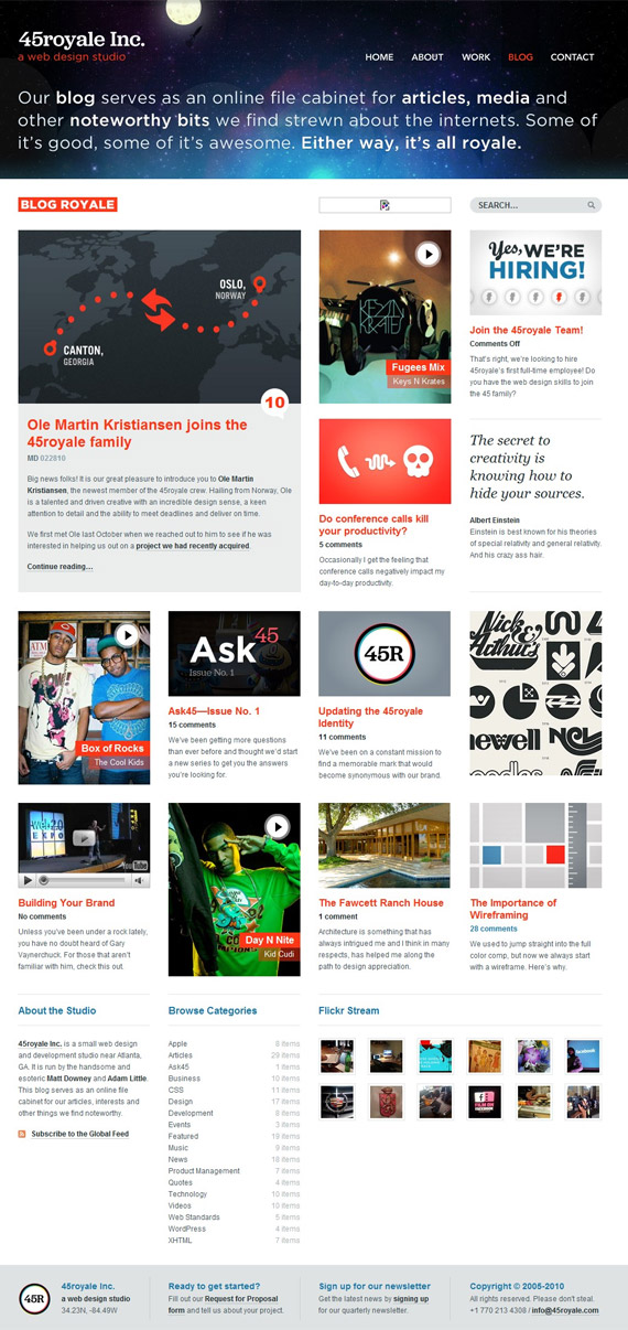
At first design seemed to be chaotic, but just after a moment I got a very good impression about its appearance and functions!
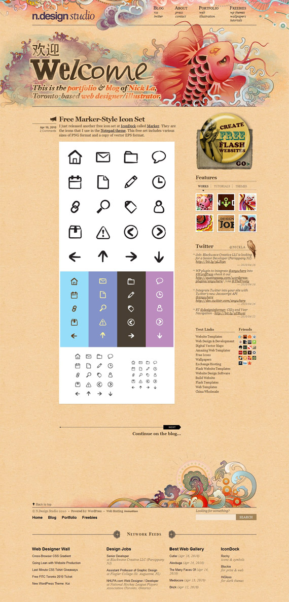
26. N-Design Studio
Amazing designer blog – extremely creative and surprisingly functional in the same time!!
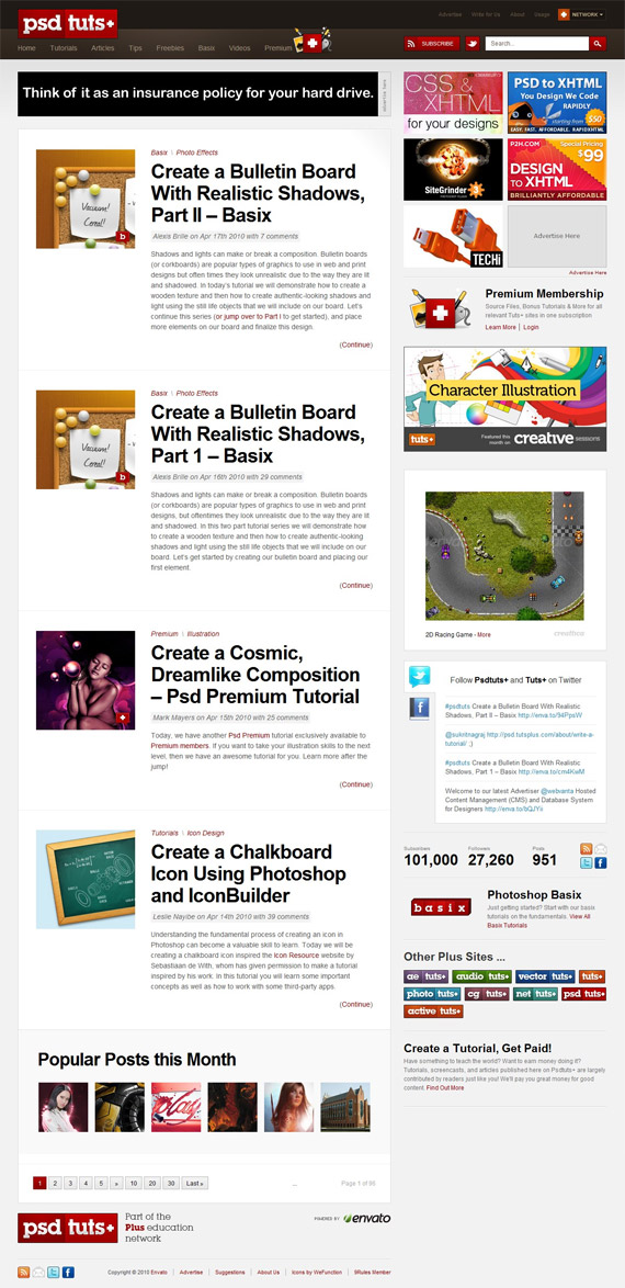
27. PSD.Tutplus
Not a long time ago Envato changed their network site designs – big case study, interesting choice of navigation, sidebar organization and great icons to make good accents!
转载自:http://www.1stwebdesigner.com/inspiration/blog-designs-design-functionality/
