30个精美大图片风格网站设计欣赏
使用一个大的背景图,可以让你的访客在第一时间,就对你的产品或个性产生印象。而随着网速的增加,为了彰显个性很多网站都采用了此风格,收集了其中精品30例,分享给您。
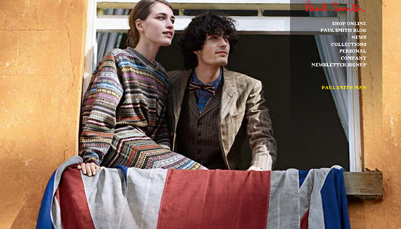
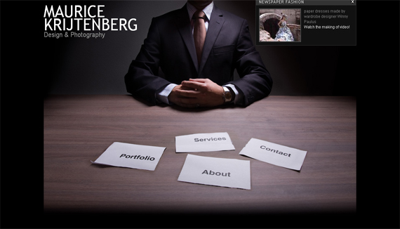
This layout looks fashionable and trendy. The photo background showcases their products at the same time it makes the page look nice.
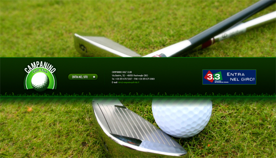
By the background itself, golf enthusiasts and athletes get excited of what this site could offer.
This layout showcases the cozy feel of the golf club. The scenic view on the background tempts the audience to come over and enjoy the amenities.
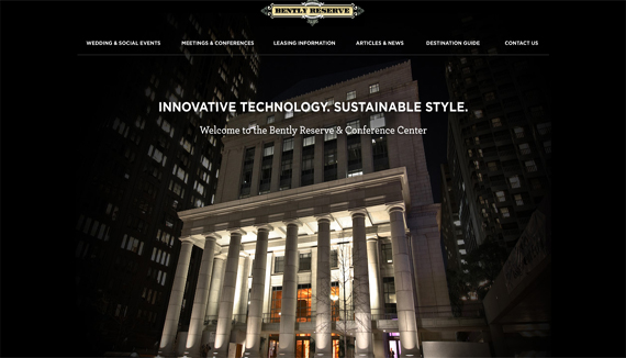
The strong background describes much about the site’s foundation and the kind of service they offer.
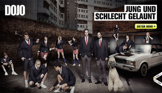
5. DOJO
As cool as the site is, this background is pretty catchy and innovative.
6. Old Loft
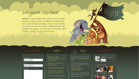
The fun & colorful background gives you that welcoming feel.
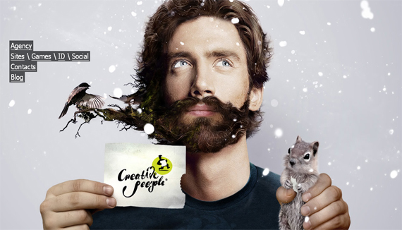
The unique background simply implies the content of this website.
8. Medis
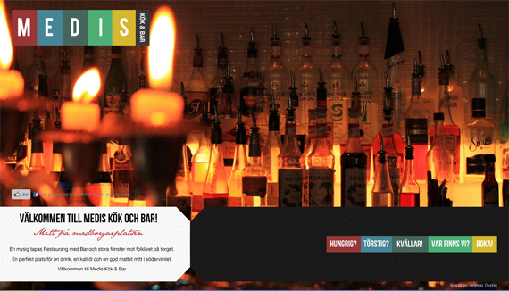
This background picture holds the mere idea of the site which is wining and dining.
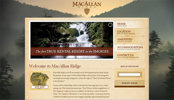
The large foggy background matches the template and goes well with the color scheme.
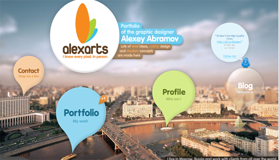
10. Alexarts
I love the great concept being put into this background. And with the additional customized thought bubble btn btn-primarys you can’t help but be impressed.
11. USAY
Color schemes and template goes well with the photo background. Added with a little touch of proper positioning of btn btn-primarys and contexts.
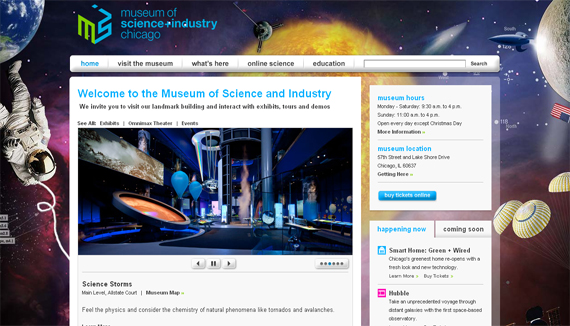
12. Museum of Science + Industry
The cool outer-space background says it all. It’s very science fictional and creative.
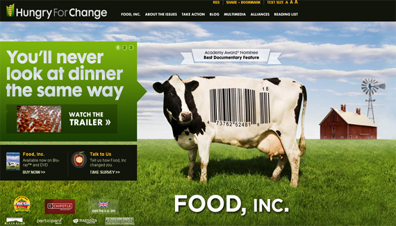
13. Food Inc. Movie
The big cow on the background is very attention catching. It makes you want to read more about the site.
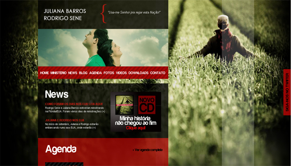
14. Julliana Barros
The great photo background has a very good composition. Templates are positioned very well and the typography is just right.
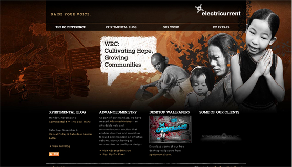
15. Electricurrent
The creative background is very compound and it delivers the objective of the website perfectly.
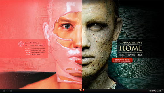
16. Gavin Castleton
This amazingly edited background makes you curious as to what the website is about. Using minimal typography, the site concentrates on the story behind the picture.
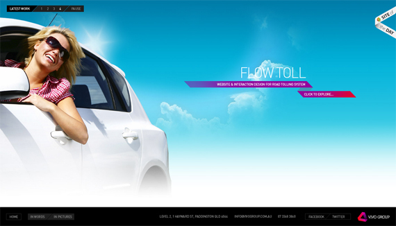
17. Vivo Group
This background contributes in acquiring that happiness filled-aura that the website is implying on the audience. Very bright colors are used and typography is minimal.
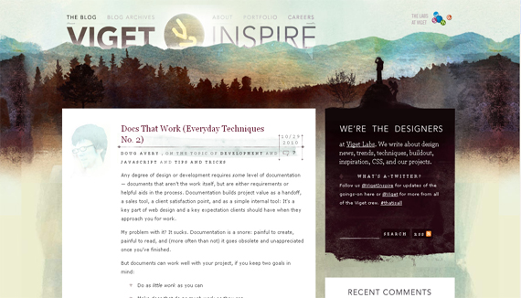
18. Viget Inspire
This example illustrates a lot about the developers of the site. Their creativity and uniqueness oozes out from this catchy background.
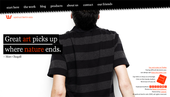
19. Upstruct
This one is simple yet bold. Gives you that strong impression about the site. The great color combination of color schemes and customized templates compliments everything.
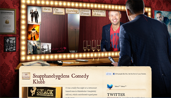
20. Hasse Bronten
Basically, the photo background introduces who the site is about and what it contains. This one has really cool templates and concept.
21. RingV Media
This is a perfect example of simplicity with a kick. It is very brilliant how the object in the image worked well with the layout.
Landscape photos are challenging because you need to match it with the right amount of color and design. This example pulled it off by putting smaller images in the middle that would compliment the background.
23. Davida Int
Talking about being minimalist, this design makes the background completely pop out. They showcase their product and make it the center of attention without losing the texts on the side.
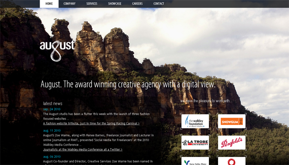
24. August
This is a tricky landscape background, applied with a good blend of color scheme, templates and positioning.
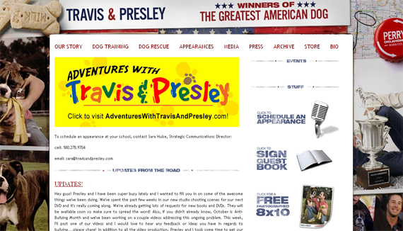
A collage photo effect like this is quirky. You need to compose the layout with great color matching and positioning so that it wont look messy and over crowded.
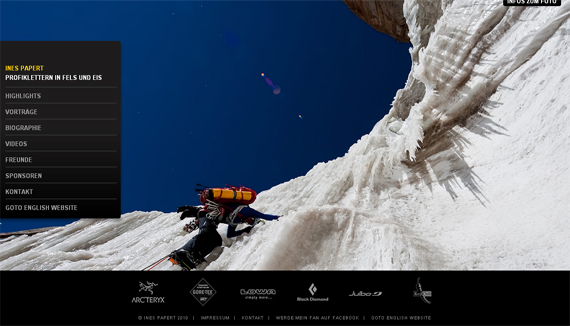
26. Ines Papert
This one is really striking. The angle of the photo background is remarkable & gave the layout a good view.
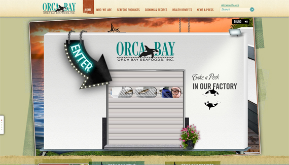
This is a great example of adding flash to the background. It is very customized and unique.
Another one of those good flash backgrounds. This one however, is a very edgy serious aura.
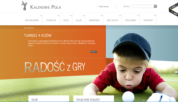
29. Kalinowe Pola
I like this one because the photo background tells a story which makes it interesting. Put together with great color scheme and positioning of templates it looks really good.
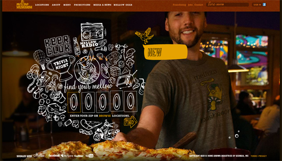
30. Mellow Mushroom
I always save the best for last. For me, this is what I found very impressive so far. It’s cutting edge flash effects and the background photo compliments each other. Worked even better because of the color scheme.
