30个精典网站导航菜单设计案例欣赏

经典网页设计 2010年07月15日

网站的导航系统,可以让浏览者在访问你的网站时,更快的达到他要的目的,更加需要分类清晰明了,最好让访问者做到一目了然。这是一个很难的地方,M4开博近半年,仍旧未找到好的解决方案。今天分享给大家30个经典案例,学而实习之嘛。^^

原文:A website’s navigation allows visitors to get from page to page and discover content. That makes it pretty important, I would say. However, some designers feel the need to experiment and try to be clever with navigation design, but when getting around a website becomes a puzzle, visitors will more often leave frustrated. A website’s nav or menu should look like a nav. It should stand out while still matching the rest of the design, and it should be in a location where users expect it. So to give you some inspiration in this area, here are 30 Examples of Excellent Website Navigation.

The Idea Lists

website navigation

Collision

website navigation

Tobias Ahlin

website navigation

Carbonmade

website navigation

dConstruct 2010

website navigation

Jeroen Homan

website navigation

Brizk Design

website navigation

Dribbble

website navigation

Buffalo

website navigation

TedxToronto

website navigation

David A. Molanphy

website navigation

Fully Illustrated

website navigation

Live Books

website navigation

Rich Brown

website navigation

I Love Dust

website navigation

Blue Sky Resumes

website navigation

Soh Tanaka

website navigation

Kyle Myer

website navigation

Yaron Schoen

website navigation

Unconventional Guides

website navigation

HAUS

website navigation

Christopher Meeks

website navigation

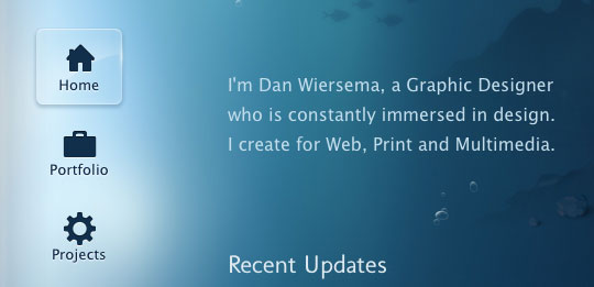
Dan Wiersema

website navigation

Williamson County Casa

website navigation

Marie Catrib’s

website navigation

The Design Cubicle

website navigation

Exclusive Reels

website navigation

AFD Folio

website navigation

Veerle’s Blog

website navigation

Drexler

website navigation

网友评论
Top