续_告别华丽_40个极简风格网站设计欣赏
我喜欢简单的生活,为什么?我喜欢简单的设计,为什么?就是因为“简单”,简约而又不失时尚的设计理念,使用大标题、大页脚、或一个flash、一个大背景图片再加寥寥无几的文字,这就形成了简约、简雅、简单。还有一个很重要的一点,就是颜色的应用。主次之间,层次分明……好吧,不叨B叨了,让我们一起欣赏他们吧。
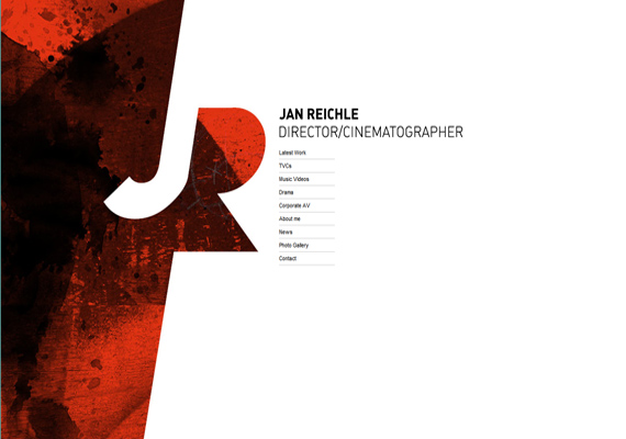
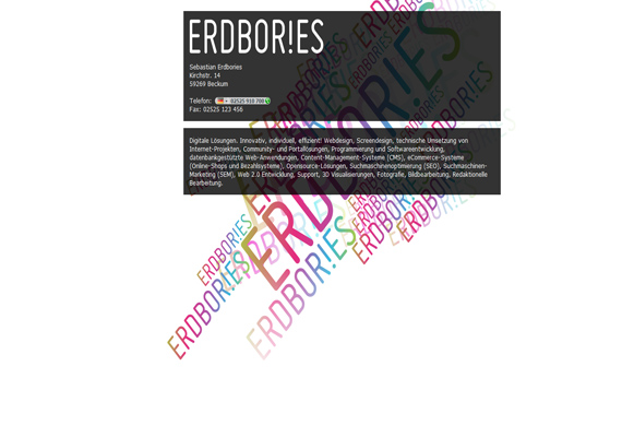
Simple but effective! It has an interesting background with a lot of white and an impressive multicolored shape to avoid flatness. The menu is simple, everything seems to be natural and calm.
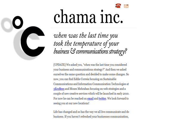
Mostly black and white, no stressed sentences, no highlighted paragraphs (except company name, email and twitter address).
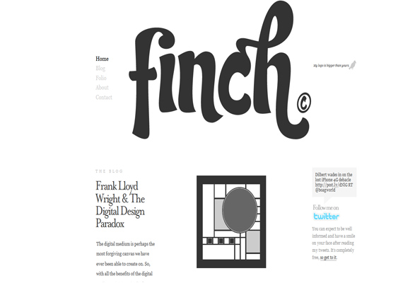
3.Finch
This is a little more complicated than the previous one…it has a menu and a picture! I like their motto “My logo is bigger than yours!”
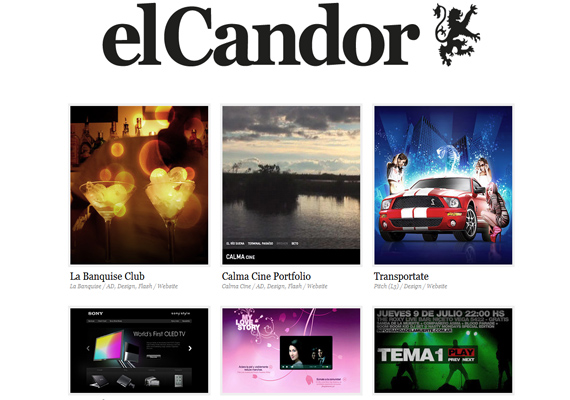
4.elCandor
Nice idea! They put a white and impersonal background to highlight the previous works that are full of color.
The header is almost impressive (I am subjective so you can have a totally different opinion). The black topside rectangle gives me the felling that some of the content is higher, which is not true. I consider it a hidden sense of humor.
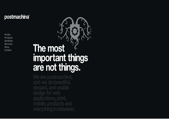
Not only white is suitable for a minimalism design. Postmachina created a nice layout based on black. You should also remark that the color of the font is gray.
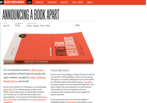
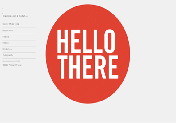
Red and white; enough to realise that the author is a pro. I really like the design of this site.
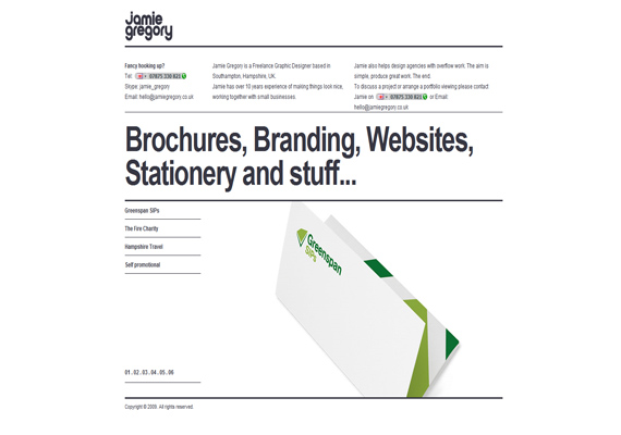
A very big title and the envelope confer this website an official attitude (but these are not the only elements which contribute to this look). I like it because of the colors, these are used where and how they should be.
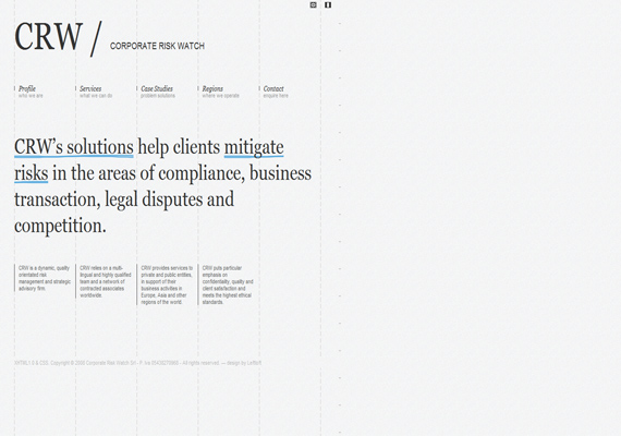
9.CRW
A nuance of gray is the background so it seems to be impersonal. To avoid this potential lack of personality the designer writes the content with a very big font. The final result: a very balanced design that looks pretty.
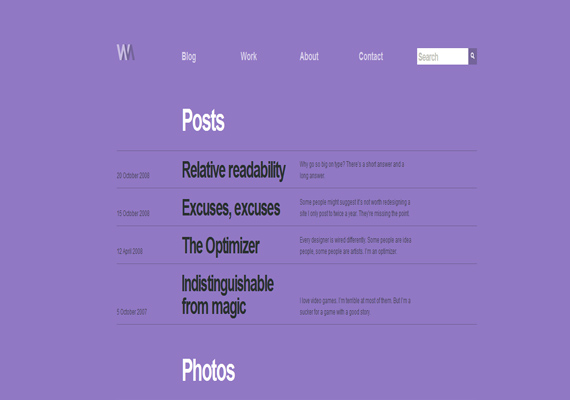
10.Wilson Miner
A seldom used color for backgrounds but that doesn’t mean the design looks amateurish. I like it and the creator has a good mark at originality.
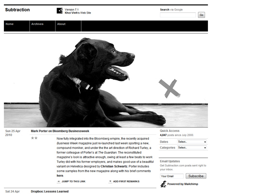
11.Substraction
Everything is black and white. The key of the design is the small “X” near dog. I think that without it the entire page looks somehow unbalanced. What is your opinion?
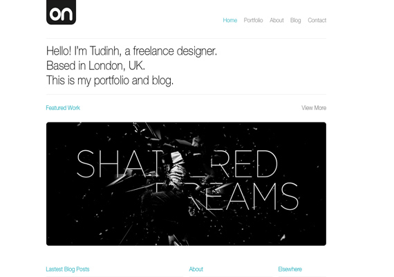
12.Tudinh
I will surely hire this freelancer should I need his services. It is a very good idea to emphasize what you have done and let the design of the site look natural and impersonal.
And if Tudinh, the owner of the previous website is busy the next one that I will hire is Sebastian. I thought that I would never say that: but a negative point for this webpage could be that it’s too minimalistic. If you do not have credit on Skype how can I hire him?
14.V Lourenco
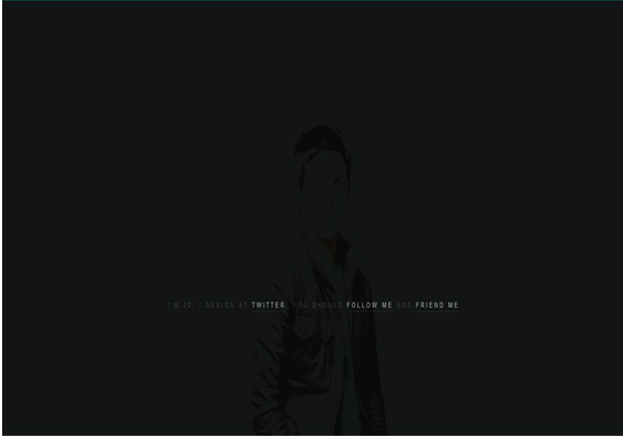
Once again, as a personal opinion is this not too minimalistic? The black background looks mysterious so it is more attractive than the previous.
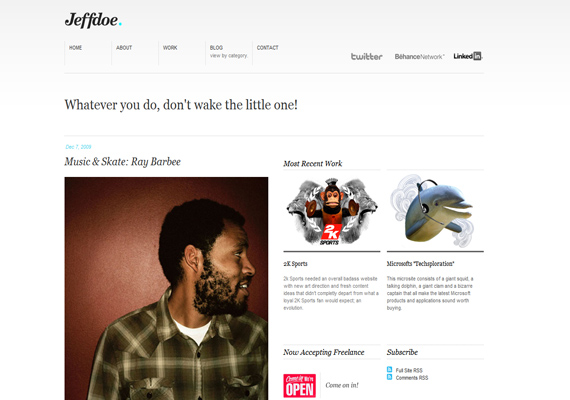
White background with some nice color combinations, so it is what I like the most. Good job!
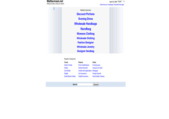
Mattiaviviani presents the situation in a non-commercial format; everything is clear and no hidden message. The blue is a very good choice.
17.Mike Ambs
Yes, I like your webpage! A picture, some links and let the white play its role!
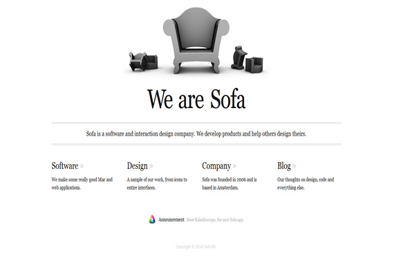
18.Sofa
A solution to avoid too much white space is to use big pictures, footer or header. They chose a big picture of a sofa, inspired by the name of the company.
19.Cabedge
It is one of the best websites I’ve ever seen. The orange line is perfectly situated and it’s the cherry on top.
This website inspires a lot of elegance and style. I could say that it is perfect.
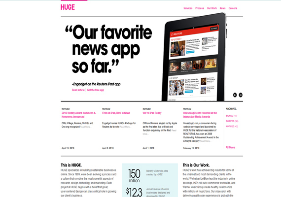
21.Huge
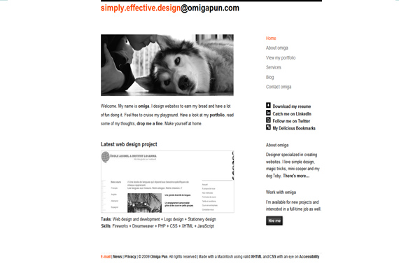
22.Omiga pun
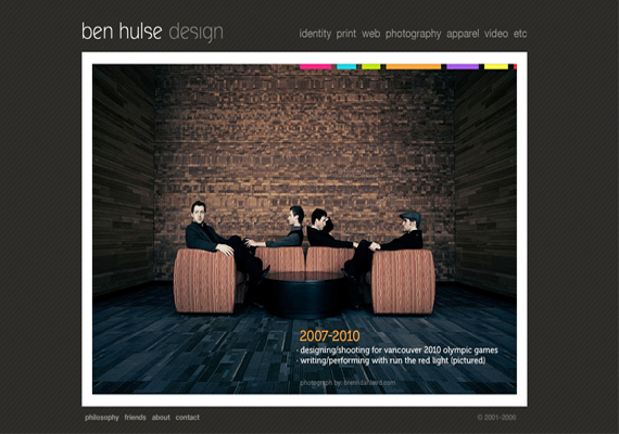
23.Ben Hulse
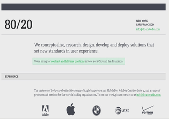
25.8020 studio
26.Skinny Ships
28.All day
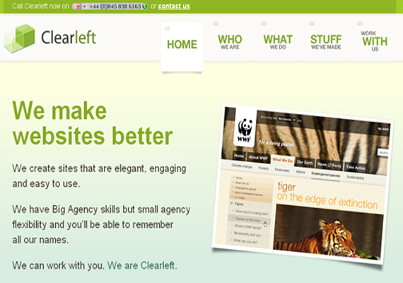
31.Clearleft
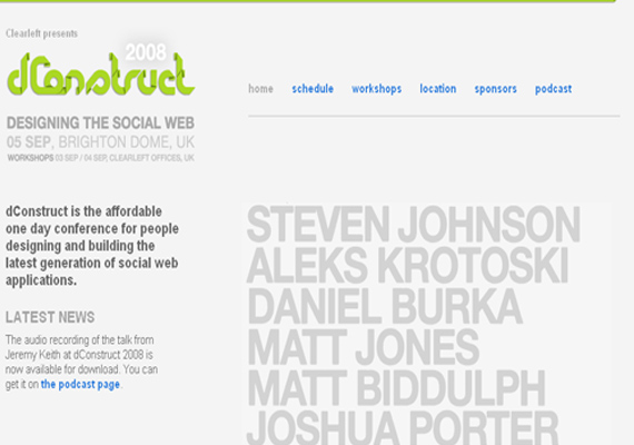
32.D construct
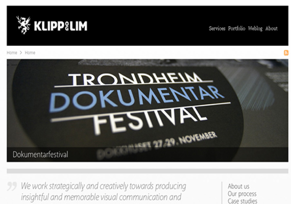
33.Klipp og Lim
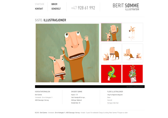
34.Somme
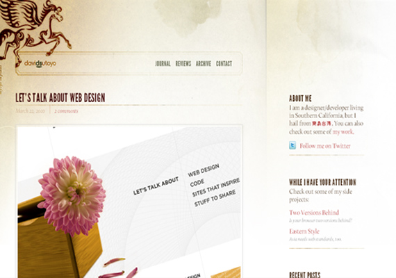
35.David Sutoyo
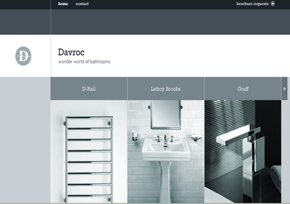
36.Interiors
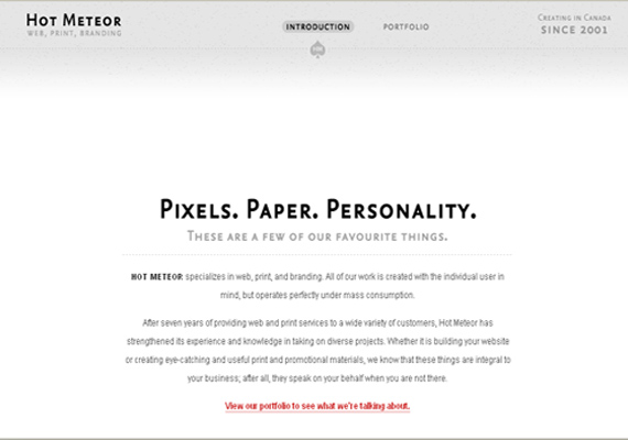
37.Hot Meteor
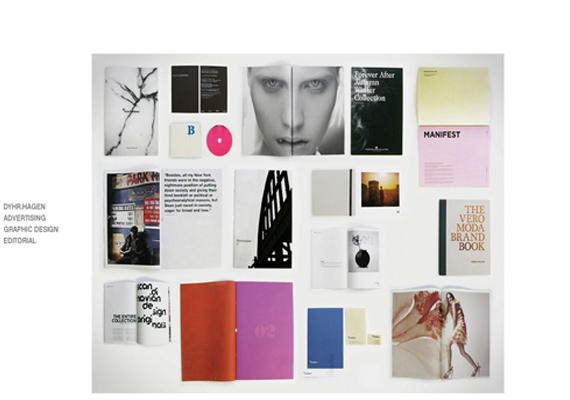
38.Dyhrhagen
40.Visual Box
