50+精美网页导航菜单设计作品欣赏
对于一个缤纷多彩的网站来讲,导航菜单的设计,永远是重中之重。不只能给用户带来或美观,或大气这样的第一印象,更深层的涉及到了用户体验,这个近年越来越热的词语。收集了国外设计师们50佳精美作品,我分享,所以我快乐。
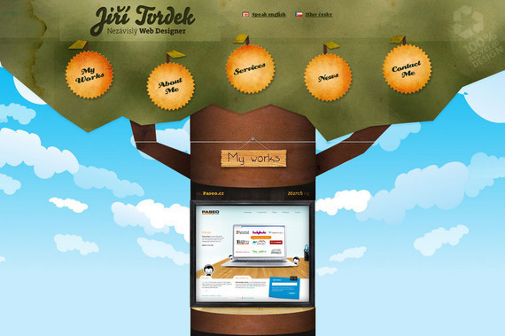
1. Tvrdek
On this website, you may feel that the website does not have any content but once you explore its navigation, you will love to browse this website more than anything.
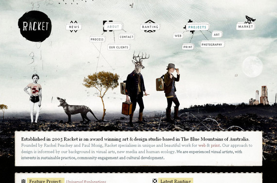
2. Racket
Here you will see the navigation menu hanging in the air. The navigation menu looks somewhat off the cuff but at the same time it looks so cool.
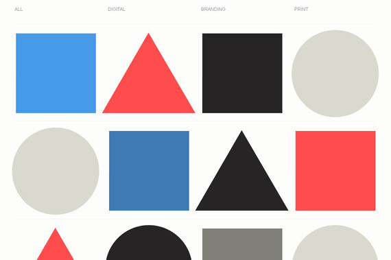
3. Iamyuna
Here the navigation may appear minimal and negligible but once you keep your mouse on the option it shows you the complete list of all available choices. The mouse over effect is simply amazing.
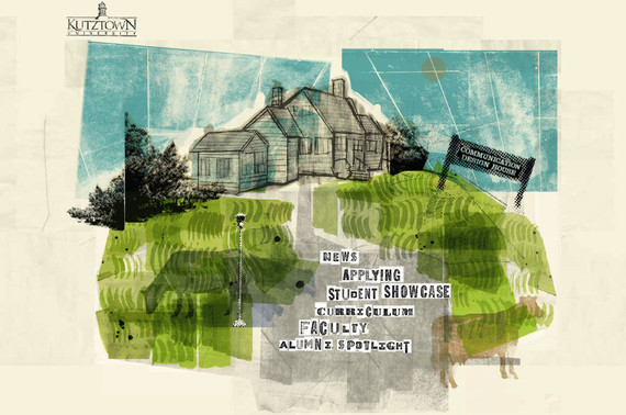
4. Kutztown
Kutztown creates a very artistic look with its design and typography, further the navigation adds more beauty to it.
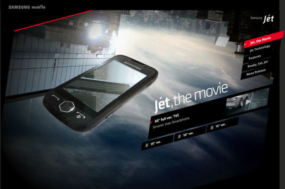
Samsung Mobile features an extremely dynamic and animated website with a unique and appealing navigation style.
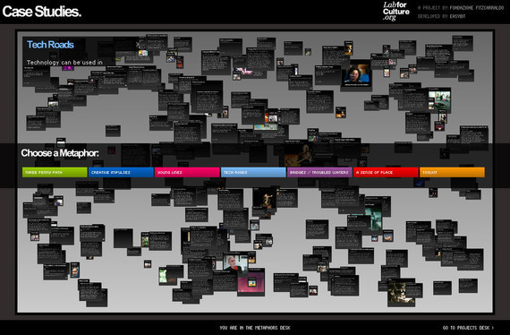
6. Case Studies
Centrally aligned navigation with some links at the top of the page is truly an extraordinary approach for a navigation menu. Clicking on any centrally aligned option will reveal the detail page.
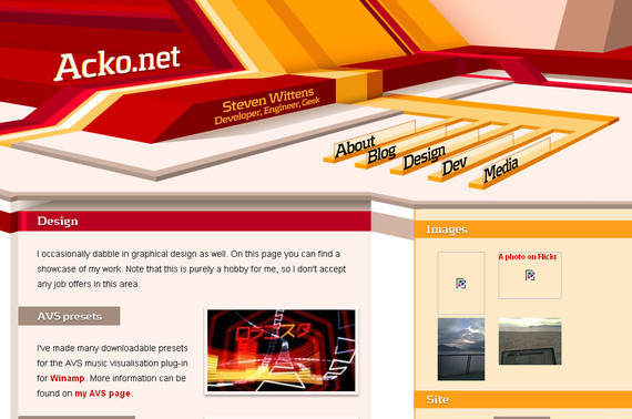
7. Acko
An artistic representation even through the choice of navigation menu. Acko takes advantage of its bright color combination to make its navigation even more attractive.
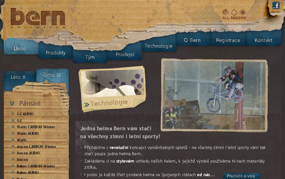
8. Helmy Bern
Helmy Bern features a somewhat disorganized top navigation but the side bar and the bottom navigation menu are simply amazing. The use of the right color to create the right impact can be seen here.
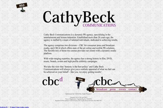
9. Cathy Beck
Cathy Beck makes use of a unique approach for her site navigation. Here the navigation is set at the bottom of the page rather than the top of the page, further the mouse over effect is out of the ordinary.
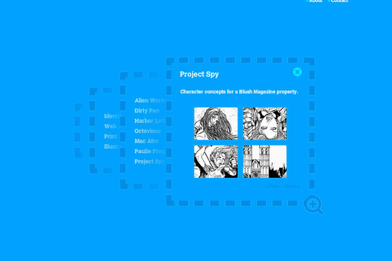
10. TinyTeam
TinyTeam offers a very systematic and pragmatic navigation menu that eliminates any confusion a new visitor may have in browsing the website and finding its desired information.
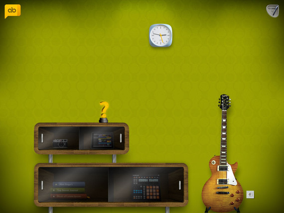
11. Alexbuga
The sliding effect on mouse over is the key point of navigation plan of this website that makes this navigation extremely classy and elegant. The main navigation reveals when you place your mouse on the logo design at the top of the page.
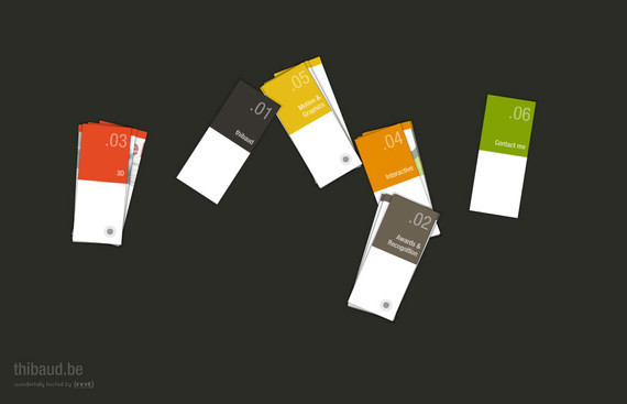
12. Thibaud
It’s truly fun to browse this website. You can actually arrange and rotate the cards present on the home page by simply dragging and dropping them to your desired location and can see the portfolio by clicking on it.
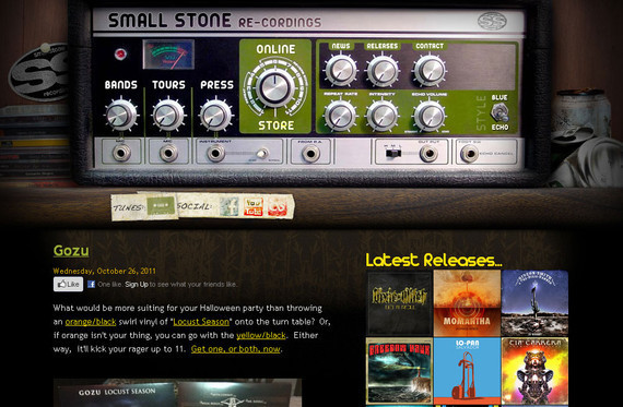
13. Small Stone
An unusual navigation that matches the website name. Here the designer has successfully imitated a recording device as a navigation menu.
###page###
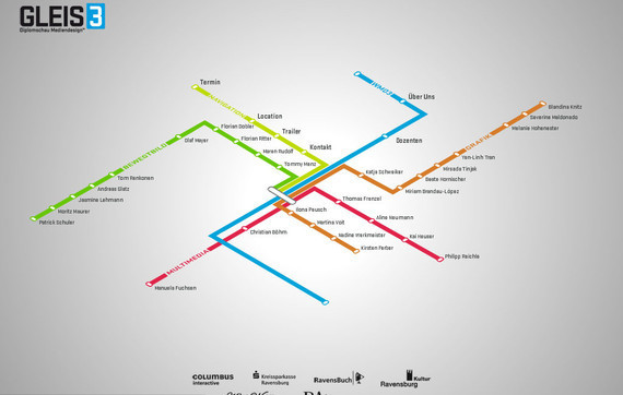
14. Gleis3
The navigation plan used in Gleis3 website looks somewhat like a road map that leads you to your desired location easily and effortlessly. Simply click on an option and you will get the relevant information.
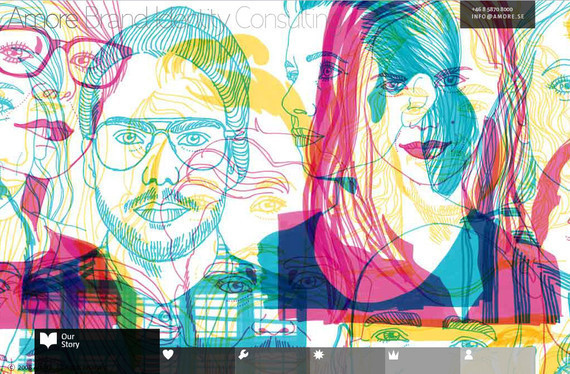
15. Amore
With a horizontal as well as vertical navigation plan, this website holds its own charm. The main navigation menu is placed at the bottom of the page with some cool and beautiful mouse over effects.
16. Yodabaz
Here the navigation is presented with an animated background image sufficient enough to create that attention grabbing first impression. Clicking on the portfolio reveals some of their excellent work.

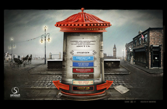
17. Sensi Soft
The whole navigation is set to be at the center that makes this website extremely well-organized and easy to navigate. The effects that this website uses are beyond the ordinary mouse over effects.
18. Nickad
Nickad brings flash into play to make its navigation menu and overall website design look stunning. This is something that you will never find in any other website navigation plan.
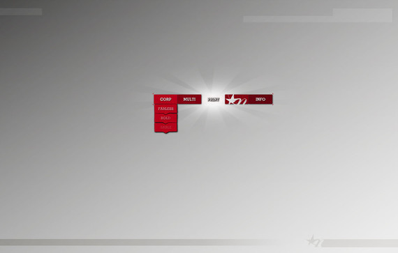
The navigation options in this website are in the shape of playing cards and when you put your mouse on it, they will give a burning effect suitable with the theme of the website.

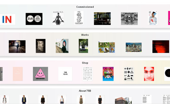
20. 75b
75b also has a horizontal and vertical navigation plan. The main options or menu is placed with the vertical navigation while the sub-menus are placed with the horizontal navigation.
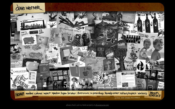
21. Dave
This website not only brings an exceptional use of navigation into play but also experiments with unique typography to set it apart from dozens of other similar websites.
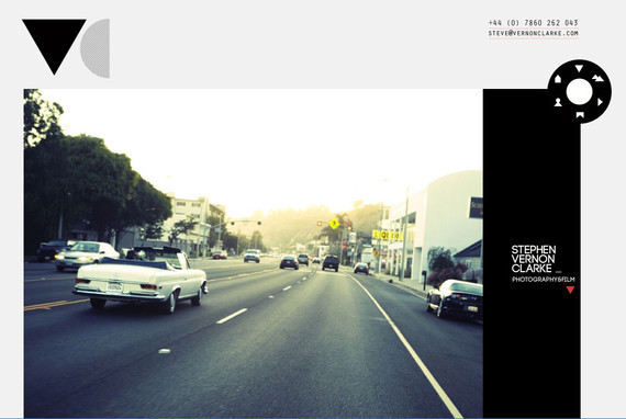
22. Vernon Clarke
Here the whole navigation has been summed up within an icon of a film tape with some small icons on it. Besides that the website also features some exceptional work on the main page.
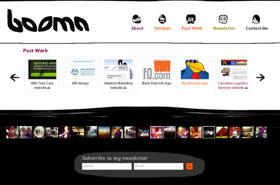
23. Booma Webdesign
Simple and efficient navigation without extra or jumbled up elements. The navigation used here is also easy to understand for the new visitors.
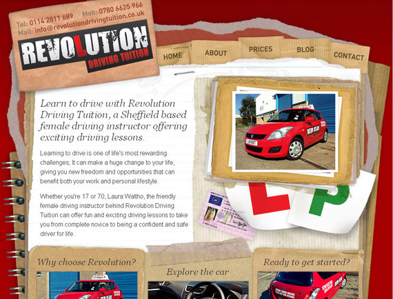
24. Revolution Driving Tuition
Simple and nice navigation with no more classy effects, even a novice can also understand how this website works.
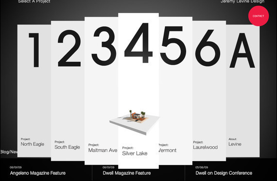
25. Jeremy Levine
An imaginative demonstration of the navigation menu that makes this website fun to browse. Jeremy Levine takes advantage of its dazzling color combination to make its navigation even more eye-catching.
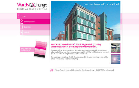
26. Wards Exchange
The whole navigation has been placed at the side of the website design that makes this website tremendously well-ordered and easy to navigate. The effects this website uses are beyond the ordinary mouse over effects.
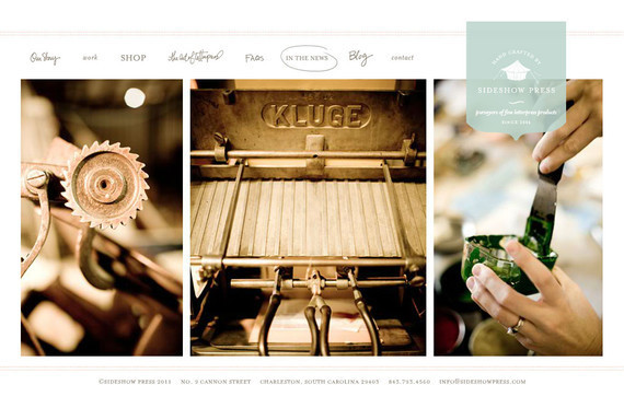
27. Sideshow Press
The navigation is presented with some cool and appealing effects giving this website a personal and human touch. Clicking on any option will take you horizontally to the relevant section.
###page###
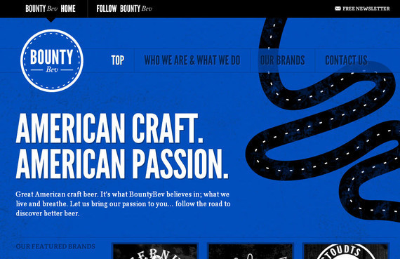
28. Bountybev
Bountybev make the most of its bright color combination to make its navigation even more attention-grabbing. The use of bold typography further makes this website design hard to forget.
29. Noonstyle
Here again, the navigation has been set at the sidebar to make this website look well organized and efficient. When clicked, the website also shows the relevant options in the sidebar.

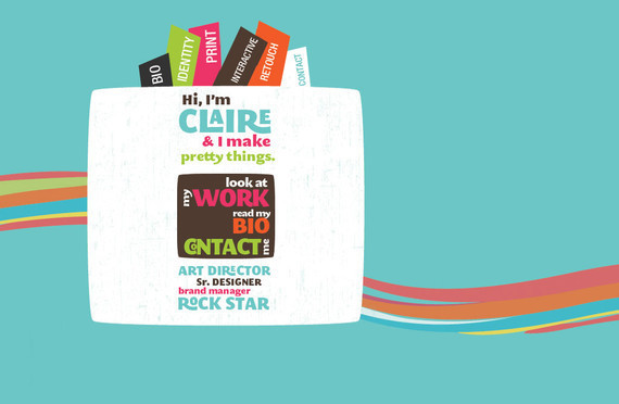
30. Vanity Claire
Easy and on the contrary an artistic approaches to design navigation for Vanity Claire that not only matches with the main concept of the website but also affords regularity.
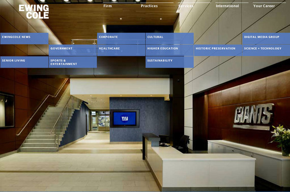
31. EwingCole
Here, the navigation options are divided into two parts. The top most navigation reveals the content in the customary style while the second navigation is presented in a somewhat trendy style.
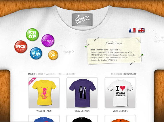
32. Custom Tshirts
Here the main links are presented at the top while a portfolio or T-shirt photo are presented with a mouse over effect that enlarge the photo when you place your mouse on it.
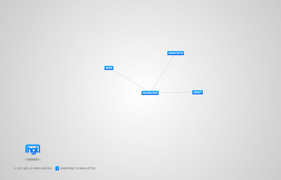
When browsing this website, initially you may feel like that this website does not contain any content but once you explore its navigation, you will love to browse this website more than anything.
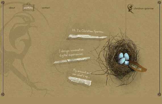
Christian Sparrow makes use of a simple but attractive navigation plan that not only grabs the attention of the visitors but also creates an everlasting first impression.
35. Enila
Enila has a rather jumbled navigation menu but the side bar at the top of the page makes it simple and easy to navigate, and also add an interesting feel to the design.
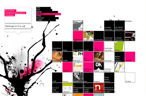
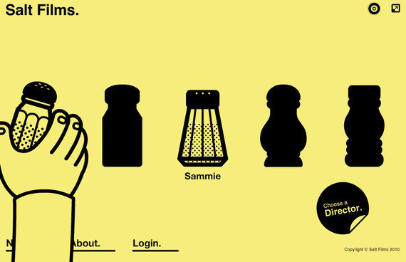
36. Salt Films
In this navigation menu the thing that stands out is the animated hand which gives the whole website a very unique and appealing look.
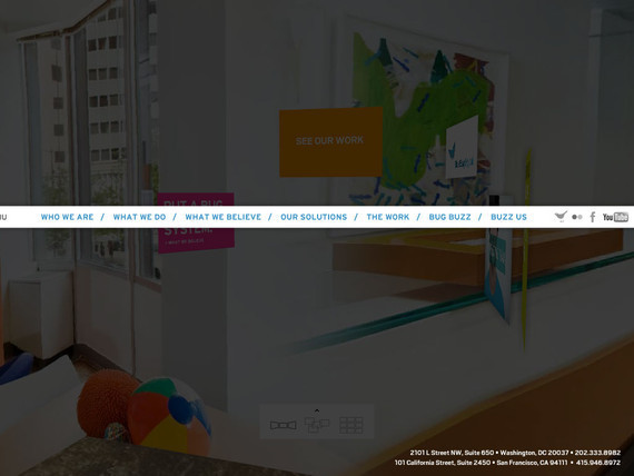
37. Blue Bug Digital
Blue Bug Digital makes use of an animated background that revolves 360 degree providing you a complete preview along with the navigation menu.
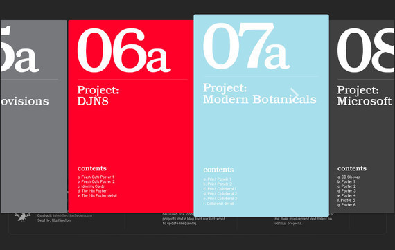
38. Section Seven
Section Seven also uses its navigation menu in an extremely creative and artistic way making the whole website look and design visually appealing and remarkable.
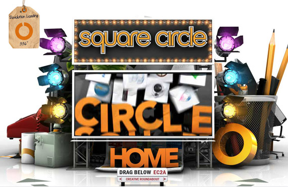
39. Sq Circle
While the website loads completely, the message says we are creative and pragmatic. That proves true when you explore the site in detail. The navigation truly is out of the box and extraordinary.
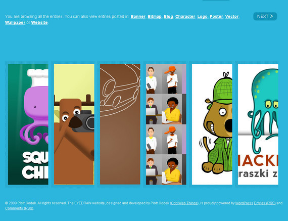
40. EyeDraw
EyeDraw presents a very non-fussy and clean website layout giving its visitors an easy to navigate and understand website. The main options slide to give you a complete preview when you place your mouse on it.
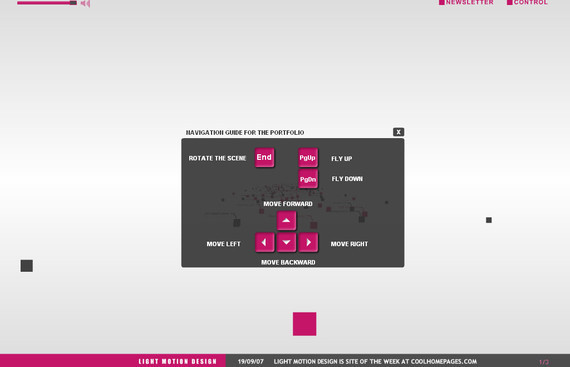
Light Motion design also provides a navigation plan or guide for those who are not very internet savvy. On the whole, the navigation is exceptional and has been designed in a very systematic way.
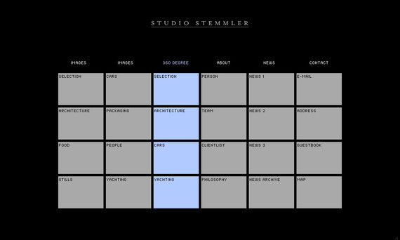
42. Studio Stemmler
Studio Stemmler combines effective navigation, excellent design and a beautiful color combination all in a one to get this visually appealing and attractive website to the surface.
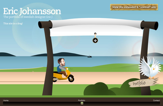
43. Eric johansson
A fun and irreverent site that also give you the option to view the site in a more traditional way.
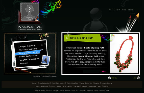
44. Iipvapi
Innovation at its very best is what that describe this navigation menu perfectly. Simple but effective navigation with some cool effects.
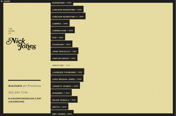
45. Narrow Design
A vertically sliding navigation menu that moves to the left when one item is clicked giving its details on the remaining part of the screen.
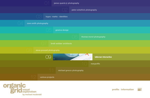
46. Organic Grid
Organic Grid holds a visually appealing website navigation that consists of more than 90% of the main page.
47. Smriyaz
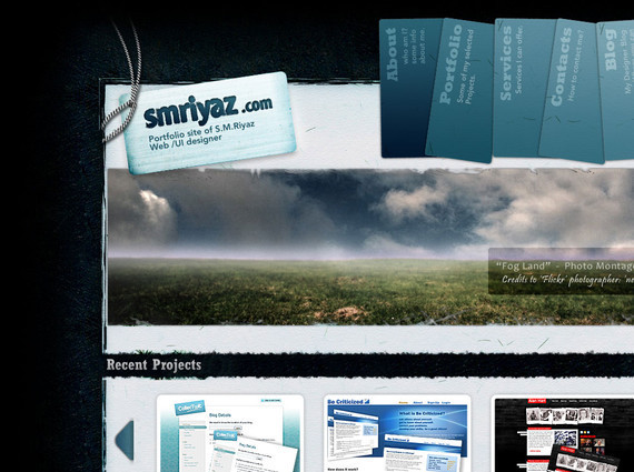
An extremely beautiful website design with neat and efficient navigation menu that guides its visitors how to explore the site to make the most of it.
48. Unfold
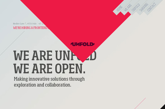
Simple but a creative approach to design navigation for Unfold that not only matches with the main concept of the website but also provides symmetry. Simply click on the top navigation links to explore the site in detail.
49. Yugop
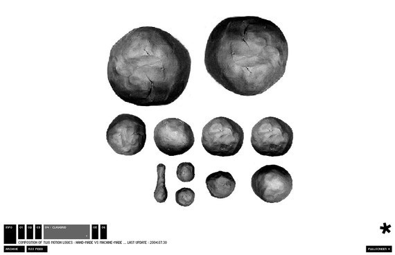
The navigation is placed at the bottom of the page with some exceptionally animated effects.
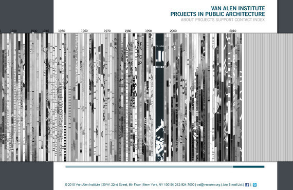
50. Vanalen
Vanalen also presents a very unusual and unique navigation menu that is totally different from the ordinary websites. The navigation plan used in this website is rare and exceptionally creative.
