50个有趣的导航菜单设计
导航菜单对于一个网站来讲,是很重要的组成部分。今天向您展示50组有趣而又美丽的网站菜单导航设计,希望给您带来一点点灵感上的帮助。
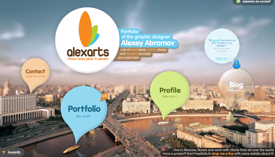
1.Alexarts
A great looking home page that has 4 large balloons as a navigation menu with each balloon floating up whenever a visitor hovers over it.
A traditional horizontal navigation menu that integrates with the website design beautifully.
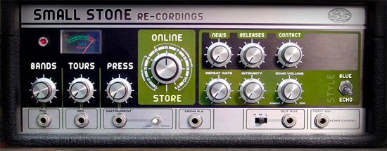
One of the coolest navigation menus on the web. Each section of the site is featured as a dial or btn btn-primary in the recording unit at the top of the page.
4.Loodo
A good navigation menu that is based upon a traditional board game.
A colourful vertical navigation menu. The background colour and icon that is shown when a visitor hovers over a link is different for every page.
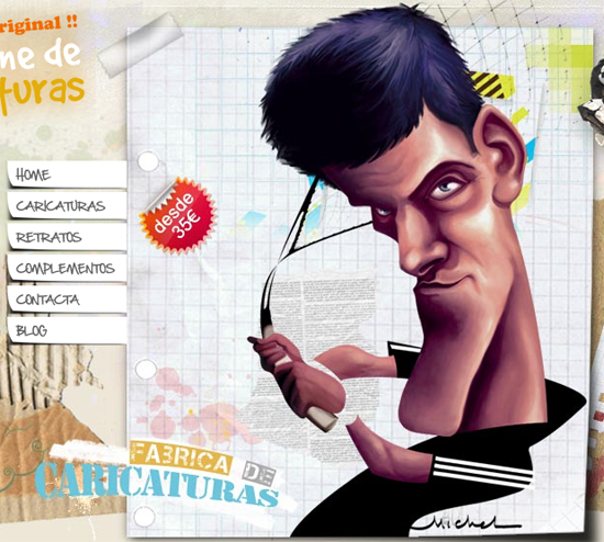
A great looking home page which features a navigation menu as labels at the left hand side of an A4 piece of paper.
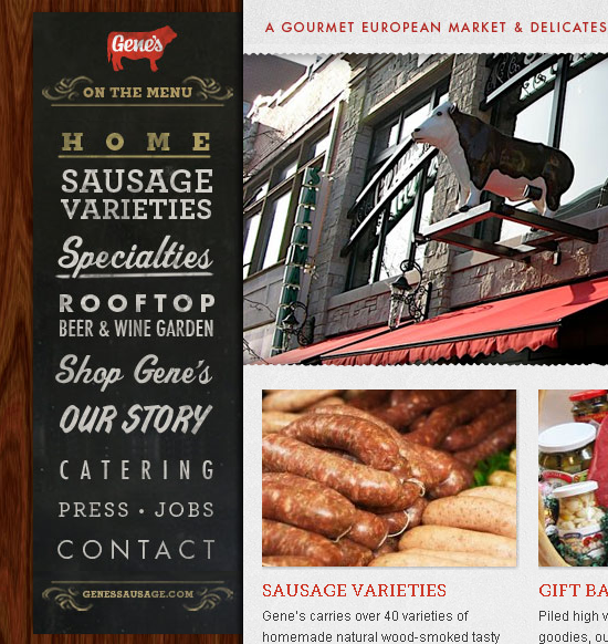
At first glance it looks like a regular vertical menu but when you look closely you will see that the designer has made the menu resemble the ‘specials’ chalkboard like you would see in a butcher shop.
The square bubbles that are placed around the navigation menu items are placed around the site in other areas. It’s a simple design but it fits in well with the site.
A stylish flash horizontal navigation menu. Sleek and simple.
10.Madison
A grungy style navigation menu that turns red when you hover over a link.
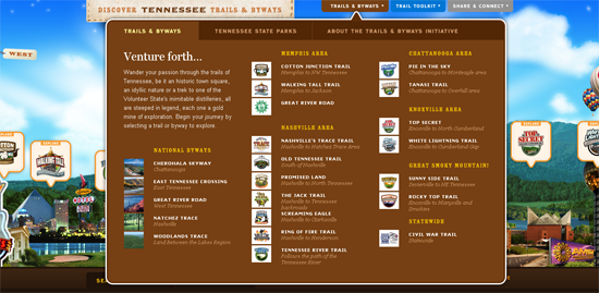
Don’t let the discrete menu at the top of the page fool you; Tennessee Trains & Byways is in contention for the largest drop down menu in the world. :)
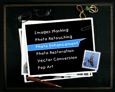
12.Innovative Imaging Professionals
A colourful flash menu that lists the various site pages on top of a photo.
13.Carsonified
A cool horizontal navigation menu that fits in well with the groovy Carsonified design.
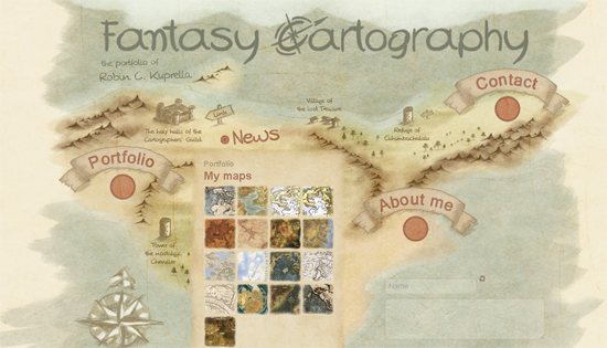
A fantastic home page from old mapmaker Robin C. Kuprella. The areas of the site are linked directly on the home page map. Clicking on a link will change the content in the central content box.
A great menu that features hand drawn icons for each section of the site.
###page###
16.Indubitablee
Beautiful hover actions and well designed sketched icons makes Indubitablee a breeze to get around.
A practical design in which all menu items, and any links on the page, turn red when you hover over them.
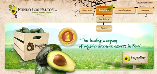
A good looking wooden style navigation menu that shows a leaf icon whenever you over a menu item.
A simple but fun menu that integrates well with the cartoon design of the rest of the website.
20.Pure Grips
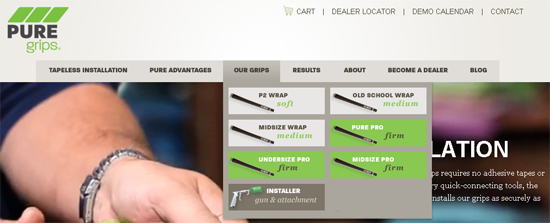
A good looking clean corporate style horizontal menu.
21.Carbonica
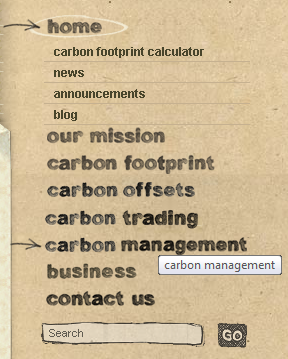
A simple vertical menu that shows an arrow and drawn circle when you hover over the item. Strangely, not all menu items have this effect.
Colourful bookmarks are used as menu links at the top of a torn piece of paper in this cool looking vertical navigation menu.
An elegant drop down navigation menu. Perfectly fits both the design and subject of the site.
24.Amazee Labs
Another simple yet beautiful horizontal menu that we felt was worth taking note of.
25.Guga Fit
A cool navigation menu which changes the links from blue to green when you hover over them. Simple but effective.
A ribbon style menu that shows page links on different levels.
A great looking vertical navigation menu. Bold and attention grabbing for such a simple design.
28.FA Design
A stylish menu that looks great over the full screen image changing background.
A basic horizontal navigation menu that works well with the colourful design of Biola Undergrad.
30.C & C Coffee
A fun flash based menu that playfully dangles links from the top of the page.
###page###
31.Helmy Bern
An interesting menu that wraps the menu links around a torn piece of cardboard.
32.Crumpler
An image based navigation menu that features social media integration.
33.B & Q
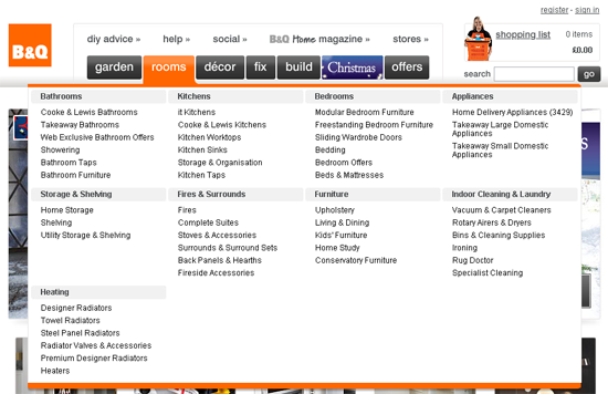
Each category shows dozens of website links under it. It’s a great example of how you can still make a website with hundreds of pages easy to navigate.
A simple vertical drop down menu that integrates well with the blog design.
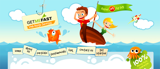
35.Get Me Fast
Many of the graphics in the background are links in this fun header design.
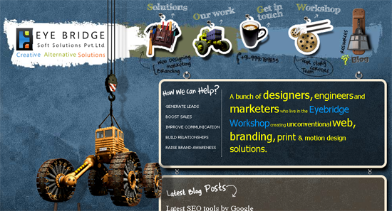
36.Eye Bridge
A graphic based menu that shows a circle around the page text when you hover over it.
37.CampLuxe
A clean professional looking naivigation menu. An easy addition to the showcase.
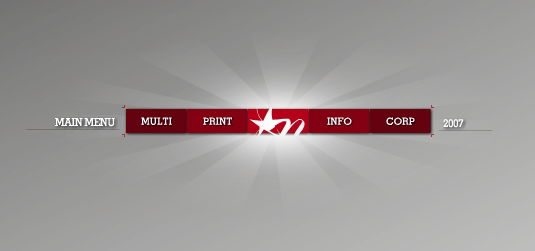
38.NickAd
Probably not the most practical menu available but certainly one of the coolest. The NickAd page remains mostly blank apart from a small logo at the top left and bottom right of the page. Your cursor changes into a star when viewing the page. If you click on the page a horizontal menu will appear that will let you navigate the site.
39.Envira Media
A great looking eco-style vertical navigation menu.
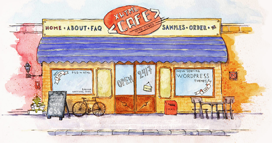
40.XHTML Cafe
Another good example of an interactive home page. The top menu and and many elements of the home page design are all clickable.
41.Design Bombs
A minimal design that integrates with the Design Bombs website look and feel perfectly.
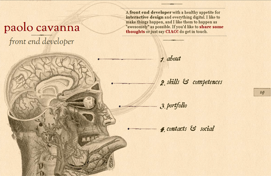
A unique navigation menu that is implemented on a cool one page design.
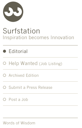
43.Surf Station
A minimal vertical navigation menu which increases the size and weight of the menu link selected.
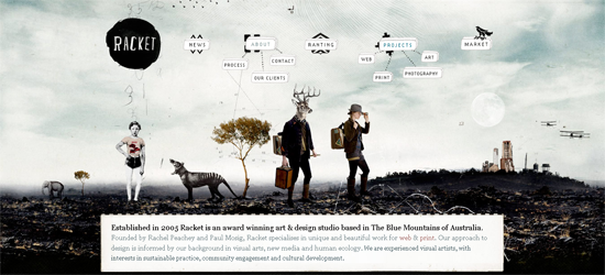
44.Racket
An innovative navigation menu that fits in well with the website’s unique design.
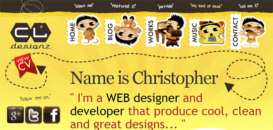
45.CL Designz
A fantastic design that is unique, colourful, fun and practical…oh my.
46.Keith Cakes
A simple horizontal menu that uses beautiful calligraphy.
47.Carbon Made
The background colour of every page is different, however the colourful navigation menu remains the same.
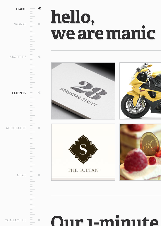
48.Manic Design
A scrolling vertical navigation menu that moves the cursor as you scroll down the page.
A fun horizontal menu that displays a descriptive pop up of each page when you hover over a link.
The cartoon font fits the cosmic style of Space O Technologies perfectly. This is a one page website so the menu colours change depending on what section you are looking at.
