25个来自法国的高端品牌官网设计
收集了一些来自法国的网站,本身带着品牌和艺术的气息。主要包括的一些品牌,好吧,做为一个穷鬼的我,只勉强认识个古奇和天梭。
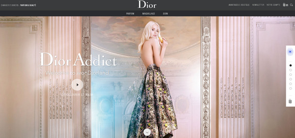
Dior
The team managed to give the website an elegant and refined appearance, using a gorgeous fashion photo, magnificent video, wonderful coloring, sleek typography and artistic touches.
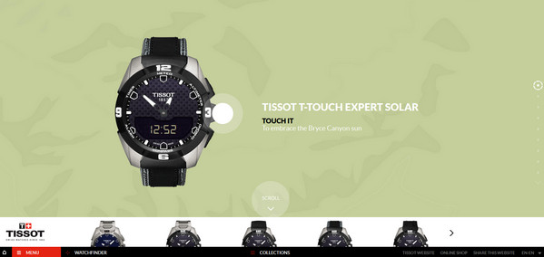
Tissot T-touch
The team goes for a quite advanced solution by incorporating several dynamic features that make promoted products look more desirable. Here, interactivity is professionally executed.
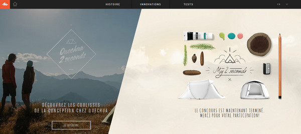
Quechua
Quechua is famous for its unique and original website designs that, as a rule, meet current trends. The updated website also follows modern tendencies by incorporating a popular “hero” image mockup, subtle contour graphics and flat color scheme.
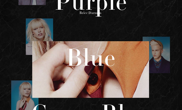
Brice Darmon
Brice Darmon is a professional photographer who owns a high-end online portfolio that certainly catches the eye. The front page is made intentionally out of balance in order to add an extra flair to the whole appearance and clearly highlight the works.
Jacob de Boer
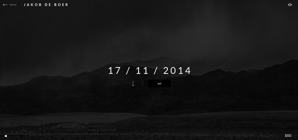
Much like the previous example, this is another matchless online portfolio that reveals works and reflects the strong personality of the talented photographer. The designer also opts for gloomier coloring in order to subtly emphasize the works.
New Jumo Concept
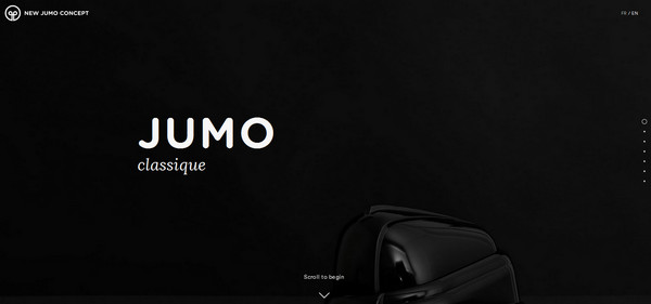
The eyes naturally flow through the website thanks to calm and pleasant color differentiation and a horizontal stripe layout. The front page features a vertical sliding, where each slide features a beautiful picture of the product.
Take Your Pulse
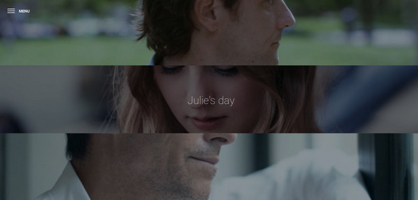
Take Your Pulse adopts a quite simple yet winning approach that involves incorporating images and massive complex navigation menu. The landing page looks splendid: A subtle “hamburger” btn btn-primary works perfectly well with a series of full-screen pictures and ultra-narrow font.
TWLVR
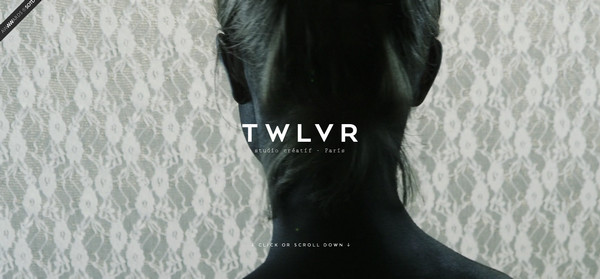
The “welcome” section looks extremely intriguing due to a creatively executed cinematographic background. The image with motion in tandem with complementary slightly enigmatic environment produces a strong effect.
Make Me Pulse
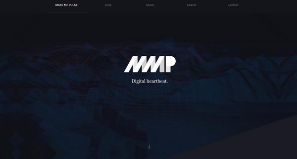
The team efficiently utilizes the notion of pulse, making it a part of the website name and a main tagline as well as trying to reflect its natural dynamics through interactivity by including a responsive 3D background and matching animation.
Celebrating Monogram
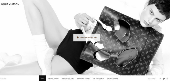
The website is made in the spirit of the brand, neatly establishing sophisticated and luxurious air inherent to this fashion house. The front page greets regular visitors with a series of short videos that draw attention.
Many Rivers
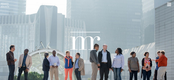
Wonderful two-tone coloring, high-quality photos, flat canvases, nifty graphics, urban vibe and some catching dynamic effects give the website a quite refined look spiced up with a calm, businesslike atmosphere.
Piaget
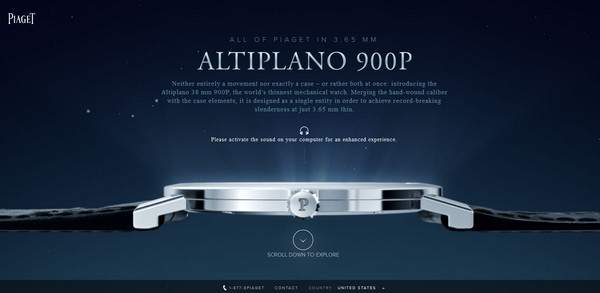
Piaget instantly impresses on their visitors a sense of delicacy and dignity. The mind-blowing highly-realistic mockup of the product placed in the proper surroundings is a prime focus.
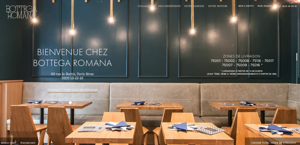
Bottega Romana
The carefully-selected choice of types in collaboration with professional shots and images of delicious meals gives the website an intensity of positive emotions as well as establishes a pleasant and appealing atmosphere.
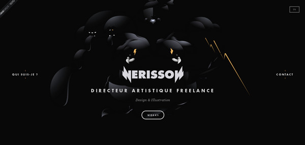
Nerisson
Nerisson radiates brutality and creativity. The dark appearance coupled with splashes of warm color, white type and geometric style tagline pull the design together and provide powerful aesthetics.
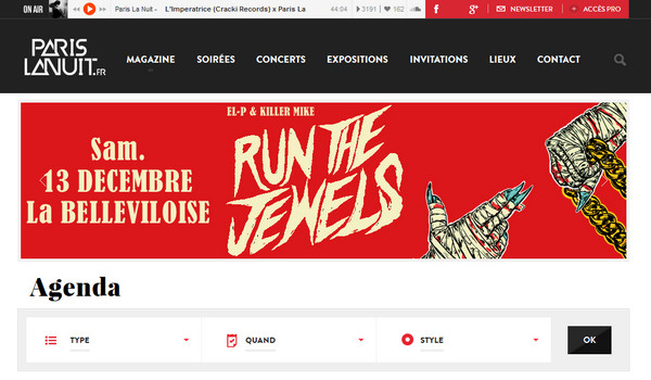
Paris La Nuit
Paris La Nuit has successfully achieved a modern look thanks to a wonderful color scheme, lavish renderings, artistic touches and balanced blog-style layout.
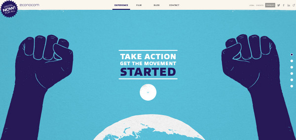
Econocom
Econocom is another professionally-crafted visual storytelling project powered by flawless illustrations. Each section is bolstered by tiny subtle effect and animation, to say nothing about the slightly grainy yet awe-inspiring complementary drawings.
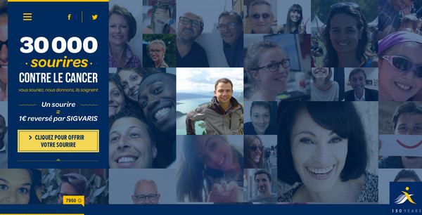
30,000 Sourires
The team is managed to showcase dozens of smiles of the people in non-intrusive manner, through using a grid-style layout that makes everything look balanced and harmonious. The smooth bluish coloring and densely packed content also enhance the design.
Orange
The latest version of Google Chrome enables the website to demonstrate its whole potential; so that if you want to feel the unique and powerful experience then switch to it.
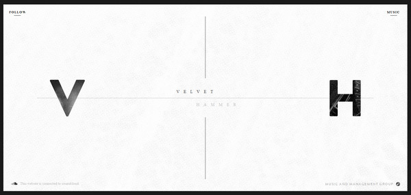
Velvet Hammer
Although the website offers visitors a conventional layout with nothing extraordinary. However carefully executed textured backdrops, wonderfully dished up monochromatic images and a classic color scheme create a distinct impression.
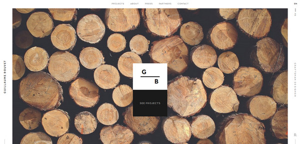
Guillaume Bouvet
The website provides the audience with a marvelous user experience. Here you find loading page animations, visually-appealing effects, interactive elements, and of course, carefully executed design.
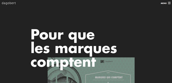
Dagobert
The team opts for a more simplistic look thereby helping the website with a neat, accurate and subtle appearance to stand out from the crowd. It also features an optimal balance between copy and design.
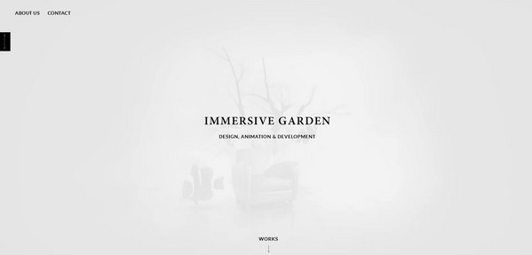
Immersive Garden
The website creates enough esthetics to reinforce the main tagline “Design. Animation and Development,” vividly demonstrating that the agency is well versed in this sphere.
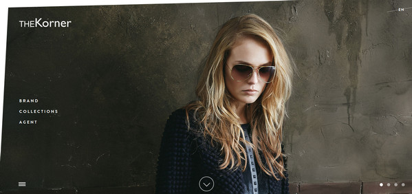
The Korner
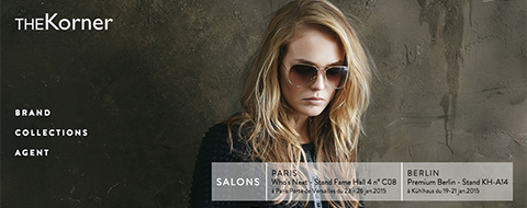
The Korner has a first-class website that fascinates by its interactivity and harmonious symbiosis between images and content.
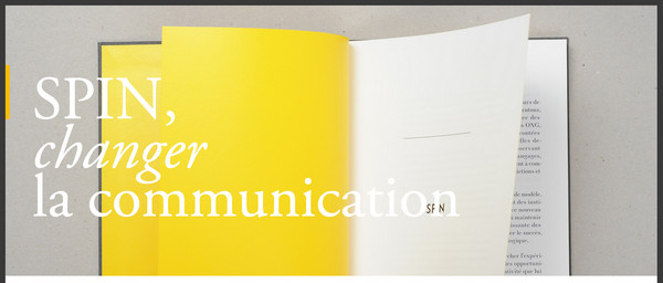
Spintank
The design naturally moves visitors’ eyes from top to bottom, revealing portfolio pieces and some key moments through design tricks. It features an optimal mix of lush visuals and clean flat elements.
SOS Mobiles
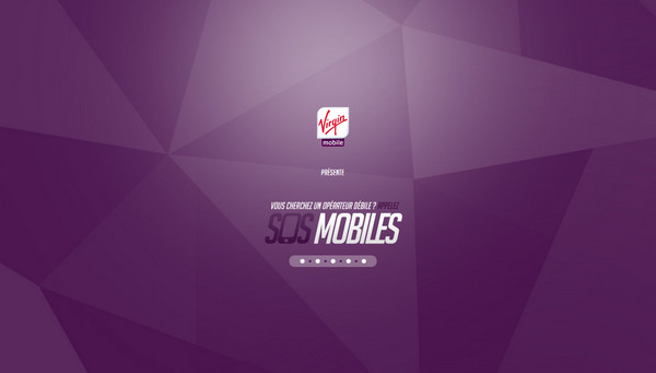
A polygonal background in cooperation with a classy violet color palette as well as some fantastic renderings and appealing videos certainly charges the website with creativity.
