第五季_本周经典网页设计欣赏09例
每周一季,季季都是经典。周推网站第五季,本次站点比较少,只有7例。但是每个网站,都是经典案例,可以慢慢品味。
Alliance Studio

I cannot tell you I am full enthusiast for its design, but I like in particular the clear simplicity of each element of this design. On a quick look, you can identify the different elements like the logo, the menu, the introduction, the contain and the footer. All over web sites had to be similar in the clarity.
Dazz Le Cat
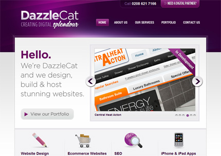
The purple is a colour which is not easy to meet on a web design, but this colour does not hurtful to this web site which is really pleasant. The contain is easy to read and you can move inside without to meet any problem. I especially like the home page and portfolio icons.
Fhoke
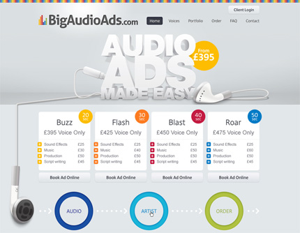
Without to put the originality on the left, this design put on the front of the stage, the simplicity of use as well as the easy reading. The menu on the top is especially easy and useful to move page to page without to get lose. Only a negative point regarding the footer which is really too long….
Stads Festen
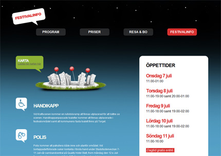
A good example of an unique one page website. I love the work which as been made on the different elements transition. Colours are very nice too. The must of the must on this site, is the high graphical and original footer.
Mysterio The Fantasy Template
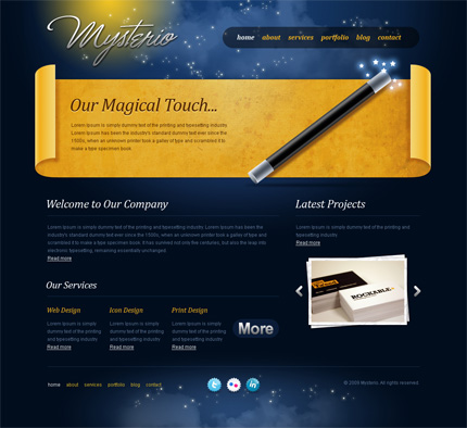
An amazing work is applied on this pleasant and original web design which also stay clear. The must for me are its header and logo out of papyrus.
Vibes the portfolio
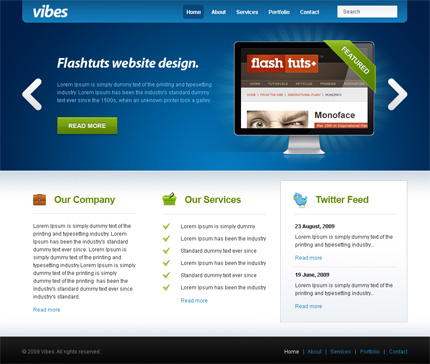
To make it short, I can say that this design is perfect. All is beautiful and useful, nothing heavy regarding the graphic or the texts, finally complete success. All my congratulation to the webmaster.
Client R
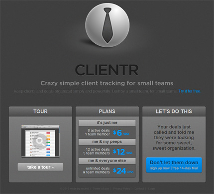
From my point of view, this Kit graphic is really nice, the metallic effect is perfect and bring a touch of originality to this software of staff management. I especially love the “Tour” page giving the possibility to get an overview application benefits.