第六季_本周经典网页设计欣赏19例
每周一季,每季都是经典。本周推荐的19个网站,包括了很多流行趋势,尤其是现在使用的jQuery以及slider特效,运用的都很合理。设计素材,均来自deviantart,如果您有意做成网站可以联系M4,我们提供低价psd2html/psd2templaters服务。
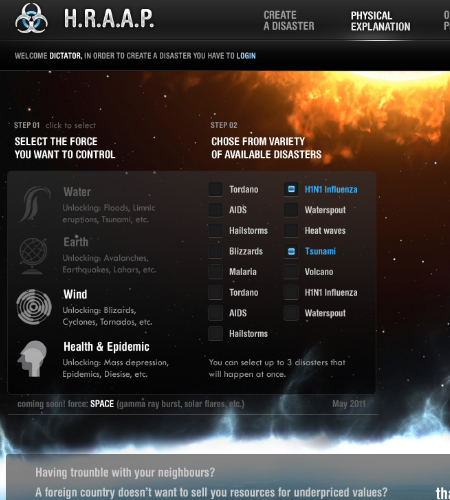
experimental by tehacesequence
This is a stunning design & an excellent concept for creating disasters around the world! The spacescape fits perfectly with this design and I can’t wait to see the finished product.
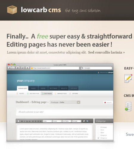
Lowcarb by alivepixel
Content is well spaced in this layout. Making great use of elegant gradients and custom fonts to make this design feel unique to the other one million application showcase websites out there!
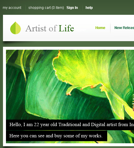
Personal Website Design by sreenijesus
I love traditional art and this portfolio draws all the attention to sreenijesus artwork. My only criticism would be to lower the opacity on the black bacground on the text as it looks too blocky.
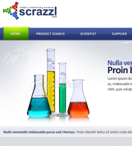
Scientist website by Nas-wd
Excellent use of stock photography showcased on a modern web 2.0 design with a logotype that doesn’t look misplaced.
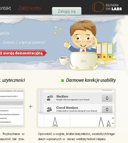
Testonic by jebanany
Making excellent use of a vector the header which fits in with the layouts colour scheme. The content text is a little on the small side but won’t be too much of an issue to fix.
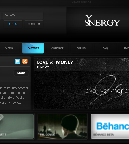
sYnergy Clandesign 2 by elemeNt-XY
This is a very dark design which for a clan template can be hard to pull off, but the bright text and small banners give this design some much needed colour. I really like the rollover effect on the header navigation.
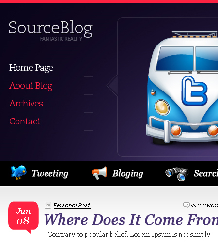
Clean Blog Template bytatostudio
We have been showcasing WordPress blogs a lot these past few weeks and this is no exception. It has everything a blog needs from great content spacing, a well designed sidebar and footer. My only criticism is the black bar where the search field is. It looks to flat and needs some more attention and possibly changing the icons used as they don’t really reflect the rest of the great design.
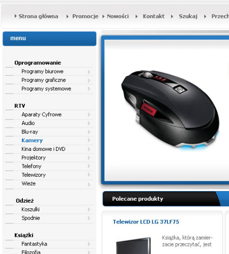
shop by amstaz
You have probably already noticed that I love simple and clean e-commerce designs and this is no exception. All products are layed out nicely and looks like that loads of customization can be done regarding design/product descriptions & featured products.
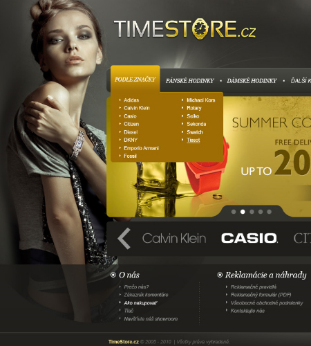
TimeStore by vladis123
For a landing page for a e-commerce store this screams “Beautiful”. I don;t really like brown and gray together but in this design they work really well.
###page###
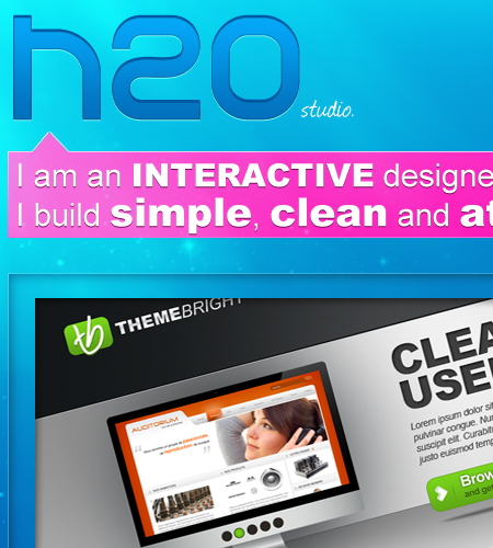
H2O studio design byjonaska
Who would of thought bright pink and sea blue would go well together? This is truly a fantastic design but would like to see how this would look coded. Could be a little tricky with all the transparent boxes and overlays.
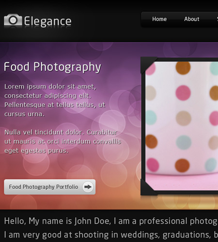
Elegance – Portfolio and Blog by justcollapse
Elegance is a beautiful multi-coloured theme. Making great use of bokeh gradients on a dark backdrop. The only critique for this interface would be vertical spacers in the content slider as they do feel out place with the rest of the design.
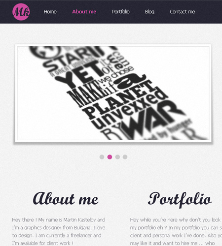
Mkastelov v.3 by TheDrake92
This is one of the most simplest and yet most effective designs this week. Making great use of custom fonts and well positioned content.
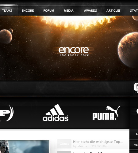
encore by noc0mment
Spacescapes in designs are becoming more and more popular I have noticed, not many interfaces can pull it off but works perfectly in “encore”. I would love to see this coded.
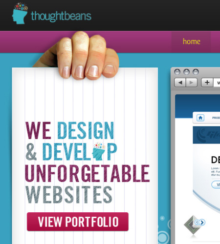
Thought Beans by deviant-bacha
This design in my opinion just looks so smooth! The colour scheme blends well with the content and I am loving the “circle effects” that are featured around the interface. My only criticism would be to change the colour of the yellow boxes or to change them to small arrows.
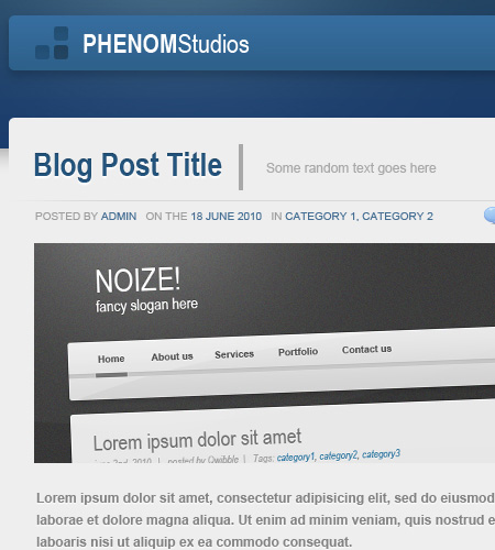
Phenom Studios by Revoken
A very simple yet effective blog interface that could be used in any environment. The colour scheme looks like it can be changed quite easily which will give you an array of options to choose from. My only criticism is to remove or re-position the social network icons in the header.
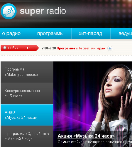
Super radio by lakinkley
I think this is the first time we have showcased a Radio portal on nenuno! I love the block feel for the content and if it was to be widgetized to give the user the freedom to move the content to where they wanted it would give more user interaction.
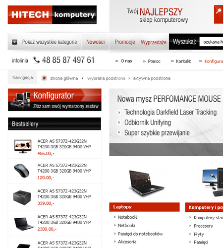
HITECH by finesy
E-commerce designs are becoming very popular on nenuno, each week we tend to feature at least one! This week is no exception with a simple yet effective design showcasing IT products.
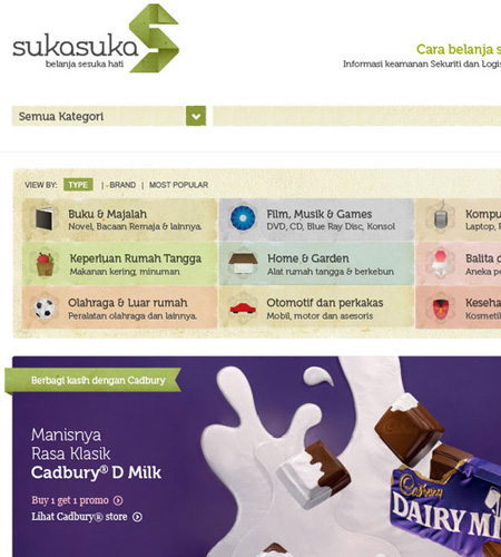
SukaSuka by foxstep
You have probably already noticed that I love simple and clean e-commerce designs and this is no exception. I love the category selection with the small icon displaying what each category represents.
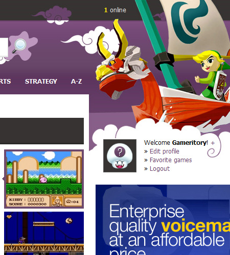
Nes-Games.net by kibus
A fantastic example of a flash games portal, giving users the chance to replay some of their favourite childhood games (in my case that is!). I am not sure why they picked Zelda The Wind Waker for the header graphics as it was a Gamecube game, but it does work well in this design regardless!
