25佳时尚经典网页导航菜单设计作品欣赏
网页导航菜单在网页设计中占有非常大的比重,一个好的导航菜单,要清晰、简洁,又要华丽炫烂。本文列出25个经典作品设计,开拓一下大家的思维以及设计灵感。
Internet Dreams
Internet Dreams features one of the most modern and well-proven methods for creating primary navigation. It's just a simple horizontal navigation near the top of the page, right under the logo. In terms of "out-of-the-box thinking" there is nothing too special here. However, it is included on this list because it is a fantastic example of how a simple navigation design solution can be done so elegantly.
The overall layout may be all too familiar, which is great for consistency across the web. However, we can see that the designer went into a lot of detail here. Everything from the texture, to the divider lines, and even the gradient on the active/hover states is perfect down to the last pixel. The modern gradients and textures also give it a creative edge.
The Whitehouse
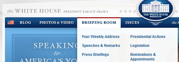
The White House's website is very content-heavy, but it wouldn't seem like it at first glance seeing how there are only seven navigation topics up top. However, when one hovers over any of the menu items, we can see how much content there really is. Drop-down lists are nothing new to web design, but what makes this navigation so smart is the column-organized links.
On most of the drop-downs, the links are separated into two columns, and in some three columns. Instead of spanning vertically a ways down the page, the hover state mixes horizontal and vertical space to save space overall and also helps the viewers to skim the links for better readability.
Cognigen
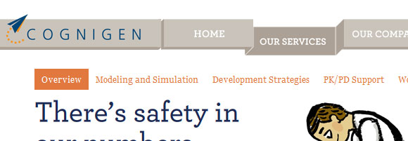
We loved this navigation solution because of the cool design effect, and how depth is added to the design with just this simple feature. The rest of the design is fairly flat, with no gradients, drop-shadows, or other design features that would add depth. This helps the navigation stand out even more, and prompts the viewer to keep checking back up at the navigation to find more as they browse through the content. The hover states are pretty unique too, and are well worth checking out.
Made By Giant
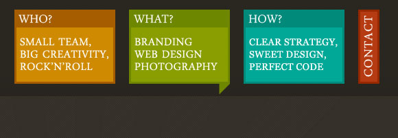
Who needs one-word text links? With so few pages, Giant Creative chose a navigation option that included short descriptions as well. The titles: Who? What? and How? are great attention grabbers, and the text in the box below gives a short byline. The contact btn btn-primary is different, however, letting it contrast from the other three options and stand out further.
On hover, each navigation link gets a bit darker and adds to the shape.
Gpacheco.fr
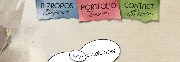
The texture in this mini-menu is really decorative and creative. There is nothing too unique about this navigation except for the detailed design you can see above. What is effective about it is that the three colors of the navigation make the menu stand out from the rest of the page, bringing attention to it.
The design itself is what makes this navigation unique. On hover, an image rollover appears adding pattern and texture to the 'paper' piece.
Von Dutch
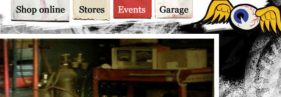
The Von Dutch navigation is very similar to the navigation we just saw above. Its unique factor comes from the design perspective, from the detailed texture and depth effects, to the deep red hover state. The entire design is very textured, which can make it difficult to give notice to the navigation. Sometimes, navigation and other important elements can drown in the use of too much texture. However, as with the example above, variations in color and also shape and texture help it stand out. There is also a colored illustration just to the right of the menu, further drawing attention to it.
Electric Pulp
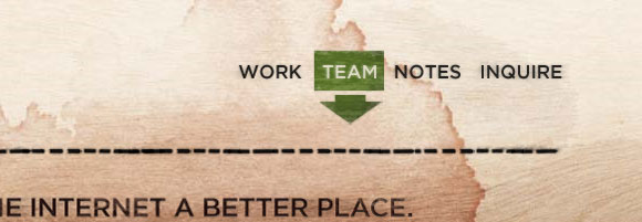
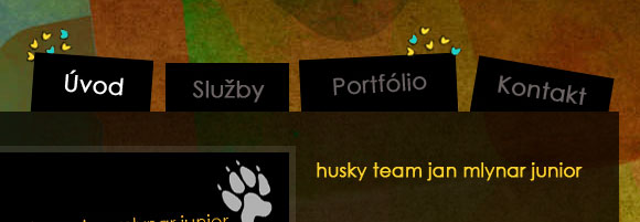
This simple four page navigation is simple, yet provides some great design perspective. We love the texture used throughout the whole design, and the texture used in the active state of each link. Without the shape behind the active state for this menu, it would be hard to find and not very effective.
However, the fact that they chose to place one of the only bits of color into the menu made the world of difference.
What also makes this menu a bit different, as simple as it is, is that the hover state and active state are different from each other. Much of the time, these two states share the same design. Electric Pulp decided to take a different approach. While the interface of the menu may not benefit in any way from this choice, it gives something different to the design when interacting with the menu.
Curious Generation Group
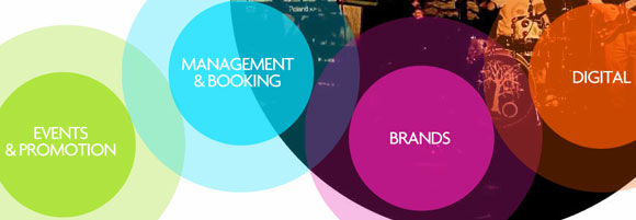
So far the navigation menus that have been featured are fairly basic and consistent with the rest of what's on the web, which is often the key to great navigation. However, this website took an entirely new approach, and there seems to be no need for explanation as to why it's different and unique. The color, shape, size, and placement of this navigation help to make it stand out, despite it not being navigation in a traditional sense.
Deli Bar
The look of this website and also of the company that created it has sparked the interest of many web designers over the past few years. Their look is modern, sleek, but not boring and bland at all. They've always chosen sleek textures, gradients, and shapes, yet also tested the boundaries of consistency vs. creativity.
The two menus here, actually, are both centered in the page - a placement that is not all too common. However, the balance created by centering these two menus worked out really well in this case. What is great about this navigation solution is the amount of detail put into it. Everything from the icons used and design detail, to the hover states, and to the animation upon interaction with the user make these menus stand out.
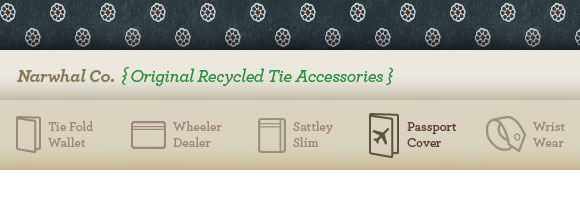
Narwhal Company
The use of icons in navigation is growing in popularity, especially when the navigation is simple like in the above example. The Narwhal Company web design got the idea down perfectly, crafting well-matching icons and unique typography for each individual link. Another trend we see here is the opacity change. The link items look like a semi-transparent state normally, and then on hover we see it in a darker brown, or 100% opaque.
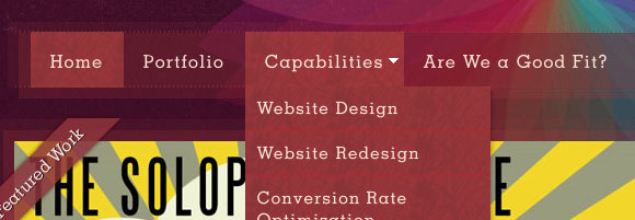
Intuitive Designs
The entire web design is beautiful here on Intuitive Designs, and of course their navigation isn't any different. In this example, the border effect of the menu reflects the rest of the website's elements, allowing it to connect with the rest of the design, but also stand out as a separate and unique section. The navigation overall is just a beautiful example of transparency, typography, and smooth drop-downs in navigation. Overall, it is a classic and ordinary example when it comes to layout, location, and functionality, but the design and interactivity are done very well and beautifully.
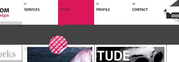
Synthview
Synthview has given each of its four primary navigation links its own shape, number, and space. Navigation is usually never between the logo and another piece of content, as this method can usually feel cluttered. However, by giving each list item so much whitespace, the placement worked out well. In this example, be sure to check out the hover and active states, and how they create repetition throughout the design, but also help each item stand out from the others when being interacted with.
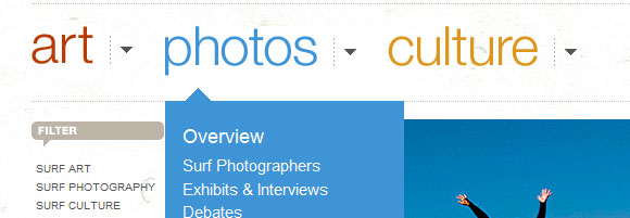
Club of the Waves
We need to make navigation stand out, and no web design does it better than Club of the Waves. The three main navigation links at the top are bright in color and huge in size. In fact, the three links are the biggest pieces of text on the entire page. Of course, there is other navigation throughout the website, and its hierarchy is all organized by size and placement relevant to this main navigation.
What is also well done about this menu is the drop-down menu under each of the three categories. We see well-organized and columned lists, just like in the White House web site above.
The Squad
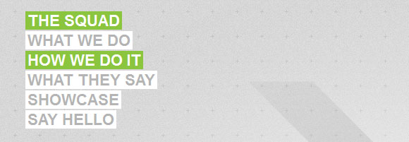
Vertical navigation is coming back in style, and web designers are finding ways to make it modern once again. In the above example, the placement of the navigation is fairly not ordinary. We hardly ever see the logo off to the right and the navigation the primary point of interest. However, with the way the navigation is set up, and considering the rest of the page's design, we can still get a quick impression of what the website is about.
It's always great when the navigation adds to the design, rather than takes away, or just blends in with it. In this case, the contrast, colors, and shape created by the variations in link length all add to the overall design.
VBG
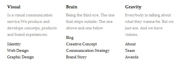
There's nothing like a well-made typography focused layout. This minimalistic design features some fairly content-heavy navigation. While these two elements seem to clash, VBG makes it work well. Because the rest of the design is so minimalistic, there is more space for navigation and they've taken advantage of that. The navigation is organized into three main sections, complete with a description, and finally the links.
This solution is great for navigation organization, it allows all the navigation to be placed right on the front page, and increases the user readability for the menu.
Ferix Design
The quirky shape this menu gives creates a unique design, and allows the menu to stand out from the rest of the web design that much more. Hover states in modern navigation are becoming ever more important, and often times require more than just a simple text underline. This is a great example of an image rollover that includes a bit of creative detail on each hover and active state.
Stacy Bias
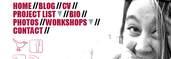
This navigation is unique all around, and for the most part, follows no common interface. The menu is both horizontal and vertical, and is custom fitted to the other imagery within the design. The contrast, layout, and typography are great here, and yet the menu is simple enough for ease-of-use. The only thing that may be a down side for this navigation is that font used for the drop-downs may be a bit hard to read. As always - readability/usability first, design second!
Medis Kok & Bar
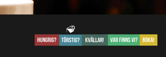
This menu is towards the bottom right of the page, but the web design itself is fairly simple and has minimal pieces of content anyway so it works out well. From a design perspective, the colors and block-design of this menu reflect the logo in the top left of the page, which is a great effect for balance, repetition, and just great design interest.
We've also mentioned quite a few times about icons used in menus and cool hover states. This menu implements them both by showing a small individual icon on the hover state of each link.
Alessandro Giammaria
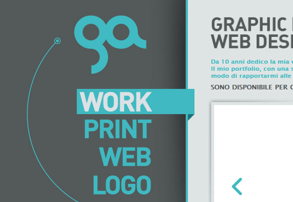
Here we have another vertical menu, and another oversized menu. As one can notice, these both have been rising trends and can be very successful navigation options when the content and website type are fitting. Taking note of the hover and active state, we can see a change in shape and depth, both adding to the overall design.
Perhaps the most unique feature of this menu, though, is the fact that the menu is intertwined with the logo itself. Often times we see the menu and logo as separate entities, although often times close together for primary and secondary focus points. However, in this design, they are almost one element together, and as a whole the logo and navigation is the primary point of interest.
Conway Cowork
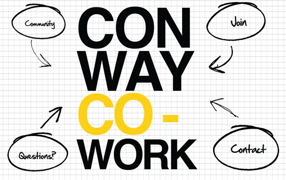
The above definitely doesn't show off a trend in anyway, and is definitely not like any other type of navigation on the web. On first view of the web page, the entire screen is just the huge logo and four navigation links wrapped around it. This navigation solution is a great way to grab attention, however, it can be argued that it may be difficult to determine what the website is about at first glance.
Despite how effective this navigation is or not, the unique nature of it and interesting design alternative are among the benefits of this solution.
Southbound Festival
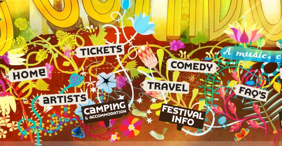
There is a lot going on in this web design, and for any design like that, navigation can find a hard time gaining attention. However, located towards the bottom of the page (on first view), this navigation spans the entire width of the page, and covers a good amount of vertical space as well. While some navigation is best to take up minimal space, this navigation benefits from being one of the main design features.
This is a unique approach to a navigation menu - unorganized, almost busy, and space-consuming. Even the placement is strange. However, because it works so well within the theme of the design, it stands out and gets noticed. Also be sure to check out the cool glowing hover states as well.
La De Da
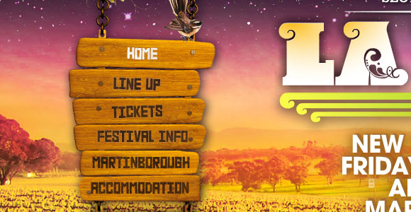
Just like in our example above, we see another navigation menu intertwined with the design of the overall website. This menu is almost more effective, though, because the links are more readable and there is also more contrast, shape, and change in texture around each link.
The above example and this one both show menus that are creative, design oriented, and work within the overall theme well. Whether we can begin to call it a trend or not, it most certainly is creative.
Travel Utah
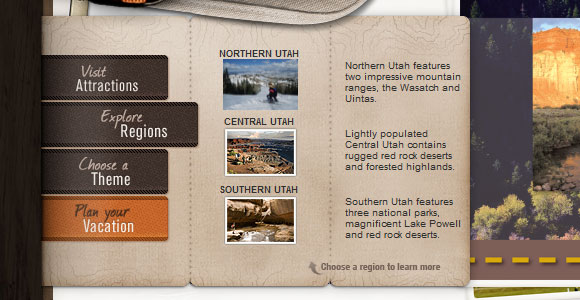
The effect of this slide-out panel is both effective and elegant in design. While the details of the menu match the rest of the website well, what is the greatest feature about this menu is its effective organization. Each panel slides out with more content and navigation, allowing for columns/rows, images, titles/subtitles, and more.
Idea Foundry
A navigation menu is hardly ever found on the right-hand side of a webpage, at risk of bad hierarchy. Navigation should always be one of the first items seen, and the placement of this navigation is usually the best way to get that to not happen. However, this menu is strategically placed to the right hand side for a reason. With block-level list elements, colorful icons, and even a unique menu heading, this menu stands out well. In fact, if it was any closer to the logo (which also has some contrast, color, and of course, the size), the design overall would be very unbalanced.
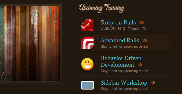
This menu is a fantastic example of how to fit a lot of detail into each menu item. Each item has an icon, a title, a short description, and an arrow icon prompting the viewer to continue throughout the website. It can hardly be called a simplistic menu, but it works well with the rest of the fairly simple design.
