15个非常艺术的404错误页面设计
一个优秀的404网页,会让访客们在看到你的404错误的时候,产生不可替代的化学作用,下面的15个案例,当你看到的时候,你就会发出会心一笑……
Probably the best 404 page I’ve ever seen, the visuals are great and just adapted for the kind of visitors Blizzard gets to its website.

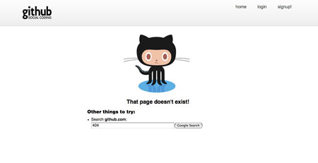
2. GitHub
Simple, elegant and useful, the kind of 404 page we’d like to see more often.
3. CSS Tricks
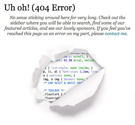
Chris Coyer likes to reveal useful code on his website, he even shows you the source on the 404 page.
4. Dawdle.com
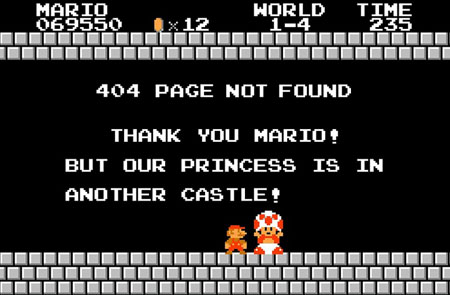
When you own a gaming website, is there any better way than this to appeal to your lost visitors?
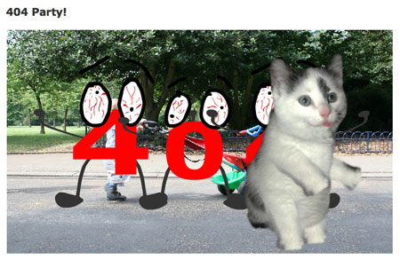
5. 404 party
Beware: loud sound and nuts stuff on this one. Obviously not chosen for its visuals, but I had to admit that I laughed my ass off.
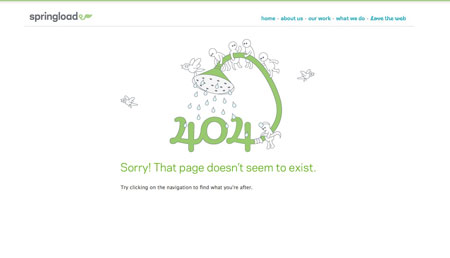
6. Springload
Cute and refreshing illustration, makes you a feel a little better about the missed page.
Either this is really cool, either it’s getting late and I’m too tired. (wait a bit before it starts)
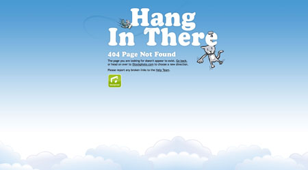
8. iStockPhoto
Nice vector illustration by iStockPhoto for their error page.
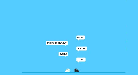
9. 8bit People
Much cooler than Twitter birds, two 8bits birds not taking errors too seriously.
10. BlueDaniel
I mention this one for the originality, but I wouldn’t recommend doing the same. First, the sound is annoying, second it’s in Flash and not very usable…

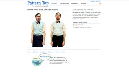
11. Pattern Tap
A funny picture, keeps the navigation so you are not totally lost.
One of the rare cases where the 404 page looks much better than the rest of the site.
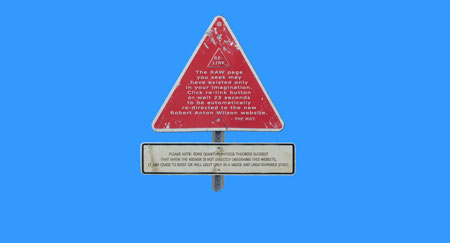
13. Chris Jennings
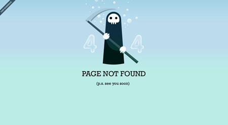
Probably the deadliest 404 page out there.
14. Above top secret
Some humour and a useful page with links to the main sections as well as a site search.

15. Grooveshark
Grooveshard shows a sense of humor, interesting insertion of Twitter updates.
