Deviantart网页设计作品35例_2010年10月
金秋十月已经过去了,在这个伟大的日子里蛋生了很多的精美网页作品,本文收集了在上个月新人新作35例。包括的类型和颜色都很多,红、黄、蓝、绿,简清、炫彩、商务风等等。全部作品,均来源于 Deviantart.com
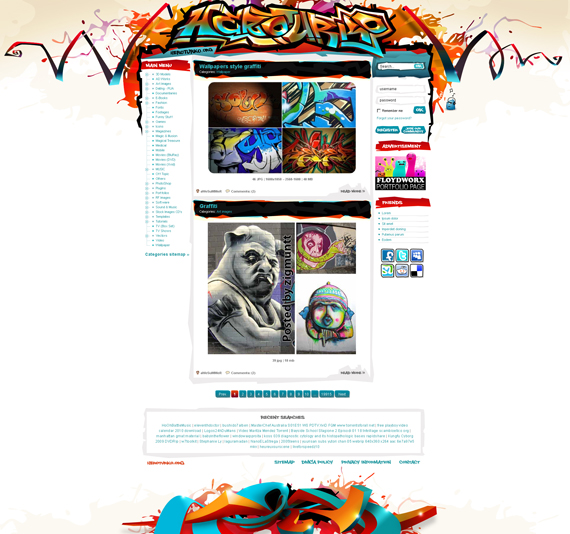
1. Heroturko Siteplan by floydworx
Graffiti can be an art, right? Masterfully brought to the center and look at the social media icons, they match perfectly with every stroke of borders and headers that his layout has. And there’s a cute little guy at the right side of login, could he be responsible for the general awesomeness of this design? But, if I’d modify this, there should at least be a menu bar .
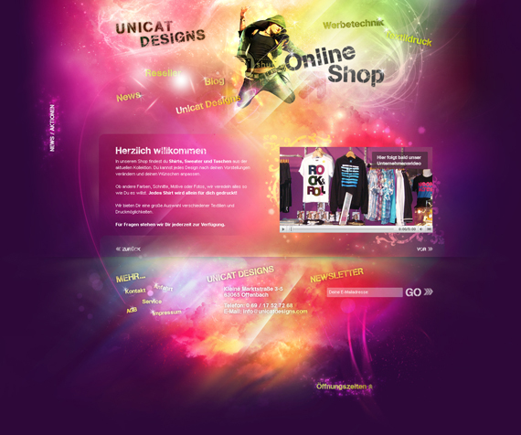
2. Unicat Designs by magnolien
Probably one of the most explosive designs you’ll see using photoshop, it’s like the Big Bang! But here’s the catch: who would volunteer to convert this to HTML/CSS? Ha!
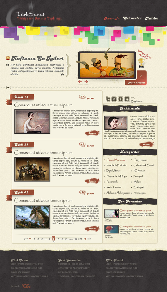
3. TurkSanat Blog by omeruysal
This layout is perfect for a blog. Look at its social media icons, aren’t they well-coordinated with the rest of the site? Well, except for the header. All in all it is a good design.
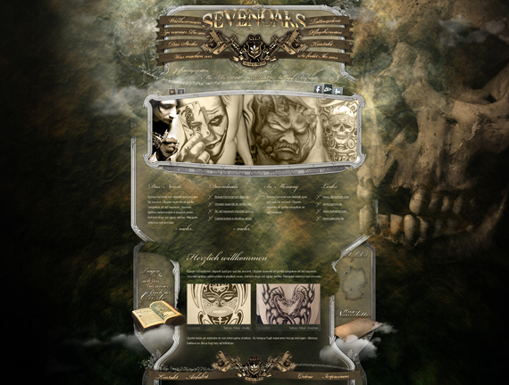
4. TattooStudio Webdesign by medienvirus
Look at those overlapping frames with great textures, very dark yet great art. No one would disagree when I say this is awesome. I’d love to have this layout tattooed on my back.
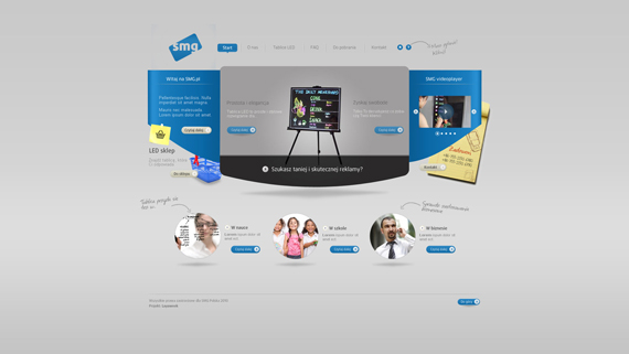
5. TabliceLEDby layaweek
Simple and easy to understand. That’s one quality that a good designer would do for usability purposes. Hence, a good design.
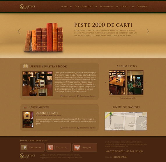
6. Sevastia’s Book by mece888
I don’t know why, but looking at this design makes me want to drink hot chocolate while reading a book.
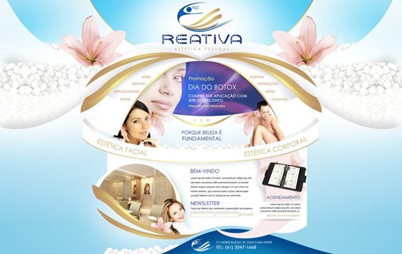
7. Reativa Estetica Pessoalby kronnosdf
At first sight I thought I saw an angel in this layout, or a beautifully curved wedding gown! And look at the logo, fascinating.
8. Pixeltimeby Timeless93
Nice choice of colors, doesn’t hurt my eyes. And I love the doodle, without them this design is boring, so they’re a perfect fit!
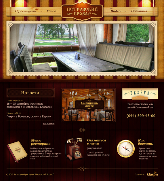
9. Petrovsky Brovar by king-pavian
Extremely classy website design, I love how the lights touch the menu bar and how it is hanging. Perfect for a restaurant!
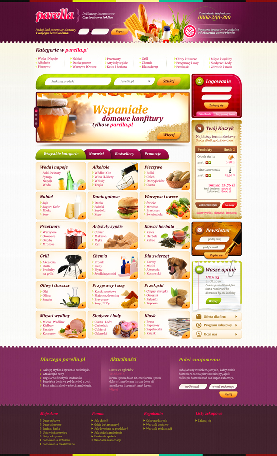
This is certainly one of the most mouthwatering web layout I’ve ever seen. Just looking at the variety of colors used makes me think of eating right now! Look, even the dog found it tummy-grumbling. This design is just perfect for a convenience store or a grocery.
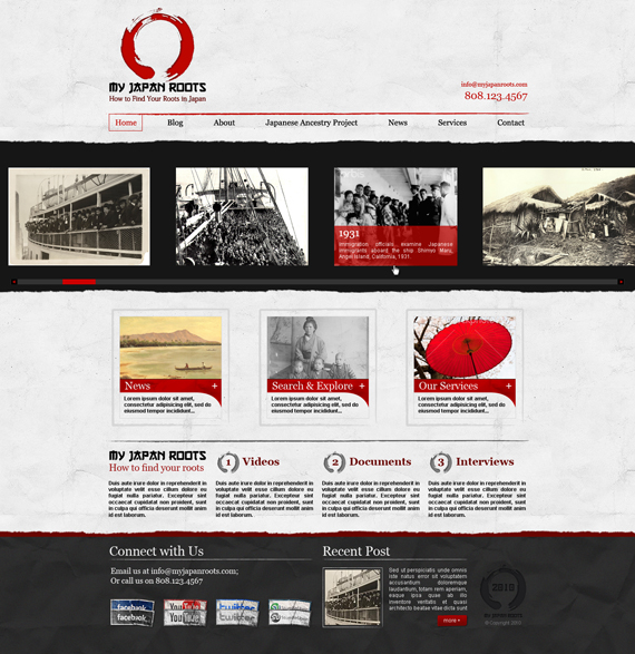
11. My Japan Rootsby bojok-mlsjr
Now, there are many similar layouts like this but the choice of the colors’ red and black and its logo makes it difficult to not notice that this indeed reflects Japan. And that is a good quality of a design, simple things mean a lot.
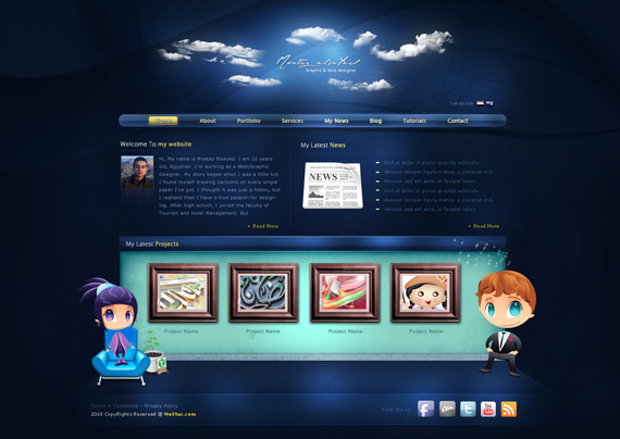
12. Moataz Portfolio by EGYweza
Notice those slowing curves in the background, they do make the layout seem like a very comfortable place to be at. Another thing is the 3D-ish illusion it projects simply by positioning one figure further back from the other, look at where the girl is.
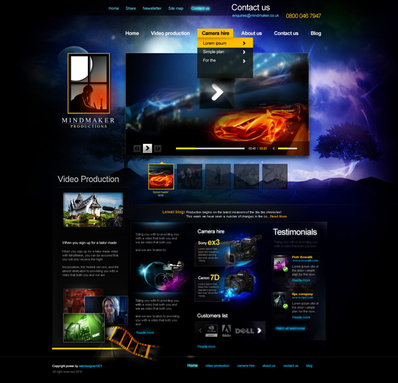
13. Mind Maker Home by webdesigner1921
You just got to love how everything blends perfectly. Also take a look at the window, noticed the moon? That’s just perfect!
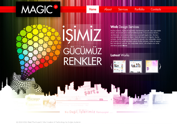
14. Magic Istby DoGaNAydemir
Very interesting utilization of colors, it’s nice to see the background image relate with the colored circles for some reason.
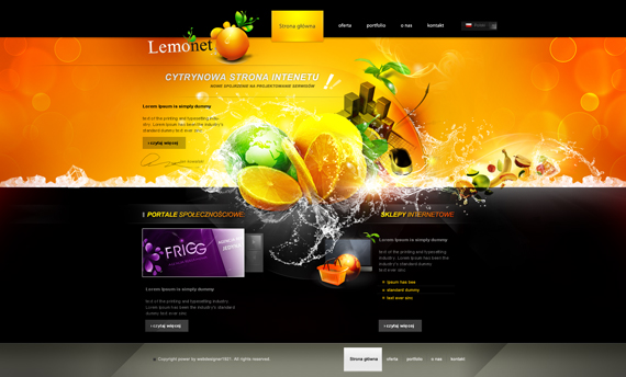
15. Lemonet Homepage by webdesigner1921
That’s very lemon-y! This design is for a company called Lemonet, pretty much seen in the design what Lemonet is right? Looks very refreshing because of that small splash of icy cold water! Yeah, I felt its coldness!
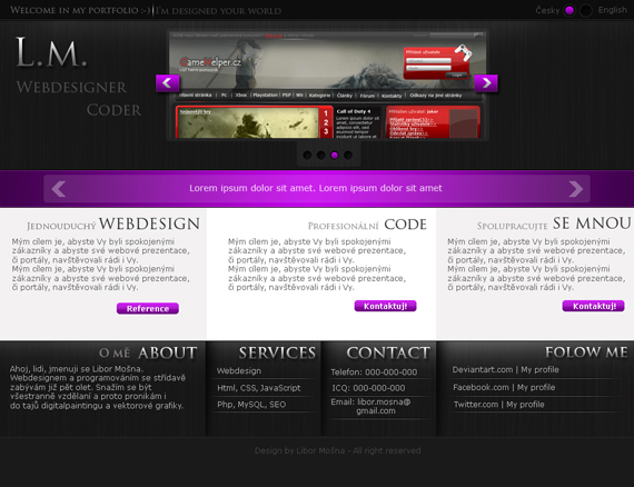
16. L.M. Design v.2 by Libor-Mosna
A commenter at Deviantart actually said that “your header is :$” which can literally be translated to “your header is yummy.”
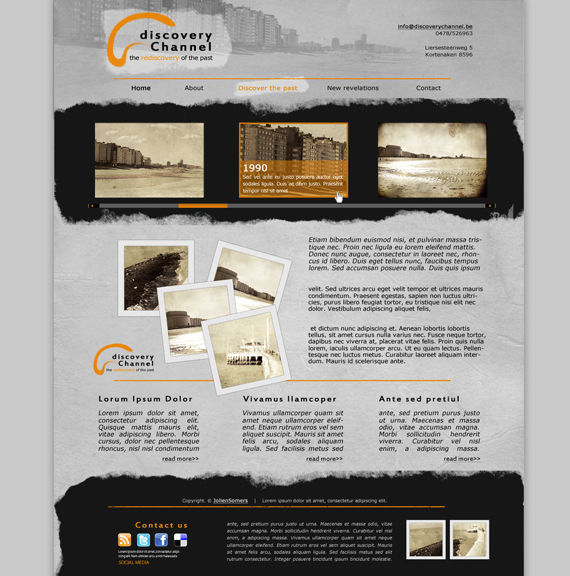
17. History Channelby joolienn
Nicely done template with slight impressions of wrinkles and paper tearing. Is this about history? It seems like it.
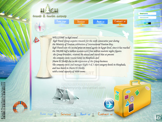
18. High web site by eltolemyonly
This might seem too much cluttered but take note, as the description says, this is a first-time web layout design. Pretty good for a first-timer!
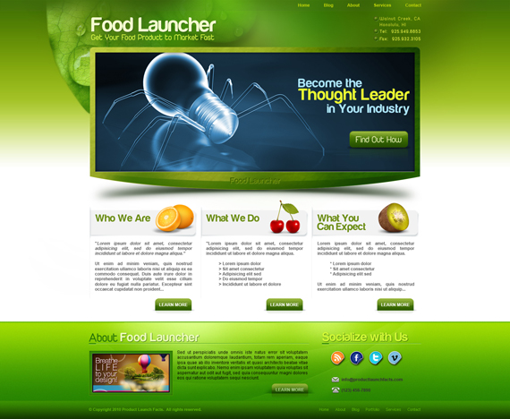
19. Food Launcherby bojok-mlsjr
Simple plus brilliant. Nicely done gradient.
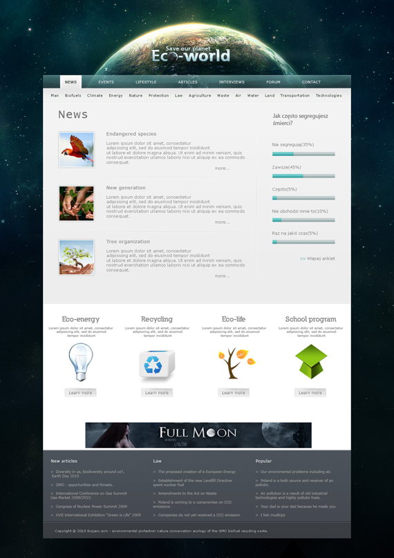
Nicely done as stars even appear almost everywhere in the background, and a slight hint of asteroids too. Earth’s color here is nicely done, I like how it glows.
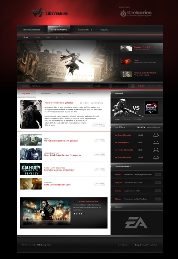
21. ChievGamingby Tropfich
Really easy in the eyes no matter how hard the colors are. To make it more interesting, I think it would be better to add a background image of the featured game since it is about games. This layout is pretty much flexible, you don’t see that quite often now. An easy to customize web layout, change its colors and see it morph from serious to refreshing.
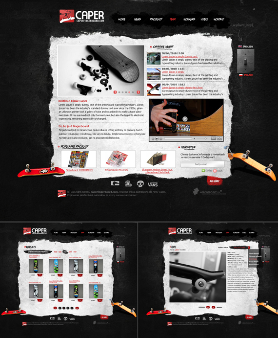
22. Caper Fingerboard Shop by lukearoo
Nice textures used here. Notice too the flip-switch, a very unique way to change the language of the site, although quite out of context…where’s the light?!
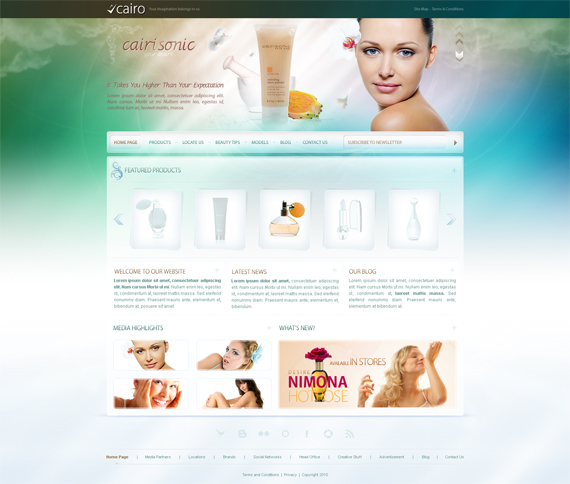
23. Cairo Beauty Face Wash by versesdesign
Ahh, what a very refreshing site to look at. Very clean and looks smooth too (open to many misinterpretations). *laughs*
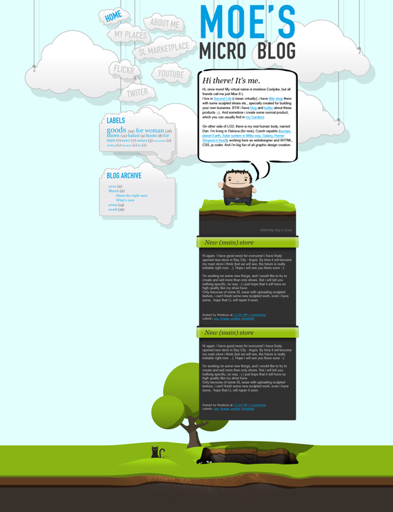
24. Moe’s micro blog design by dan-Es
It’s simple, the colors used are soothing and the entirety of the design is mega cute! And did you notice how he followed the Golden Ratio either knowingly or not?
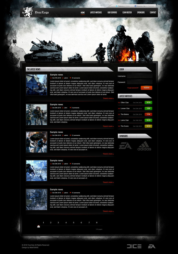
25. Bad Company 2 Clan template by MateToth
This one is serious, header compliments it. A nice way to separate the menu bar from the body using a header image.
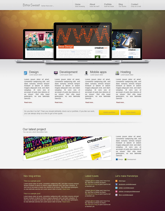
26. Bittersweetby MateToth
Love or hate those notebooks, they add to the flash. This is one of those layouts with the neat and sexy feel. Plus, is that bokeh?
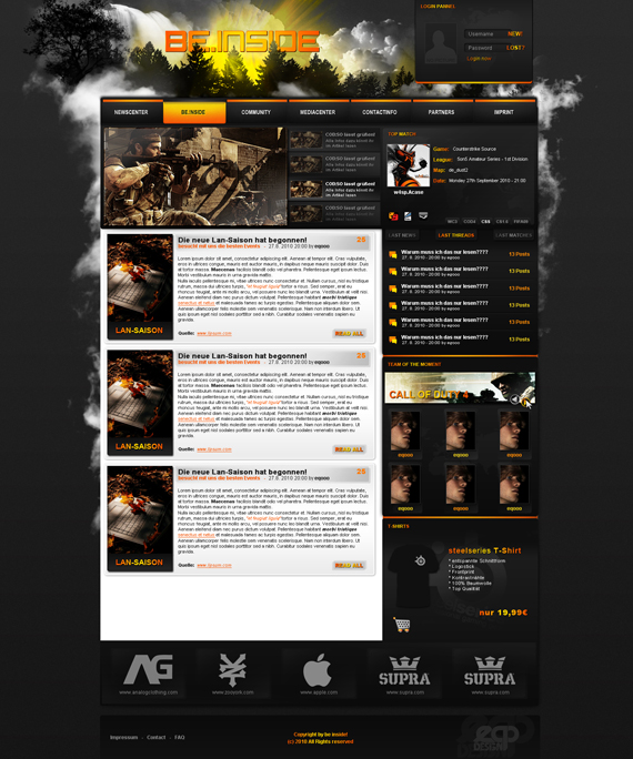
27. be-inside Clandesign by eqooo
The design is generally awesome, and I like how the login panel is separated, but not alienated, from the rest.
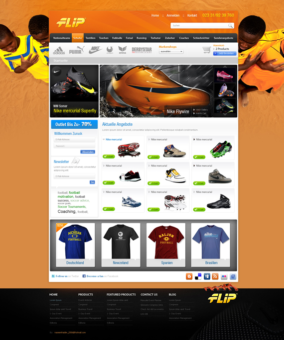
28. An Ecommerce Storeby naseemhaider
And did you notice how ironic the background image is?
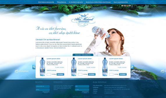
29. Albamineral weboldal tervby VictoryDesign
One-word comment: refreshing.
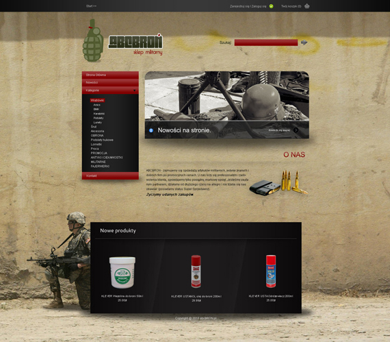
30. abcbron.plby lilkangoo
Another website that utilizes the use of a full background image. Can’t say that it is flashy or grand, but it actually accentuates firearms.
How many times have I mentioned “neat” now? Another neat layout, the color pretty much compliments every aspect of the site from icons to frames.
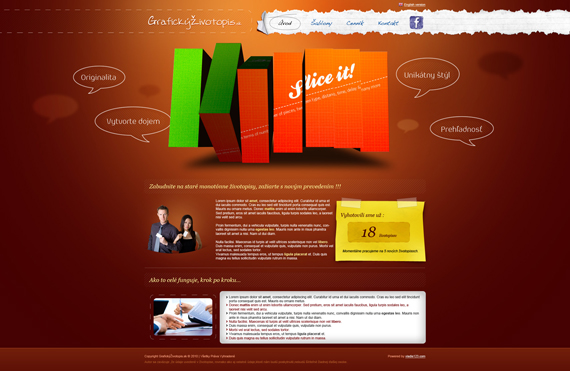
32. MyCreativeBio.com by vladis123
What makes this web layout fantastic is its use of delicious colors and that “sliced” flash banner which actually rotates. There are a couple of samples in differing colors in this website as it provide clients a “creative blog”.
